

A Tale of Gold, Bonds and Fed (In)dependence
A Tale of Gold, Bonds and Fed (In)dependence
Plus gold and the Great Inflation Part II

The first 10 days of April brought solid US economic data.
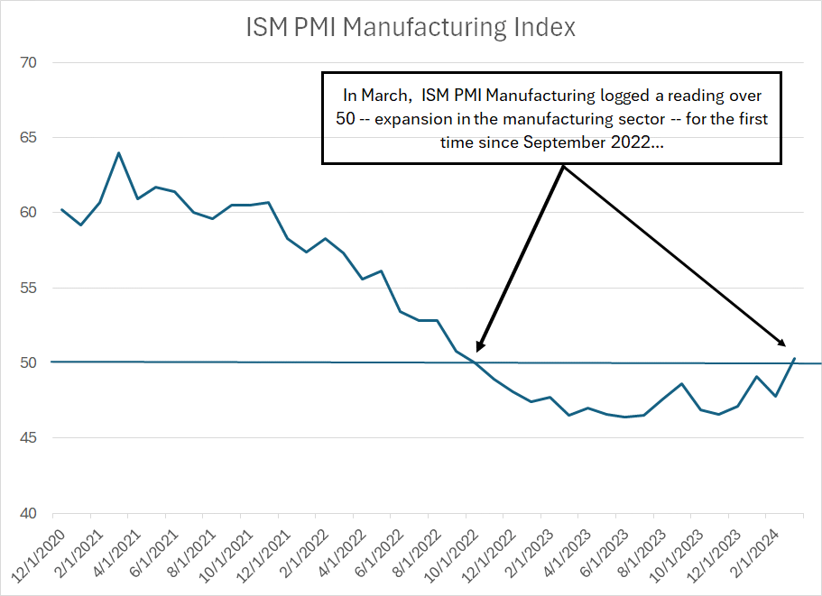
In early March, the Institute for Supply Management’s (ISM) Purchasing Manager’s Index for Manufacturing came in below expectations at 47.8, below the key 50 level that divides an expanding from a contracting manufacturing sector.
At the time in “Growth and Inflation Resurgent,” I wrote PMI was likely to rebound, reaching levels over 50 in the next few months.
That’s happened sooner than I expected – ISM Manufacturing PMI rose to 50.3 in March, well above expectations for a more muted increase to around 48.3:
Source: Bloomberg
As you can see in my chart, this is the first reading for ISM Manufacturing above that key 50 level since September 2022 when PMI came in at 50.8.
(To be fair, ISM registered 50.0 in October 2022).
My optimism one month ago was based on two points and both points suggest continued upside for PMI this spring.
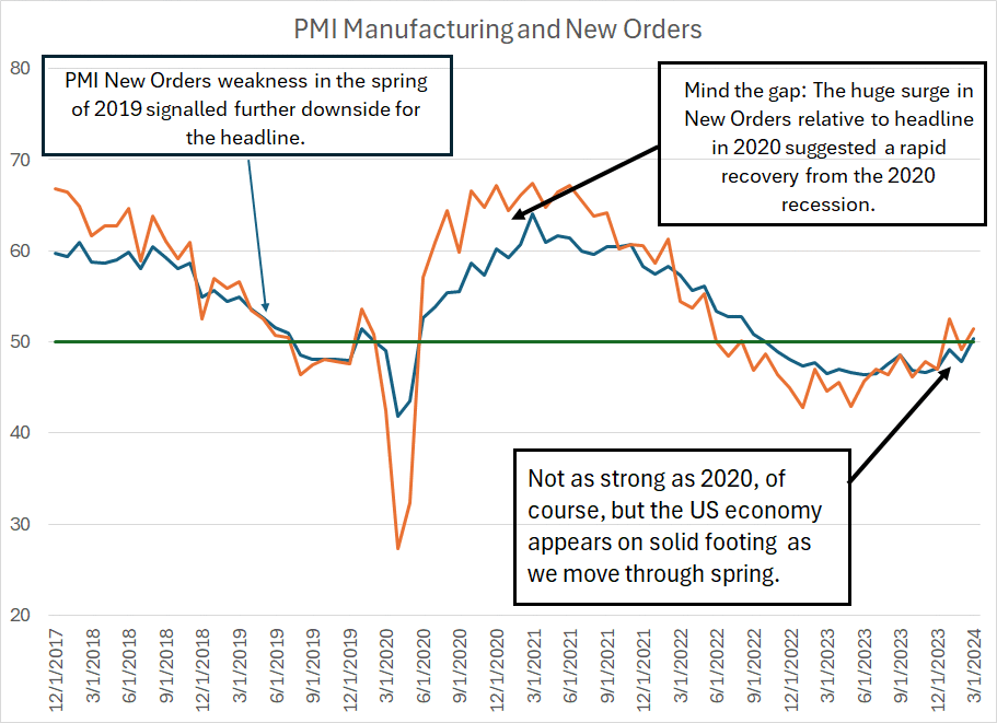
First, the PMI New Orders Index tends to lead the headline number, albeit with significantly more volatility; the surge in the new orders component over 50 in January suggested more upside for the headline in the coming 2 to 3 months.
New Orders continues to lead:
Source: Bloomberg
I like to monitor the relationship between these two indices over time.
As you can see, PMI New Orders weakened faster than PMI starting in roughly the spring and early summer of 2019, a signal the economy was weakening (even before COVID lockdowns) and the market was in late cycle mode.
In contrast, just look at the chasm that opened up in early 2020 amid a surge in stimulus from Washington – PMI recovered, but New Orders soared, reaching highs in the mid to upper-60s by the summer of that year. That suggested the US economic recovery from the 2020 recession would be unusually swift.
Granted, the more recent rise in New Orders that’s leading headline PMI higher pales in comparison to 2020; however, at a minimum, I’d take this to mean the US economy is on solid footing as we move through the first half of 2024.
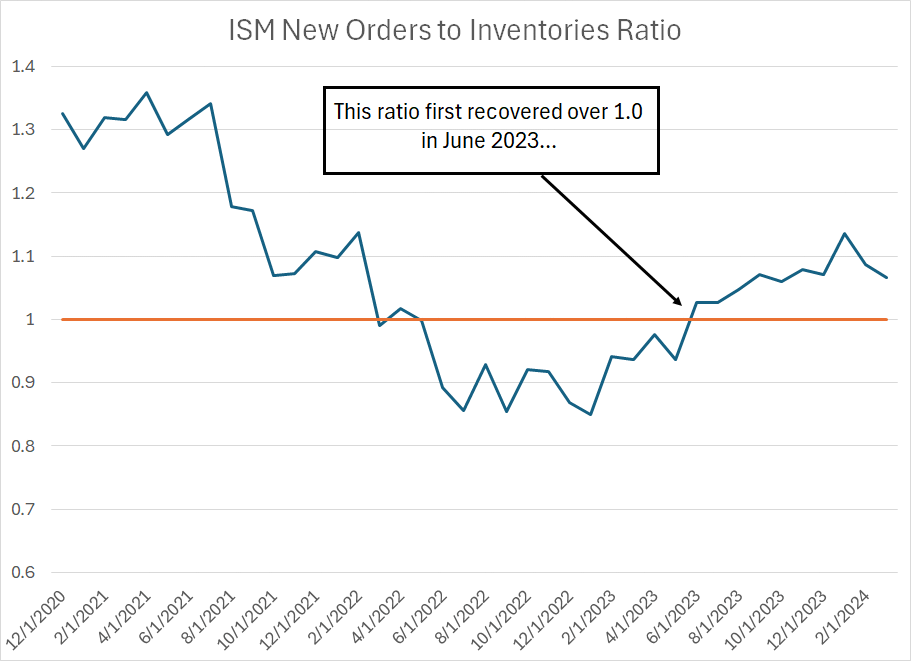
The second indicator I watch when evaluating PMI is this:
Source: Bloomberg
This is the ratio of the ISM New Orders Index to the ISM Inventories Index. The latter tells us whether manufacturers in the US are accumulating or reducing inventories.
Simply put, when this index is above 1.0, it suggests manufacturers are seeing strengthening in new orders while inventories are lean – that’s a generally constructive outlook for the economy because it implies manufacturers will need to ramp up production to replenish inventories and meet the rising incoming pace of new orders.
As you can see, this ratio first crossed above 1.0 in June 2023; by the fourth quarter of last year, you can clearly see the improvement in the ISM Manufacturing headline, and New Orders Indices I posted earlier.
The Jobs Number
Last week’s jobs number also came in hot – overall payrolls were up 303,000 compared to the 214,000 consensus on Wall Street heading into the report while private payrolls came in +232,000 vs. the +170,000 expected.
Long-time readers know the monthly BLS Employment Report isn’t my favorite indicator (to put it mildly). BLS data is subject to massive revisions over time that can completely change the picture for the labor market.
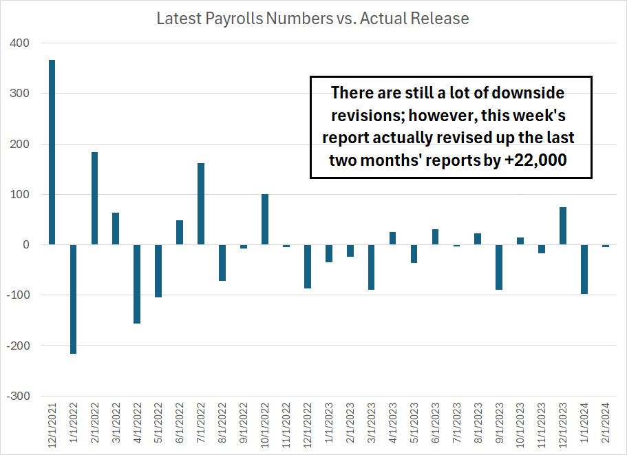
I would note that this month’s number looks decent on some of the secondary indicators I follow:
Source: Bloomberg
To be fair, the number of downside revisions to BLS data since early last year remains elevated, usually a signal there’s something amiss with government estimates. However, this month the government revised payrolls higher for the past two months by +22,000.
Of course, even with this latest revision, BLS has still revised both January and February data lower from its initial release. However, at least there wasn’t a revisions shock to the March jobs report.
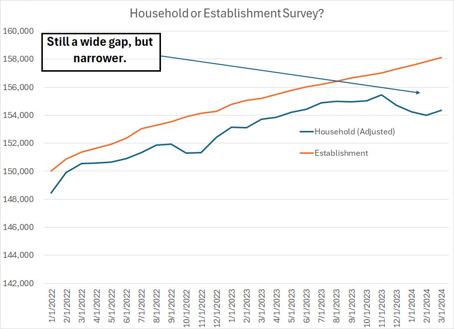
Each month the payrolls number, so widely reported in the mainstream and financial media, comes from the so-called “Establishment Survey” conducted by BLS. This is a survey of businesses, and it counts payrolls – jobs – NOT people.
There’s also the so-called “Household Survey,” a survey of individuals, that’s used in part to calculate the unemployment rate. The gap between the picture provided by these two surveys has attracted a large amount of attention in recent months:
Source: Bloomberg
The orange line shows the total number of payrolls in the US over time, the change in this number is what tends to attract most of the attention in financial markets.
The blue line is the same data taken from the household survey that’s adjusted so that it purportedly tracks the same employment picture captured in the establishment survey.
Normally, you’d expect to see these two series track closely; however, late last year we started to see a situation where the US continued to add jobs according to the establishment survey but was shedding jobs per the household survey. Gaps in these series have opened before, but since late last year the divergence here has been remarkable.
Look at the household survey and the labor market looks almost recessionary compared to significant strength evident in the establishment survey.
We did, however, get at least a temporary respite in March as the household Survey showed slightly more growth than the establishment survey – that’s +352,000 jobs on a fully adjusted basis versus the +303,000 in the establishment survey.
There are many potential explanations for the wide gap in these two pieces of survey data. In my view, one of the most plausible and logical is the surge in multiple jobholders in recent years. According to the latest BLS numbers, there are 8.476 million people in the US labor force with more than one job. We have data on this going back to 1994, 30 years, and we’ve never seen this many people with more than one job before.
As I mentioned, the establishment survey queries businesses and tracks payrolls. So, theoretically, if a person has two jobs that may be counted as two separate payrolls by the establishment survey. In contrast, in the household survey that would show up as just a single employed person.
It’s at least plausible changes in the economy – the increased prevalence of “side hustles,” part time freelance jobs and services like Uber – are difficult for BLS to track as they don’t fit the pattern of the economy and labor markets of prior decades.
I have two general conclusions from all this.
First, there’s nothing in the March employment report that suggests imminent weakness in the US economy. Indeed, this month’s release is pretty consistent with the message of other economic datapoints so far this year – the US started 2024 with solid economic momentum.
Second, the ongoing revisions trend in monthly BLS data and aberrations such as the household-establishment survey divergence certainly don’t do anything to make me more enthusiastic about the BLS report as a leading indicator for the economy. I know it’s widely watched by markets, but I continue to believe the monthly BLS reports are among the most overrated bits of data for assessing the health of the economy.
And that brings me to this, a question I’ve been asked multiple times in the past few weeks:
The Fed, Yields and Gold
The current Fed Funds rate is about 5.33%, smack in the middle of the Fed’s target range between 5.25% and 5.50%.
And, after holding roughly constant since late February, this week’s hotter-than-expected Consumer Price Index (CPI) inflation report has finally shocked Fed Funds Futures into a reaction:

Source: Bloomberg
As you can see, Fed Funds Futures are pricing in a year-end 2024 rate of 4.91% right now, which works out to 100% probability of one 25 basis point cut and 71.4% probability of two cuts by year-end.
That’s less than the 3 cuts factored into the FOMC’s dot plot I wrote about in “Inflation and the Federal Reserve.”
What’s even more dramatic is the roundtrip we’ve seen in market expectations since last autumn – at one point in mid-January (less than 3 months ago) Fed Funds futures were pricing in 100% probability of six 25 basis point cuts by the end of this year and 70%+ probability of a 7th.
Indeed, market expectations for the year-end 2024 Fed Funds rate are now a little higher than they were during the height of last year’s bond sell-off in mid-October.
All that said, it’s important to point out the market is still expecting a pivot despite hot inflation and strong economic data. Moreover, yields on Treasuries are NOT back to their late 2023 highs – the 10-Year, for example, currently yields about 4.55% compared to a peak just shy of 5% on a closing basis on October 19, 2023.
This year I’ve spilled considerable ink on the sector rotation underway in US equity markets in favor of groups like energy and materials, a trend that’s accelerated since the end of January. That’s a clear signal to all who would listen that markets are worried about the risks of resurgent inflation in 2024.
With that in mind, one could be forgiven for wondering why the Fed is even contemplating any cuts to the Fed Funds rate at all in 2024, even why they’re not considering one or two more hikes to nip inflation pressures in the proverbial bud.
And if the Fed is determined to pivot, why aren’t the so-called bond vigilantes driving yields on longer term Treasuries well above levels that prevailed last autumn?
The market seems to be telling us the Fed will be willing to accept a higher level of inflation – well above its 2% target – for longer than previously expected. Indeed, as some have suggested, perhaps the Fed will eventually abandon that 2% target entirely in favor of 3% or more:
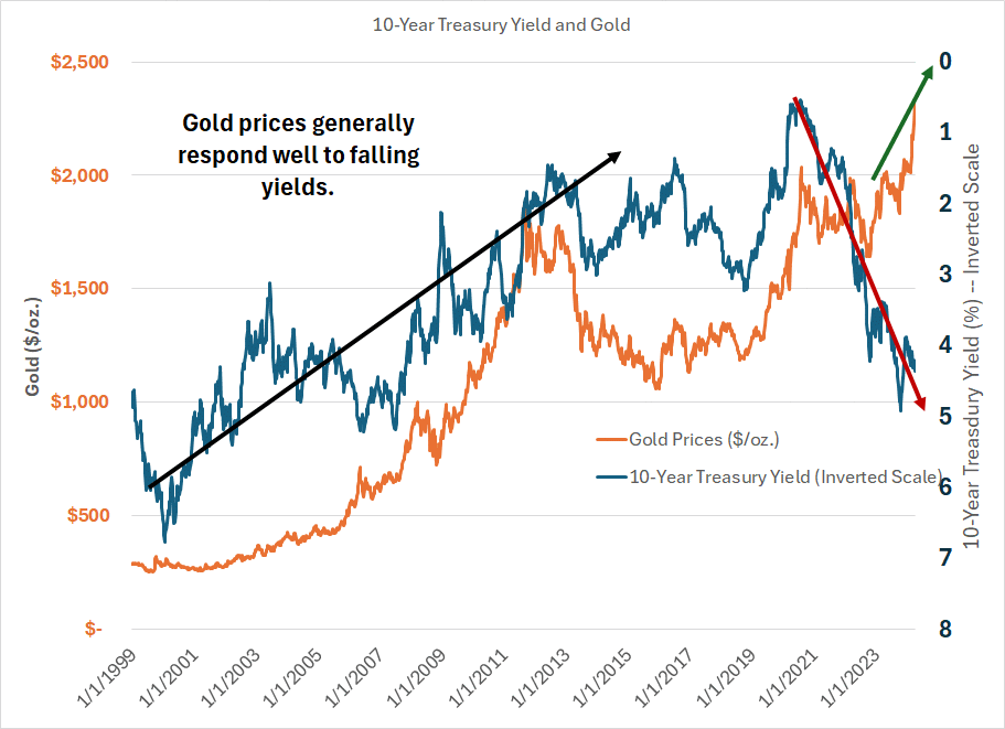
Source: Bloomberg
This chart shows the weekly price of gold since January 1999 as an orange line and the yield on the 10-Year Treasury as a dark blue line – I’ve inverted the scale on the latter such that a rising blue line implies falling Treasury yields.
As you can see, the drop in yields from the late 1990s through 2011-12 powered a massive bull market in gold – prices jumped from around $250/oz at one point in 1999 to over 1,900/oz.
And this general relationship continued thereafter until roughly the middle of 2022 – falling yields in 2019-20, for example, powered a leg higher in gold to fresh all-time highs. Rate hikes in early 2022 catalyzed a dip in gold to a low in the low $1,600s per ounce as of September 2022.
However, the divergence since then has been incredible – yields have risen from under 3% as of mid- August 2022 to around 4.55% right not; yet gold has broken out, rising to an all-time high of over $2,350 per ounce this week.
While the gold bears continue to attribute strength in the yellow metal to everything from irrational markets to geopolitical risk, the reality is it likely reflects something far more fundamental and dangerous:
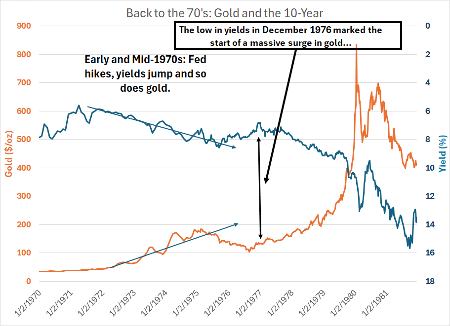
Source: Bloomberg
Here’s a chart of gold prices and 10-year Treasury Yields on exactly the same basis from 1970 through 1981.
As you can see, gold prices generally rallied into the mid-1970s, despite a series of Fed hikes through 1974 and soaring 10-year yields. Even more interesting is to look at the action after December 1976 – yields bottomed at around 6.80% that month, jumping to over 9% by the end of 1978, over 11% in 1979 and 13%+ in early 1980.
The bottom in yields marked the bottom in gold in the 70s.
Gold and yields both rose together from 1976 into the early 1980s. Gold and yields then assumed a negative correlation only after inflation started to come down in the early 1980s.
As I said, I’ve been writing for weeks now that trends in various industry groups like energy, materials and technology all suggest a market increasingly concerned about stubbornly high inflation. This is perhaps the biggest warning sign of all – positive correlation between gold and yields was a key characteristic of the Great Inflation era of the 1970s.
Back to my original question:
So Why Would the Fed Cut?
Hot inflation data, surging commodity prices, a strong start to the year for the stock market and resilient economic data.
That certainly doesn’t sound like a recipe for cutting rates.
So, the obvious question:
Why does the market still expect cuts and why have various Fed members continued to suggest that conditions could be approaching a point where cuts would be appropriate?
There are a couple of likely explanations in my view.
Long-time readers know I’m not a fan of market narratives grounded in political views. After all, politics is inherently emotional, and I’ve found over the years that emotions and biases can be very expensive indeed for investors.
That said, I think it’s fair to point out there’s a US Presidential election slated for November 5th of this year and inflation is a major (perhaps even the most important) issue for voters. Historically, the Fed has tried to steer clear of the appearance of interfering with elections and so the central bank may well prefer to move slowly and methodically at least until after November.
While that doesn’t necessarily mean they’ll cut, it probably does mean they’d be reluctant to start hiking rates again mere months before the election even if inflation continues to reaccelerate.
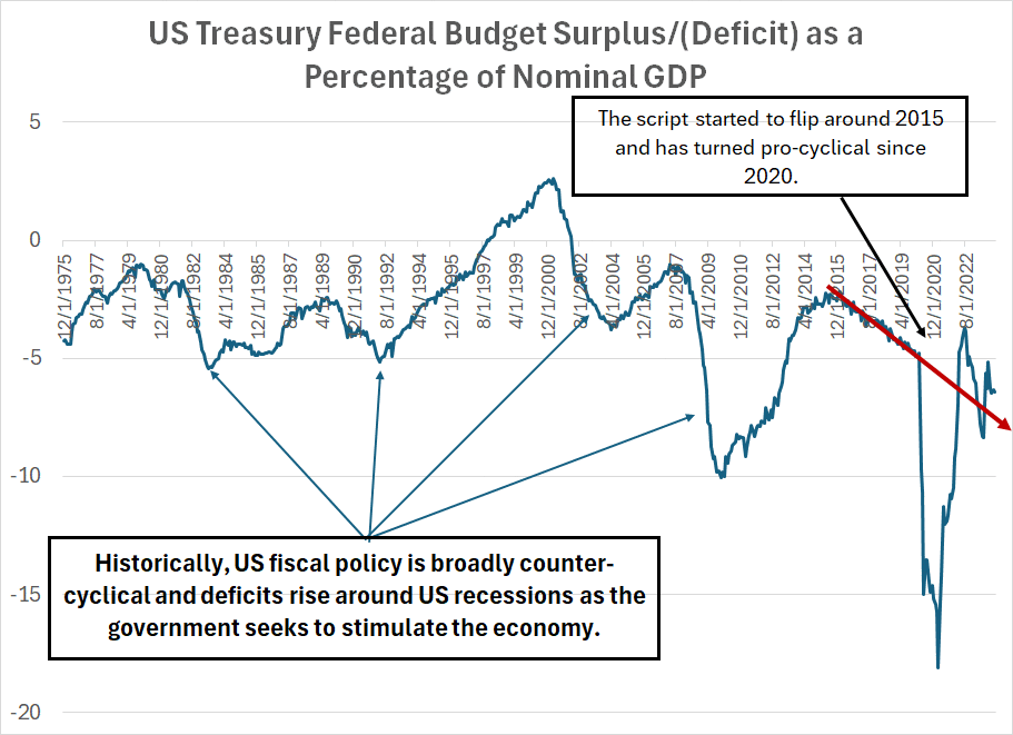
Second, and far more important in my view, is the shocking state of the US federal government’s finances right now:
Source: Bloomberg, US Treasury
Historically, the US government, like most governments around the world, has attempted to use fiscal policy to soften the pain of recessions. So, if you look at all the recessions since the mid-1970s depicted on this chart you’ll see there’s been a sharp increase in deficits around those economic downturns.
So fiscal policy is counter-cyclical – the government strives to lean against weakness in the economy by spending more.
That started to change right around 2015. There was no recession in this era, but the US deficit began to rise at a steady pace even when the economy looked solid, and unemployment was low.
The government then set the countercyclical fiscal policy book on fire in 2020 and threw it out the window entirely in 2021-22. While the initial response to the COVID lockdown recession of 2020 might have made some sense based on the traditional countercyclical playbook, the elevated level of fiscal stimulus clearly continued long after COVID started to recede from the headlines, the economy was clearly on the mend and inflation was running hot.
Since 2020 and based on projections for spending over the next few years, US fiscal policy has turned increasingly pro-cyclical, reinforcing the strength in the economy, and offsetting some or all the monetary tightening since 2022.
(To be fair, the US isn’t alone in this as fiscal stimulus has surged in many developed countries since 2020.)
Put in a slightly different way, the US federal government has become more of an actor in the US economy in recent years, and when that happens it becomes increasingly difficult to separate the Fed’s monetary policy from the conduct of government spending.
Just consider, in the government’s fiscal year 2023 (ended last September) total net interest on the national debt was $659 billion, up from $345 billion in 2020. That’s about 2.5% of GDP; however, given the rise in US government debt and higher interest rates, the Congressional Budget Office (CBO) expects interest on the national debt alone to approach $1 trillion annually by 2028, more than 3% of their projection for US GDP by that year.
Now the problem here is the government must pay for all this spending and must find a way to pay interest on all that debt. Taxes are an option of course; however, when the government raises taxes, that directly takes money out of the economy and acts as a headwind for economic growth (as well as stocks).
So, the government can also borrow to fund the debt – a quick glance at the Treasury’s quarterly refunding statements and the sheer scale of the deficit shows that’s been the main avenue in recent years. However, what’s less appreciated by many investors is that borrowing money also takes money out of the system.
This is something I’ve written about on a few occasions in this service, but it bears repeating.
When the government sells a bond to raise cash, someone must buy that bond. When the Fed is undertaking QE, the US central bank is one major buyer, and the Fed’s bid for government bonds keeps rates low. However, when the Fed is shrinking its holdings of Treasury securities (quantitative tightening) then the government needs to find a different buyer, not only to finance current spending but to roll over maturing US debt and pay interest on that debt.
Foreign central banks and governments have been major buyers in the past, but most are reducing their Treasury holdings.
That leaves US corporates, banks and individuals. Banks already have sizable portfolios of Treasury securities – some, like now-defunct Silicon Valley Bank, lost billions amid the rise in yields over the past few years – and it seems unlikely they’ll be major buyers going forward.
When an individual buys a bond, they’re likely to fund that purchase by transferring money from their deposit accounts at US banks. And when deposits fall across the banking system, there’s downward pressure on bank reserves which underpins credit creation across the entire US economy. While the economy looks solid now, that can turn on the proverbial dime if bank reserves were to fall significantly and credit conditions were to tighten meaningfully.
Last year, Treasury unlocked a honey pot of alternate funding at the Fed in the form of the central bank’s domestic reverse repo (RRP) facility:
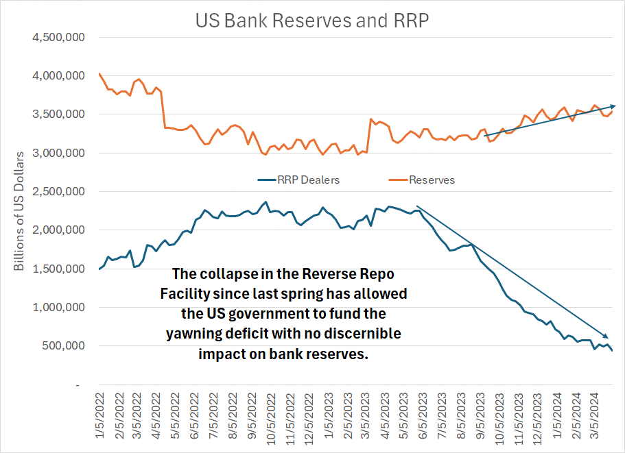
Source: Bloomberg, Federal Reserve
The main users of the RRP dealer facility have been money market funds – this facility allows these funds to “park” money on a short-term basis at the Fed and earn an interest rate close to the current Fed Funds rate.
Money market funds can also buy Treasury Bills – short term government debt – though they can’t buy longer-dated notes and bonds. So, following last year’s debt ceiling deal, Treasury ramped up its sales of Treasury Bills to replenish the government’s cash reserves and fund ongoing spending.
Indeed, the Treasury’s issuance of Bills has soared from 72.8% of debt issued in late 2022 to a record high of 87.4% as of the final quarter of last year.
Since the rate paid on short-term Treasuries exceeds the rate paid on RRP, money market funds exited the RRP in droves and bought T-Bills. That’s why the deficit has yet to impact US bank reserves, which remain at the highest levels since early 2022. The government is funding the deficit with cash from money market funds that was previously sitting in the RRP.
This little game is nearing a conclusion. As of the most recent data, the domestic portion of RRP stood at $436.6 billion, down from $818.87 billion on the final Wednesday in 2023 and $2.3 trillion a year ago in April 2023.
On top of that, the surge in bill issuance has left Treasury reliant on short-term refinancing to fund the deficit – over the intermediate term the government will want to shift their issuance back in favor of notes and bonds. After all, T-Bill issuance is already well above Treasury’s communicated long-term favored range as a share of total debt.
The April income tax deadline may provide Treasury with a short-term reprieve, but by this summer I’d still expect RRP to be nearing exhaustion. It will then become harder and harder for the government to fund the debt without impacting bank reserves and tightening credit conditions.
In the current environment, it’s harder, MUCH harder, for the Fed to conduct monetary policy without taking the fiscal situation into consideration.
For one thing, it’s a near-certainty the Fed will need to start tapering its quantitative tightening in the next few meetings even if inflation is still elevated – the shrinking Fed balance sheet shifts more of the burden of financing deficits to the private sector. Indeed, the Fed minutes released this week revealed considerable discussion around tapering QT; the consensus appears to be building to start by reducing the pace of asset run-off in Treasuries to around half the current rate.
Moreover, if the Fed were to cut rates, it would tend to reduce the government’s interest bills over time and make longer-term Treasury Bonds and Notes more attractive for investors. After all, the yield on T-Bills is significantly higher today than the yield on 10-year and 30-year bonds (an inverted yield curve). A series of rate cuts could change that, driving down short-term rates below the yield on longer-term notes and bonds.
You can clearly see the problem in the form of this week’s auction of 10-Year Treasuries:
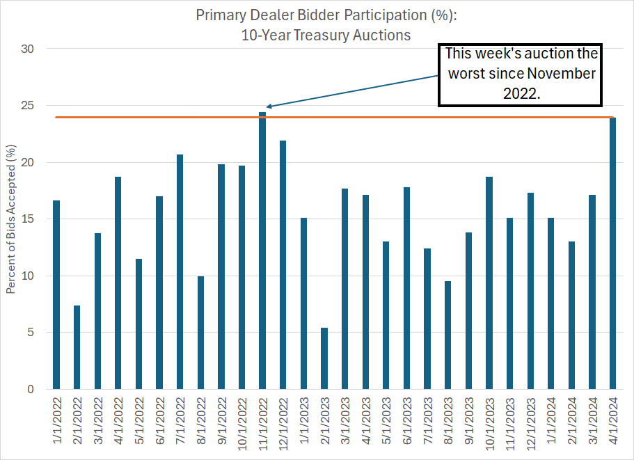
Source: Bloomberg, US Treasury
As you can see, primary dealers – basically large financial institutions that make a market in Treasury Bonds – had to buy almost 24% of this week’s auction. This happens when the auction doesn’t attract adequate demand – individuals, corporations, or foreign central banks – to take up the entire issue at the yields offered. And when primary dealers get stuck with an issue like this, it implies downward pressure on prices (upward pressure on yields) as those institutions later seek to sell Treasuries on the secondary market.
Simply put, the Treasury is struggling to borrow – sell bonds - -at current 10-year rates.
At a very minimum, as RRP is exhausted I’ll be watching for a shift in the recent pattern of stable-to-rising bank reserves. Should reserves begin to fall in earnest, it’s tough to imagine the Fed NOT cutting rates and ending QT regardless of the inflation outlook.
That’s a dangerous backdrop for risk assets generally; however, it’s constructive for the markets’ new leaders in groups like energy and materials.
Here’s a look at the updated model portfolio:
Keep reading with a 7-day free trial
Subscribe to The Free Market Speculator to keep reading this post and get 7 days of free access to the full post archives.