


Agriculture, Tech and the Great Cycle
What to buy (and sell)...

Editor’s Note: I’m making some adjustments to the model portfolio this week, including recommending you book sizable profits on three recommendations.
I’m also adding two new stocks to the portfolio, the first is a stock that benefits from one of the most profitable commodity groups that’s all-too-often overlooked by equity-focused investors.
The second represents an extension of an investment theme I added to the portfolio back in January that’s already up close to 20% despite extreme volatility in the S&P 500 since that time. This name also benefits from a “kicker” in the form of what some call the “caterpillar.”
Paid tier readers should consider scrolling down to the “Actions to Take” section of this issue for my latest buy and sell recommendations as some of these shifts could be time-sensitive.
And, for those free tier FMS readers interested in all of our model portfolio recommendations, you still have two days left to claim a 90-day free trial of the Free Market Speculator paid tier through this link:
—EG
There’s more upside for stocks in the short to intermediate-term.
In the April 10th issue, “Bear Market Rally is Underway,” I covered significant ground, centered on 3 key points:
I see the odds of recession at roughly 50/50 in the next 12 months as the soft economic data (forward-looking data based on surveys) has weakened to recessionary levels, but the hard economic data (series like the monthly payrolls report) continue to hold up.
With the S&P 500 now trading below a falling 200-day moving average, I believe the primary trend for US stocks is lower and we’ve seen the top of the bull market that started in late 2022.
The severity of the sell-off from late March through early April, coupled with the extreme negative readings we’ve seen from market breadth, pointed to growing probability of countertrend, bear market rally.
Since I wrote that piece, we’ve seen a classic bear market rally, including a near-retest of the lows early last week:
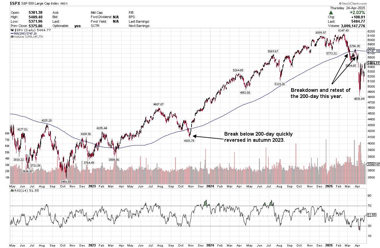
Source: Chart Courtesy of StockCharts.Com
This chart shows the S&P 500 with the 200-day simple moving average overlaid as a blue line.
Remember the quote referenced in the last issue, attributed to Paul Tudor Jones:
Nothing good happens under the 200-day simple moving average.
Generally, in a healthy rally, the S&P 500 spends most of its time above a rising 200-day moving average. Sell-offs below the 200-day are quickly reversed, as we saw in the fall of 2023.
This time, we saw the S&P 500 tumble below its 200-day moving average in March, then rally to retest that key technical marker in late March. However, that rally failed when the S&P 500 collapsed into early April.
Today, the S&P 500 continues to trade below the 200-day simple moving average and that average is now trending lower. That suggests the primary trend has changed and we’re now in a bear market.
However, as I pointed out in the last issue, extremes in market breadth suggested the market was due for a short-to-intermediate term rally and rallies in the context of a bear market are among the most powerful short-term moves you’ll encounter.
I see room for additional upside in stocks near-term:
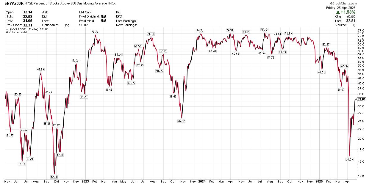
Source: Chart Courtesy of Stockcharts.Com
This chart shows the percentage of NYSE-traded stocks above their respective 200-day moving averages. In other words, it’s a rough measure of what percentage of stocks are trading in uptrends.
As you can see, at the lows in April, only about 16% of stocks on NYSE were above their 200-day MAs, the smallest percentage since the late 2022 bear market lows. Since that time, we’ve rebounded to just under one-third of stocks trading above their 200-day MAs.
Extremes in breadth where fewer that 20% of stocks on NYSE trade above their 200-day moving averages are typically consistent with a short-to-intermediate-term rally. In most bear market rallies, however, you’ll see this metric climb to the 45% to 55% range or higher before the rally runs out of steam.
Take a look:
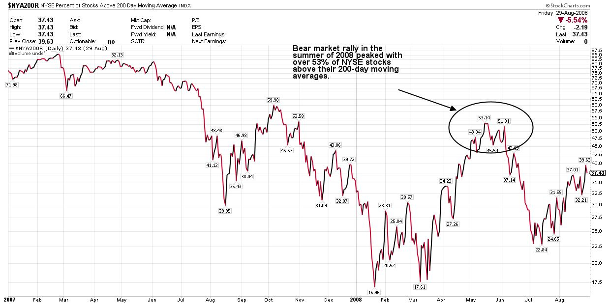
Source: Chart Courtesy of StockCharts.Com
This is the same chart, showing the percentage of NYSE stocks over their 200-day moving averages plotted between the end of 2006 and late August of 2008.
As you can see, in early January 2008, about 17% of NYSE stocks were trading above their 200-day MAs. The market rallied and ultimately that bear market rally peaked in the summer of 2008 with about 53% of NYSE stocks above their 200-day MAs.
Contrast that with the situation through 2024. Last year, the percentage of stocks above the 200-day moving average ranged from around 60% to 75% through most of the year. That’s what a healthy rally looks like.
That’s the same pattern we saw at the 2000 and 2007 market tops. In both cases, the S&P 500 experienced a significant correction and then rallied to retest the prior highs. In 2000, the S&P 500 didn’t quite touch its March 2000 highs in September of the same year and in 2007, the S&P 500 made a marginal new high in October 2007.
In both cases, that rally to retest the prior peak failed, and the bears took over.
I believe there’s a good chance we could see a similar pattern this year, consisting of a broader market rally that stalls out at or near the February highs and then renewed selling pressure later this year.
The first level I’m watching is the 200-day moving average on the S&P 500, which is now around 5,750. In addition, of course, the December and February highs are closer to 6,100 to 6,150.
There are no hard and fast rules for calling the top of a bear market rally. We’ll simply need to watch how the market acts as we approach some of these key technical levels.
I also believe it’s a good time to keep an eye on the fundamental and macro picture, which brings me to this:
Hard Data Still Holding Up
I continue to look for the so-called hard economic data to soften and confirm the weakness we’re seeing in the soft, survey-based data.
So far, we’re just not seeing that:
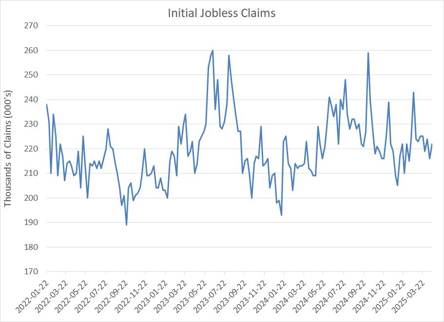
Source: Federal Reserve Bank of St. Louis
This is a chart I’ve posted multiple times over the last few years, showing weekly data on first-time claims for unemployment benefits. This is important because it’s hard economic data, based on actual filings for unemployment benefits, and it’s also released weekly. The high-frequency nature of claims data makes it one of the most sensitive and forward-looking pieces of hard economic data you can monitor.
As you can see, we’re right in the middle of a range that’s prevailed since early 2022 and there’s no obvious sign of a meaningful tick higher in layoffs.
This Friday May 2nd, the Bureau of Labor Statistics (BLS) will release its monthly Employment Report for April and the consensus on Wall Street is looking for payrolls to grow around +130,000, a healthy pace that’s only slightly lower than the average pace of jobs creation so far this year of +152,000 per month. Given the benign trend in initial claims, I’d posit the risks are balanced to the upside, in favor of a stronger-than-expected report.
At a minimum, it appears that economic weakness flagged by soft data series like the Institute for Supply Management (ISM) Purchasing Manager’s Index (PMI) is not yet showing up in the BLS labor market data.
This remains a crucial trend to watch.
Historically, the S&P 500 doesn’t peak and enter a bear market more than 12 months ahead of recession. So, if that February 19th closing high is the peak of this bull market, then we should start to see more evidence in the hard economic data – particularly labor market data watched closely by the Fed – that backs the recessionary message we’re already seeing in the more forward-looking soft data series like ISM.
At this time, I still see the probability of a recession in the next year at roughly 50/50.
Over the next 3 months or so, I’d expect the hard data to weaken significantly, more in line with the soft data or I’d expect the soft data to bounce back to reflect a more sanguine outlook for the economy.
For now, we continue to get mixed messages.
I’d also point out that equity and bond markets are also providing a mixed picture right now, one I expect to clear up over time:
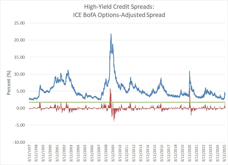
Credit Spreads
One measure of stress in credit markets is the ICE Bank of America options-adjusted high-yield credit spread.
Simply put, this spread measures the yields on high-yield (below investment grade) US corporate bonds relative to Treasuries of equivalent duration:
Source: Federal Reserve Bank of St. Louis
The blue line on this chart shows the spread’s daily close since March 1997.
The red columns below the chart compare the current spread to the 50-day simple moving average – a positive reading indicates a spread below the average of the past 50 days. I’ve also included a horizontal green line at the 1.75% level for comparison to these red bars.
Simply put, credit spreads tend to “spike” ahead of recessions as investors demand a higher yield to buy bonds issued by corporates with shakier credit. That’s because during recessions earnings for most companies will experience a cyclical decline and that can make it tougher for “junk” rated issuers to service their debts, so investors demand a higher yield premium to compensate for those risks.
The question is what exactly constitutes a “spike” in spreads.
To answer that, I compare the latest reading to the 50-day simple moving average – when the spread is far above the 50-day average that suggests a “spike” in spreads.
Based on this history, investors should sit up and take notice when high-yields spreads spike about 1.75% or more above the 50-day simple moving average. Such a spike occurred just ahead of, or during, all three recessions since the late 1990s.
However, take a look at high yield spreads so far in 2025 and you’ll see they don’t look recessionary on either an absolute basis or relative to the recent range.
On an absolute basis, the peak of spreads was 4.61% on April 7th, far below readings around 6% we saw during the height of the recession scare and S&P 500 bear market in late 2022. During the COVID lockdown recession and market panic in the spring of 2020, spreads ballooned to well above 10%.
And compared to the 50-day moving average, the peak was about 1.58% in early April this year, against 6% back in 2020.
Since peaking earlier this month, Credit spreads have receded again to under 3.75%, only about 35 basis points above the 50-day simple moving average.
Bottom line: The high-yield bond market just isn’t confirming a recession signal at this time.
And that brings me to this:
The S&P 500’s Tech Headache
There’s a well-known phenomenon in financial markets called the home country bias, a tendency for investors to focus most of their attention, and most of their portfolios, on their local stock and bond markets as well as domestic economic conditions.
American investors are particularly prone to this bias though, in all fairness, there’s some merit as the S&P 500 has trounced most international markets consistently for much of the past 15 years.
This year things have changed.
As I showed you earlier on in this update, the S&P 500 looks vulnerable here, trading under a now downward-sloping 200-day moving average for the first time since the bear market in 2022.
However, look at Germany’s DAX Index this year:
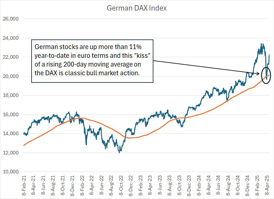
This chart shows the daily close for the DAX compared to the 200-day simple moving average in orange.
Contrast that to the chart of the S&P 500 I posted earlier. Unlike the S&P 500, Germany’s DAX is trading above a rising 200-day moving average.
Even better, the DAX pulled back amid the global market panic in early April, broke below the rising 200-day moving average short-term and then reversed sharply higher – that’s the sort of “kiss” of this key technical level you’d generally expect to see during bull markets.
And the DAX is up 11.72% year-to-date in euro terms while the MSCI Germany Index, priced in US dollars, has soared a whopping 23.6% year-to-date.
Does that sound like a bear market to you?
It certainly doesn’t from my perspective.
Index composition remains a major headwind for the S&P 500 in 2025:
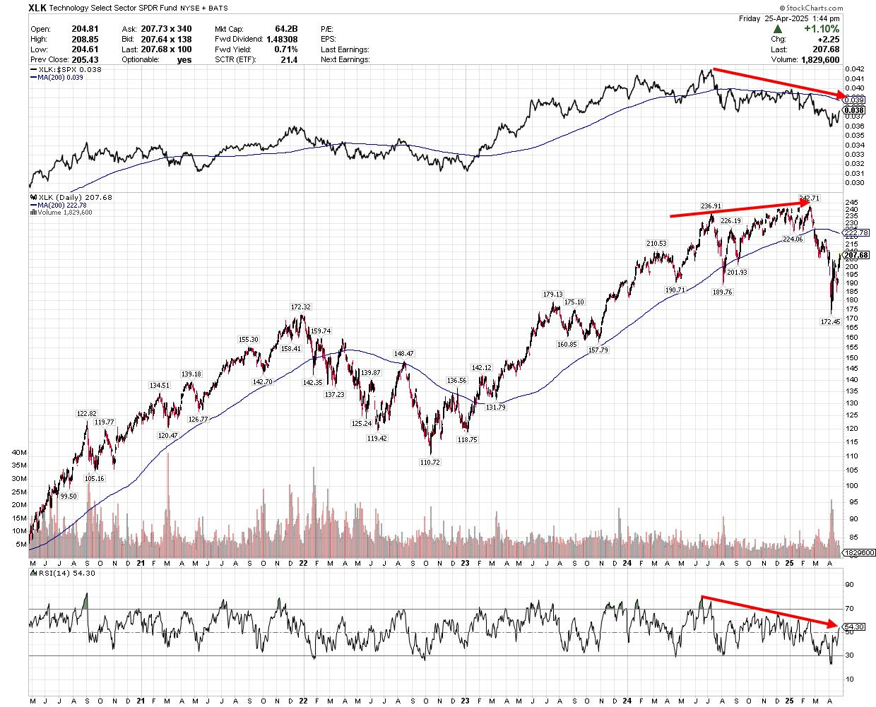
Source: Chart Courtesy of StockCharts.Com
This chart shows the Technology Sector SPDR (NYSE: XLK) over the past five years. The top pane of the chart shows the relative strength of XLK to the S&P 500 while the bottom pane shows the 14-day Relative Strength Index (RSI).
Technology has been the lynchpin of US equity market exceptionalism over the past 10-15 years – XLK has returned +442% since the close on April 27, 2015 compared to around 210% for the S&P 500 over the same period.
However, as you can see on this chart, tech’s relative strength to the S&P 500 peaked in the summer of 2024. And while XLK logged fresh absolute highs early this year, strength relative to the S&P 500 continued to weaken (top pane of my chart). XLK is now trading below a falling 200-day moving average on both a relative and absolute basis.
Strong upside reversals for tech on an absolute and relative basis helped carve out the market lows we saw in 2020 and 2022-23, but this time other sectors of the S&P 500 look a lot healthier than technology right now.
Financials are an obvious example:
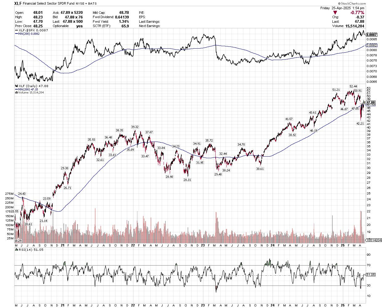
Source: Chart Courtesy of StockCharts.Com
Financial stocks looked to be in recovery mode in early 2023 when the group was pole-axed by the collapse of Silicon Valley Bank. However, a year later in early 2024, XLF broke higher again and the rise in the relative strength line since that time (upper pane of the chart) suggests financials have emerged as a leadership group once again.
Indeed, you could say US financial stocks look a lot more like Germany’s DAX than the S&P 500.
And there’s good reason for that – strength in tech and tech-attached growth shares over the past 10 to 15 years has resulted in a growing market weight for these groups in the S&P 500. Meanwhile financials remain by far the largest industry group in most European markets – financials are almost 24% of the Euro Stoxx 50 Index, and 23.5% of the MSCI United Kingdom Index compared to just 14.7% for the S&P 500, about half the weight of tech in the same index.
It's even worse than that when you consider many US tech companies – names like Tesla (NSDQ: TSLA), Meta (NSDQ: META) and Alphabet (NSDQ: GOOGL) – aren’t even considered “technology” stocks as far as the S&P 500 is concerned. Nor are these growth giants represented in funds like XLK.
For example, look at the SPDR Consumer Discretionary ETF (NYSE: XLY) and you’ll find the two largest holdings are Amazon.Com (NSDQ: AMZN) and Tesla (NSDQ: TSLA), which account for a combined total of almost 37% of the ETF.
That’s far more than names like Home Depot (NYSE: HD, 7.4% of XLK) and TJX Companies (NYSE: TJX, 4.1%), which are likely more commonly regarded as “discretionary” stocks. Contrast that with the Euro Stoxx 50’s weight in consumer discretionary (14.4%) which is dominated by less high-growth, tech-attached names like LVMH Moet Hennessy, L’Oreal and Danone.
You could say that US index and Exchange Traded Fund (ETF) providers have suffered from mission creep in recent years, trying to add a sprinkle of tech growth and excitement to more staid, Old Economy groups like discretionary and communications services.
Over the intermediate term, the direction of the broader US stock market will likely be a function of whether technology and growth names can stabilize. It will be difficult indeed for even strong performance in groups like financials and industrials to offset much weakness in tech given the latter’s growing dominance of major US indices in recent years.
It's also worth noting that some major sectors outside tech, and stealth tech sectors like discretionary, also remain far weaker and more vulnerable than financials:

Source: Chart Courtesy of StockCharts.com
This is a chart of the SPDR Industrials sector since 2020. As you can see, this group is trading under its 200-day moving average, but it’s only down about 2.2% year-to-date and that 200-day moving average is still rising for now.
Further, look at the top pane of my chart and you’ll see industrials are trading near the top of their relative strength range over the past two years.
From a longer-term perspective, this is all consistent with a major shift in the “Great Cycle” I’ve written about on several occasions this year including, most directly, in the March 28th issue “The Turn of the Great Cycle.”
From a practical perspective, that means we’re likely in for a prolonged period – into the coming decade – of more subdued returns from US stocks than investors have grown accustomed to in the past 15 years. It could even be a “Lost Decade” for US stocks such as we saw from the late 1990s until 2012 or before than from 1968-82.
The shift in the Great Cycle also suggests strong returns for commodities, a weak US dollar and major shifts in equity market leadership. For example, back in the late 1960s we saw a major shift away from the US “Nifty 50” growth stocks that dominated returns for US equities starting in the late 1950s. And, in 2000-02 we saw a big shift away from large-cap US tech, that had dominated US and global equity market returns through most of the 1990s boom.
This year I’ve written about several markets that benefit from the turn of the Great Cycle including energy, particularly natural gas right now, global equities and precious metals like gold and silver.
Here’s one more overlooked and underappreciated group to watch:
Agricultural Commodities Bottoming Out
As I’ve explained, the last turn of the Great Cycle started in the late 1990s and persisted into the early 2010s.
Look at corn futures prices through this period:
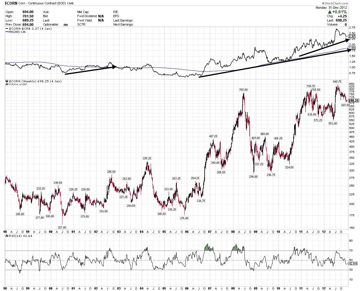
Source: Chart Courtesy of StockCharts.Com
This is a weekly chart of corn futures prices from the late 1990s through the end of 2012. The top pane shows corn’s price performance relative to the CRB Index, an index that tracks all sorts of commodities including energy and precious metals.
As you can see, corn prices were weak into 2000, reaching a low of 157 cents per bushel in the summer of 2000. However, the corn market reawakened in the 2000s and I see two periods of extreme outperformance relative to other commodities from late 2000 to late 2003/early 2004 and an even bigger period of explosive gains from late 2005 through 2012.
Here's a chart of soybean prices over the same time frame:
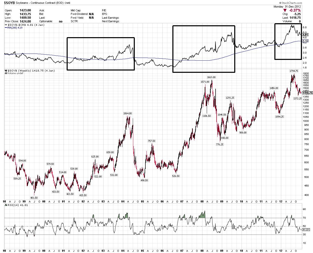
Source: Chart Courtesy of StockCharts.com
The timing of these trends doesn’t line up perfectly; however, you can see that soybeans enjoyed three powerful waves of rallies in this period. The first persisted from late 2001 through early 2004, again from late 2006 through early 2008 and, finally, from late 2008 through early 2012.
This isn’t the only example in history of course.
Look at this data on the annualized returns from wheat by decade since the mid-19th century:
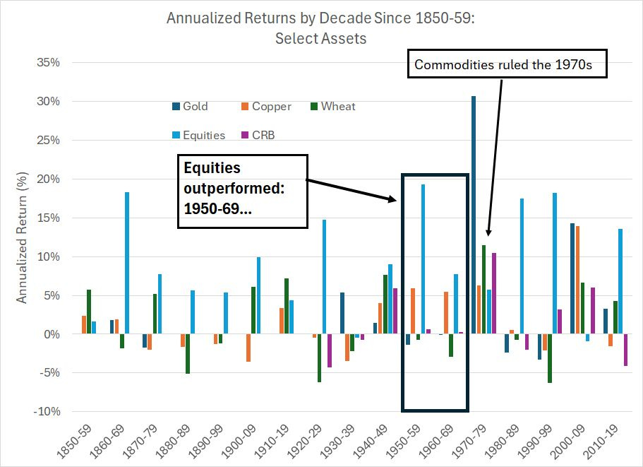
Source: Deutsche Bank, Long-Term Asset Returns by Decade, 2020
This chart shows nominal annualized returns – NOT adjusted for inflation – for 5 different assets by decade since 1850-59. All returns are in US dollar terms.
Equities are represented by the light blue bars on my chart. Take a look at the period from 1950-69 that I’ve boxed in a black rectangle – over this two-decade period US equities outperformed, and commodities offered little or no nominal upside.
Indeed, wheat prices (green bars) actually fell in nominal terms through this period while the CRB index as a whole offered only a slight positive return in each decade. Once adjusted for inflation, both wheat, and the broader commodity complex, actually offered negative real returns in both the 1950’s and 60’s.
However, look what happened in the 1970s. Equities offered a 5.77% annualized return from 1970-79 which disappears once we adjust for the sky-high inflation of that era – US stocks produced a -1.51% annualized real return through the 1970s.
Commodities were the only source of wealth creation in the 1970s. On a nominal basis the broader CRB Index rose about 10.5% annualized while wheat returned 11.43%, gold prices were up 30.70% annualized and oil (not pictured in my chart) jumped 28.04% annualized.
Then, once again, equities took over from a return perspective in the 1980s and 1990s before commodities jumped again in the 2000-09 era.
Go back even further and look at how these cycles have played out over time.
In the 1850s, equities produced annualized gains of just 1.62% on a nominal basis and 0.07% in real terms; meanwhile, wheat returned 5.70%. Equities boomed in the 1920s while wheat, copper and the CRB index fell.
Of course, financial markets are inherently noisy. Cycles in various financial assets don’t perfectly line up with calendar decades and different commodities have under or outperformed in various cycles. However, there is a pattern here of multi-year periods where US stocks beat all other assets, followed by multi-year periods where stocks lag and commodities shine.
That’s what I call the Great Cycle, and the more recent iterations favoring commodities have been the period from 1968-1982, 1998 to 2012 and, I believe, the period starting in 2020-2022.
Agricultural commodities like wheat, corn and soybeans are absolutely part of that conversation.
Indeed, some of the strongest gains I’ve seen in the stock market over the past 25 years have been in stocks leveraged to agricultural markets. Here’s an example:
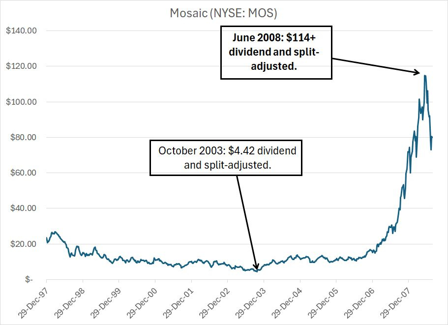
This is a chart of a company called Mosaic (NYSE: MOS), which produces fertilizers including phosphate and potash. It’s not an obscure company and is a particularly dominant producer of phosphate in North America.
I recommended it for years in the early 2000s and even wrote about Mosaic in The Silk Road to Riches, a book I co-authored that was published back in April 2006.
Just look at how the stock performed over the big bull market in agricultural commodities in the mid-2000s – Mosaic shares soared more than 25-fold over a period of roughly 5 years from late 2003 through mid-2008.
My point: Bull market cycles in agricultural commodities can be very profitable for equity market investors, producing gains every bit as impressive as what we saw from groups like energy and precious metals in a similar era.
Generally, the time to accumulate these names is when the cycle for agricultural commodities is still depressed yet showing signs of turning higher again. And that’s exactly where we are right now in my view. That’s also why I’m adding a small starter position in an agricultural stock to the model portfolio in this issue.
More broadly, my strategy for handling the market, and model portfolio, this year is to stay flexible.
I believe the risk of recession is rising, and US stocks face headwinds from a hefty weighting in expensive technology and growth stocks facing slowing growth. However, I’m seeing plenty of strength in groups like the financials as well as key foreign equity markets like Europe; it’s unusual for global indices like the German DAX or pro-cyclical sector indices like the S&P 500 Financials, to be at or near highs when a bear market is imminent.
The experiences of 1998-2001, 2005-2008 and even 2018-2020 prove that the process of finding a market top can take time. And even in recessionary bear markets, not all sectors and stocks peak at the same time. In the 2000-02 cycle, for example, the S&P 500 peaked in March 2000; however financial, energy and industrial stocks didn’t peak until early 2001, almost a year later.
And, as I’ve outlined in the last few issues, various commodity markets have seen their strongest historical gains during periods when US stocks are marching in place or even falling in nominal terms.
So, while I will continue recommend selling out of some recommendations in the model portfolio into what I believe to be a bear market rally underway right now, I’ll also be looking for opportunities in select groups that are emerging as market leaders right now. That includes the two new recommendations I’m introducing in this issue.
It's also important to book gains from time to time even in favored sectors. That’s why I’m recommending readers book partial gains in two of our top-performing model portfolio recommendations over the past 18 months, up more than 70% in that holding period.
Similarly, I’ll repeat the warning I’ve made about the Great Cycle investment themes. The good news is that these multi-year cycles produce some of the most spectacular gains and can create wealth through bear market or “lost decade” cycles for the S&P 500 when most investors are losing money or treading water.
The bad news is that not all commodities move on the same time timetable and there can be some nasty corrections and pullbacks amid even the most powerful bull markets. So, we’ll need to stay nimble with these markets as well, booking gains in groups that get extended and adding to positions that are showing signs of turning higher. It’s far from exact science.
With those points in mind, here’s what I’m recommending this week:
Keep reading with a 7-day free trial
Subscribe to The Free Market Speculator to keep reading this post and get 7 days of free access to the full post archives.