
Beyond the Railroads: Modernizing the Market’s Oldest Indicator
How "New School" Dow Theory identifies the next leg of the AI rally...

Charles Dow invented the concept around the turn of the 20th century.
Now known as Dow Theory, the original idea was simple and intuitive:
The Dow Jones Railroad Average and the Dow Jones Industrial Average must confirm one another. In other words, if both averages are strong, breaking out to fresh highs together, that suggests strength in stocks is for real.
In contrast, if the industrials are breaking higher and the railroads are lagging, or vice versa, the rally is suspect and on shaky ground.
In Dow’s day, the Dow Jones Industrial Average consisted primarily of manufacturing companies and commodity producers while railroads dominated transportation.
So, it’s logical to suppose that if the industrial sector of the economy is in growth mode and the stocks are strong as a result, demand for railroad transportation would also be on the rise to move all those products and commodities to market.
Therefore, we’d expect the railroads to be enjoying strong fundamental tailwinds and for the stocks to be moving higher as well.
Of course, the US economy has changed dramatically in the past 126 years. The economy, and key US stock market indices like the S&P 500, are now dominated by technology and tech-attached stocks in other industries like Meta Platforms (META). Services industries have grown steadily in importance since the 1970s while manufacturing industries have declined.
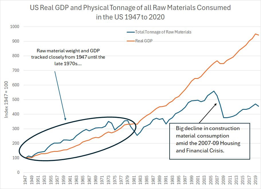
Former Fed Chairman Alan Greenspan used to talk about the physical weight of US GDP in decline as far back as the late 1990s and early 2000s, observing that the total tonnage of materials—grain, cotton, iron ore, steel—required to produce one dollar of inflation-adjusted GDP had plummeted over the years.
Here’s one way to look at that trend:
Source: Federal Reserve Bank of St. Louis, US Geological Survey (USGS)
This chart shows data from USGS on the total tonnage of raw materials consumed in the US economy each year including everything from agricultural products to construction and energy products as a blue line. The orange line is US real (inflation-adjusted GDP) over the period from 1947 to 2020.
I’ve indexed both GDP and raw material consumption to a level of 100 in 1947 so that you can see the trends over time.
What’s interesting is that these two lines tracked closely from 1947 up to the late 1970s; however, in the 1980s and 1990s, US real GDP went parabolic driven, to a significant extent, by services industries and technology rather than “heavy” resource intensive economies that drove the economy in earlier decades.
Then, in 2006-09 the housing bust catalyzed a major decline in consumption of construction materials, a major component of the USGS data while real GDP continued to rise.
Meanwhile, railroads are just one of many key modes of transportation these days – trucking, air transport and marine transportation all play a role while a lot of products are digital these days and no longer require physical transport.
So, does Dow Theory have any relevance in the modern world?
Let’s Test It
I still follow the Dow Jones Industrial Average, and I probably look at a chart of the Dow or the ETF Equivalent “Diamonds” (NYSE: DIA) virtually every trading day.
(I do realize that probably makes me sound old.)
However, when most investors these days think about the stock market, it’s the S&P 500 that jumps to mind. So, let’s use the S&P 500 for our test.
And, while railroads are an interesting sector that far too many investors ignore, let’s use the Dow Jones Transportation Index, which adds marine shipping, airlines, and stocks like FedEx (NYSE: FDX) to the mix. In my view that’s still a very relevant economic metric because if the economy is strong, you’re likely to see more people flying on airlines and shipping packages via FedEx.
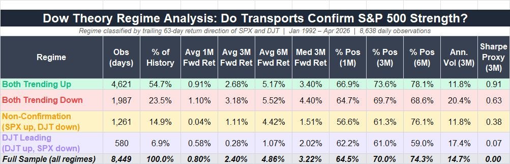
Turns out Mr. Dow was onto something:
Source: Yahoo Finance, Retrieved Using Python Script
I took a look at data on the Dow Jones Transportation average and the S&P 500 since January 2, 1992 (34+ years). I looked at trailing 63-trading day performance for both indices over this period (that’s about one calendar quarter) and divided the 8,449 rolling, overlapping observations into four “buckets.”
Those four buckets are: Both indices trending higher, both trending lower, S&P rising while the DJT is falling, and DJT rising while S&P is falling.
I then computed the average 1-, 3- and 6-month forward returns for the S&P 500 in each market regime and a few points jump out:
When both indices are trending higher (bullish confirmation). Subsequent stock market returns are above average in all three holding periods with below average volatility and a higher-than-sample win rate (the full sample averages are in that bottom row).
When the S&P 500 is higher, but the DJT index is lower (non-confirmation. The average forward returns across all three holding periods are positive, but below the full sample average and the win rates are also below average.
When the DJT is higher, but the S&P 500 is down (non-confirmation). The average forward returns are the worst across all the regimes, well below the full sample average, while volatility is high.
When both indices are down (bearish confirmation). Ironically this produces the best forward results of all, probably because it “catches” the big bear market lows through the sample period. Volatility is, however, sky high.
It’s fascinating that some 126 years after Charles Dow outlined this “theory,” there’s still some useful information here – at a minimum, when the S&P 500 is rising while the DJT is falling, that’s a “yellow” flag and if the DJT is rising while the S&P 500 is falling that’s an even stronger signal of trouble, and elevated volatility, ahead.
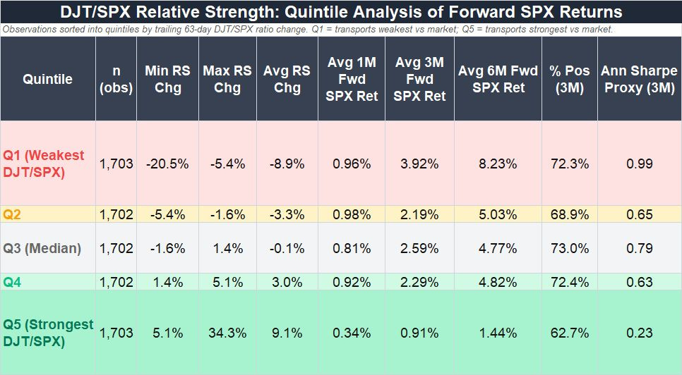
Let’s look at the data in a different way:
Source: Yahoo Finance Retrieved Using Python Script
Long-time readers know I like to watch relative strength charts and, in this case, let’s look at the relative strength of DJT to the S&P 500. When this line is rising, the transports are outperforming the S&P 500 and vice versa.
Again, I looked at changes in the DJT/SPX ratio over 63-trading-day (one quarter) periods since 1992 and divided the observations into 5 quintiles where Q1 is the weakest DJT/SPX relative performance and Q5 is the best.
What’s ironic here is that the worst Quintile from a forward return perspective is Q5 – when transports handily outperform the S&P 500 – while the very best quintile is Q1 where the transports badly lag the S&P 500.
Looking at the data, this appears to be a result of the fact that since around 2014, or so DJT has been underperforming the S&P 500 consistently. That’s roughly the time when big US technology stocks started trouncing just about every other asset class not just in the US but globally. I’d posit this reflects the longer-term changes in the economy I outlined earlier since Dow’s day – while transports provide useful information about the health of the economy today as they did back then, they don’t have much information content when it comes to the digital economy.
I’d note the period since 2014 featuring tech and US equity dominance is unusual in the longer span of market history. I call it the “Great Cycle, and, historically, periods of US equity dominance give way to periods where global markets and “heavy” commodity sectors outperform. And, if we do see more leadership from Old Economy and more cyclical industries in future as I expect, the Old School Dow Theory may well garner additional predictive power.
Just look at my chart of US real GDP and the aggregate weight of US raw material consumption from 1947 to 2020. In my view, we’re likely to see a period of catch-up for raw materials use as we did in the 70’s and the period from 2000-05.
Indeed, one of the key themes I’m watching is the growing importance of decidedly “Old School” sectors – energy, basic materials (i.e. copper and rare earths), transports (oil and refined product tankers) and financials -- in enabling the hottest New Economy trends like artificial intelligence (AI).
And that brings me to this:
The New School Dow Theory
This idea isn’t new at all, nor is it original.
To be honest, I can’t remember where I first saw it, but the basic idea is that the key sector for the technology-dominated “New Economy” is semiconductors rather than transports.
Indeed, you could argue convincingly that, since semis are now in products as diverse as AI data centers, autos, manufacturing robots and washing machines, the health of this sector tells us a great deal about the health of the broader US economy.
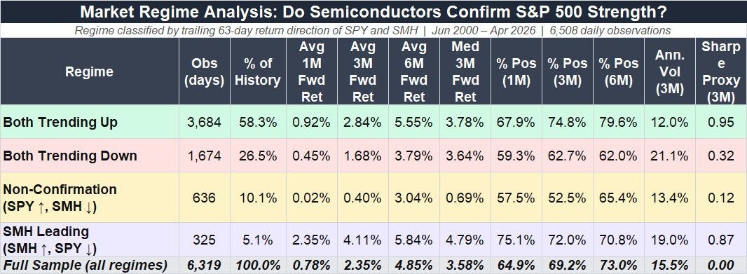
So, let’s swap the semiconductor stocks in for the transports and see if confirmation signals there have any predictive power. I performed a similar battery of statistical tests on the VanEck Semiconductor ETF (SMH) and the SPDR S&P 500 ETF (SPY) over the past (roughly) 26 years.
Let’s start with this:
Source: Yahoo Finance Retrieved Using Python Script
The results are interesting.
The best regime is when both S&P 500 and the Semis are trending higher over a trailing 63-day period (Bullish Confirmation). Returns are above the full-cycle average out to 6 months, and volatility is below the full sample average.
When both are trending down (bearish confirmation) returns are weak out to 6 months relative to the full-sample average and volatility is sky-high over 20%.
However, the worst regime is one where the S&P 500 is rallying but SMH is weak. In this regime, the S&P 500 only produces an average forward return of 0.40% and a median 3-month return of 0.69% relative to the full-sample average and median of 2.35% and 3.58% respectively.
In contrast, when Semis are up but the S&P 500 is down, returns are the best of any regime, albeit at the cost of elevated volatility. In this regime the 3-month forward average and median returns are 4.11% and 4.79%, besting the full sample averages by 1.76% and 1.22% respectively.
In effect, it appears that SMH can act as a leading indicator for the broader market – when semis start rallying while the rest of the market is falling, this case indicate a potential bottom in the making.
And that brings us to the quintiles for this “New School Dow Theory” test:
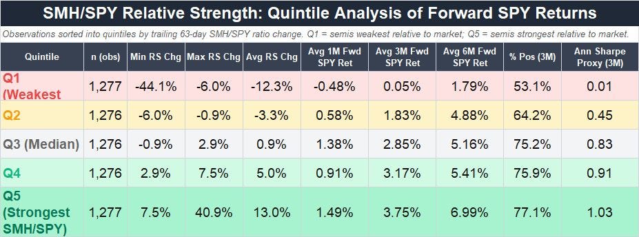
Source: Yahoo Finance Retrieved Using Python Script
Just as we looked at the DJT/S&P 500 relative strength line earlier, let’s look at the relative strength of semiconductors to the S&P 500 and dividing all observations into quintiles.
Here we can really see the value of watching the semiconductors.
When semis are their strongest relative to the S&P 500, forward returns are the highest. At forward six months in Quintile 5, the average return for the S&P 500 is 6.99% compared to a full sample average of 4.85% with a hit rate approaching 80%.
In contrast when semis are lagging look out. In this regime, market returns at 3 and 6-months average just 0.05% and 1.79% respectively and at 3-months it’s little better than a coin flip that the S&P 500 will manage a positive return.
As always, a word of caution is in order. Much like the 200-day simple moving average data we dove into last month and the economic and credit market indicators I covered in prior updates in 2025 and 2026, neither the Old School or New School Dow theories should be used in isolation – it’s just another indicator I follow and another tool in the toolbox.
And, right now, both indicators are largely pointing to higher stock prices. Both the Dow Jones Transports and the S&P 500 are higher on a trailing 63-trading day basis as are the SMH and SPY. Given the dramatic surge in the semis we’ve seen of late we’re also in Quintile 5 in terms of SMH/SPY relative strength, the strongest quintile on a going forward basis.
Here’s a chart:
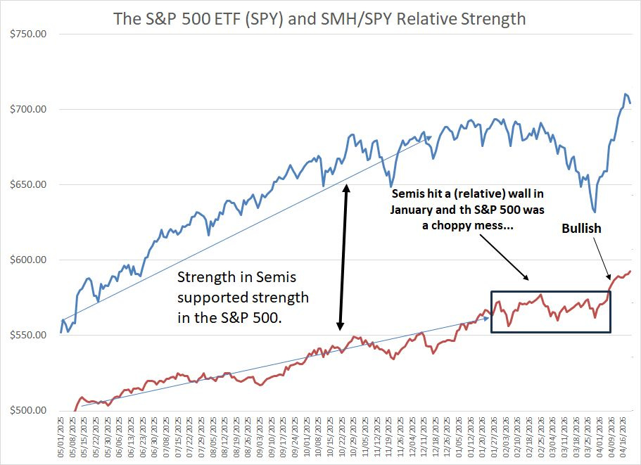
Source: Yahoo Finance, Retrieved Using Python Script
The blue line here is the SPDR S&P 500 ETF (SPY) from May 1, 2025 (last year) through late April while the red line shows the relative strength of SMH to SPY.
Below the paywall for paid subscribers, I'm revealing a new portfolio addition—a 30-year-old tech veteran perfectly positioned for the AI data explosion—plus updated buy targets for our networking and regional banking plays.
I’ll also be back later this week with an Energy Bulletin update, including a look at one of the most exciting growth areas in the energy business right now that could actually benefit from de-escalation of the conflict in Iran
To start your 30-day free trial, tap the button below:
As you can see, strength in semis relative to the S&P 500 from May into late 2025 supported a generally strong rally in the S&P 500. But, when semiconductor relative strength hit a proverbial wall early this year, the S&P 500 peaked and entered a choppy period.
However, in April, SMH soared and the SMH/SPY relative strength ratio has surged to new highs. The S&P 500 has broken out as well and on a forward basis SMH leadership looks bullish.
So, let’s take a quick look at recent news out of stocks in the model portfolio as well as the changes I’m recommending this week:
Keep reading with a 7-day free trial
Subscribe to The Free Market Speculator to keep reading this post and get 7 days of free access to the full post archives.