

Cheap, Unloved and Breaking Higher
Cheap, Unloved and Breaking Higher
An idiosyncratic sector with rotation upside

Editor’s Note: This week’s post is on the long side, a deep-dive look at the US regional banking industry, and why I believe it’s poised to benefit from sector rotation and the interest rate cycle as we move through 2024.
I’ve decided to make most of this issue, including the industry analysis and macro outlook, available to all readers of FMS. If you enjoy this longer format, please be sure to drop me a comment or “like” this post by clicking the heart-shaped icon (I am told these “likes” actually help readership a good deal). Specific recommendations for the model portfolio are reserved for those subscribed to the paid tier of FMS.
If you’re interested in giving the paid tier a test-drive, I’ve also decided to open 30-day free trials through the first quarter of 2024, via this link:
Thanks for reading!
—EG
Last year the S&P 500 soared 26.3% including dividends paid, a sharp reversal of its 18.1% loss in 2022.
And, just yesterday, the S&P 500 closed at 4,783.45, within 0.3% of its all-time closing peak set over two years ago on January 3, 2022.
However, more shocking than the scale of the rally last year is just how lopsided it was:
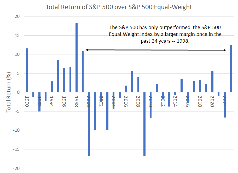
Source: Bloomberg
This chart shows the annual total return for the S&P 500 less the annual return for the S&P 500 Equal Weight Index. The S&P 500 Equal Weight represents the same stocks as the S&P 500 with each component weighted the same rather than by market capitalization.
The S&P 500 outperformed by more than 12.4% percentage points last year. As you can see, in the 34 years since 1990, the S&P 500 has only outperformed its equal-weight counterpart by a larger margin once, back in 1998 in the final stages of the late 1990’s tech and telecom bubble.
That’s because in the late 1990s, as was the case last year, much of the upside for the broader market was driven by a small list of large-cap components with hefty weights in the cap-weighted index.
The result is that even with the stock market within a hair’s breadth of all-time highs, and some (mainly) US stocks trading at nosebleed valuations, it’s not tough to find cheap stocks, industry groups and markets in the current environment:
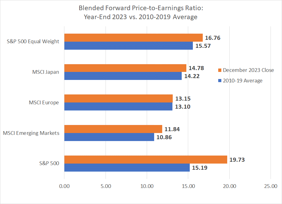
Source: Bloomberg
This chart shows the forward price-to-earnings ratio for a handful of indices around the world using blended forward 12 months earnings estimates. I’ve included both the P/E as of the end of 2023 (orange bar) and the average P/E on this basis for the decade from 2010 through 2019.
As you can see, the traditional cap-weighted S&P 500 is a standout, trading at 19.7 times forward earnings estimates, more than 4.5 turns above the 2010-19 average. In contrast, the equal-weighted S&P 500 sells for less than 1.2 turns above the 2010-19 average while the MSCI Emerging Markets Index sells at less than a 1 turn premium. And, finally, Japan and the EU trade in-line with their longer-term averages.
And look at valuations for ten key S&P 500 economic sector indices on the same basis:
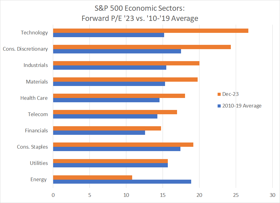
Source: Bloomberg
It’s not difficult to see that some sectors – notably technology and consumer discretionary – are trading at stretched valuations relative to their 2010-19 averages while others, including energy, screen cheap on this basis.
However, at this point it’s crucial to issue a warning:
Cheap Doesn’t Mean Buy
Just because a stock or market is cheap, either in absolute terms or relative to its historic average valuations, does not mean you should buy it.
Just as important, expensive stocks aren’t automatic sells. Often, stocks and industry groups are cheap, or expensive, for a good fundamental reason.
The late 1990s also offers a cautionary tale. As I mentioned, the S&P 500 beat its equal-weight counterpart by a record 18.2 percentage points in 1998; in fact, ’98 was the 5th consecutive year of cap-weighted outperformance.
Anyone tempted to sell the “expensive” 1998 large-cap market leaders in favor of less expensive value or small-cap stocks was quickly humbled – in 1999, the cap-weighted S&P 500 soared 20.9% besting the S&P 500 Equal Weight by almost 11 percentage points. And the S&P 500 Information Technology Index, which returned an unprecedented 78% in 1998, managed an even more impressive 78.7% gain in 1999.
However, if you can find a cheap and unloved market sector that’s showing signs of improving relative strength and has some identifiable fundamental upside catalysts, you have the recipe for some impressive intermediate to long-term market-beating returns.
Bottom line: I believe we’re in the early stages of what could be a powerful, multi-year rotation in stock market leadership right now.
I’m NOT saying all technology and growth stocks will see dramatic losses over the next 6 to 12 months or that all laggard sectors will suddenly become momentum favorites.
However, a few key facts are tough to ignore starting with this:
Normal for Longer
Global central banks unleashed a wave of liquidity and monetary stimulus amid the financial crisis of 2007-09 and then doubled down on that strategy in 2020 amid the COVID lockdown recession.
This tidal wave of easy money and stimulus was like nothing we’ve seen in history.
As you might expect, a prolonged period of near-zero short-term interest rates and depressed longer-term bond yields benefited certain market sectors and harmed others.
The US technology sector, and the S&P 500 generally, were among the biggest winners:
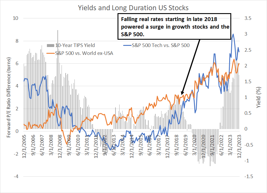
Source: Bloomberg
This chart is complex, so please bear with me.
The grey columns represent the closing monthly yields on the 10-Year US Treasury Inflation-Protected Securities (TIPS). It’s essentially a proxy for real (inflation-adjusted) 10-year Treasury yields, and these columns are plotted using the right-hand scale on my chart.
The blue line represents the forward price-to-earnings (P/E) ratio for the S&P 500 Information Technology Index relative to the S&P 500 while the orange line represents the P/E ratio of the S&P 500 less the MSCI World excluding-USA Index. Both lines are plotted on the left-hand scale; a rising line indicates rising relative valuation for the Tech sector vs. the S&P 500, and for the S&P 500 relative to the rest of the world, respectively.
Let’s start with the pattern in real interest rates since 2005.
The average 10-year TIPS yield from December 2005 through the end of 2008 was about 2.1%, falling to just 0.65% on average from January 2009 through December 2012 as the Fed, alongside other global central banks, responded to the financial crisis and Great Recession of 2007-09 with a wave of stimulus and easy money.
Yields on this basis first turned negative in November 2011. While the 10-year TIPS yield climbed back into positive territory in the middle of 2013, the yield on averaged just 0.46% from the middle of 2013 through to the end of 2018, far below the 2005-08 pre-crisis average level I just outlined.
Finally, real yields reached a cycle peak in October 2018 near 1.1% before plunging back below zero in January 2020, just ahead of COVID-related lockdowns. Of course, massive Fed interest rate cuts in 2020, the re-start of quantitative easing and a resurgence in inflation in 2021 all conspired to push 10-Year TIPS yields to record lows near -1.20% in the summer of 2021.
Basic financial theory suggests low real rates should benefit growth stocks the most. That’s because all stocks are valued based on the present value of their future earnings streams and growth stocks, by definition, rely on more distant earnings streams, and expected future growth prospects, to support their current valuations.
To calculate the present value of future earnings and cash flows we use a discount rate; rising real interest rates will tend to increase the discount rate and vice versa. And the higher the discount rate, the less distant future cash flows are worth in present value terms.
My chart above is broadly consistent with this theory. After all, the initial plunge in real interest rates from 2009 through 2012 helped put a floor under valuations for both the S&P 500 Technology sector versus the S&P 500 and for the S&P 500 compared to the rest of the world.
Then the second flood of global liquidity and plunging real interest rates starting in 2018 turbo-charged US valuations, sending the S&P 500 Information Technology Index to as much as a 7 turn premium to the S&P 500 in late 2021.
Similarly, the S&P 500 has a far higher weight in technology and growth sectors than most other markets around the world. So, the global waves of liquidity since the 2007-09 crisis years have tended to support US market valuations above other major markets around the world. The valuation premium for the S&P 500 has reached more than 6 turns on a few occasions since 2021.
A second, related point is that while low interest rates will tend to benefit long duration sectors like technology, they also tend to act as a headwind for some groups, including financial stocks. I’ll have (much) more to say about financials and rates in just a moment; for now, suffice it to say that financial stocks have a much higher index weight in key foreign markets than in the US S&P 500. So, that’s acted as a headwind for most global market indices relative to the US.
Of course, it’s crucial to point out there’s far more to relative stock market valuations than real interest rates; in financial markets, there are typically multiple, sometimes interrelated drivers of major trends.
Also, the timing of these shifts in real rates and valuations doesn’t always line up perfectly – lead and lag times in markets, and the economy, are notoriously unstable.
For example, it took some time for plunging real interest rates after 2009 to drive up valuations for US tech stocks and the S&P 500 on the basis I’ve outlined. And, while valuations for the S&P 500 and S&P 500 IT index initially plunged in 2022 as real rates rose, both groups performed well in 2023 despite additional upside in 10-Year TIPs yields to the highest levels since before the 2007-09 financial crisis.
However, as I noted in my December 28, 2023 update “Equities in Dallas,” I believe the end of the more than decade-long era of easy money and financial repression that followed the 2007-09 financial crisis is the most important shift in global financial markets we’ll see in the current decade.
While some have called for “higher for longer” interest rates, the truth is that the current interest rate environment isn’t at all unusual. After all, in the 1990s, the Fed Funds rate averaged over 5% and the 10-Year Treasury Yield averaged 6.65% compared to 5.35% and 4.02% respectively right now.
It’s the 2009-2021 era that’s the aberration – what we’re seeing right now could be more accurately characterized as a normal-for-longer interest rate environment.
Regardless, it’s logical to suppose that some of the equity market trends supported by the financial repression era of 2009-2021 could be reversed as rates return to more normal (at least positive) levels both here in the US as well as in most major markets around the world.
From Theory to Practice
Of course, it’s all well and good to discuss longer term trends in real rates and how that impacts equity markets, and market valuations, over time.
However, such fundamental and valuation rationales are terrible indicators in terms of market timing. After all, the stock market, and technology stocks, were outrageously expensive at the end of 1998 and market breadth was terrible; however, as I outlined earlier, that didn’t stop the Nasdaq from rallying over 100% again in 1999.
Similarly, real interest rates spiked in 2023; yet that didn’t forestall market leadership from the Nasdaq 100 and the Magnificent 7, the very long duration growth stocks that are “supposed” to underperform dramatically when rates rise.
Just over the past two to three months, however, we have seen the first tangible signs of a rotation in equity market leadership of the sort you’d expect to see amid the shift in real interest rates.
I’ve written about this theme before in this service including in my December 21, 2023 piece “Rotation’s Turn,” so I won’t belabor the point in this issue.
Instead, in this week’s issue I want to take a closer look at one key stock market sector that I believe will be a significant beneficiary of this rotation, namely financials and, specifically, regional banks.
First up, as I alluded to earlier, depressed interest rates – especially when both long-term, and short-term rates are low -- represent a major headwind for the profitability of the banking business:
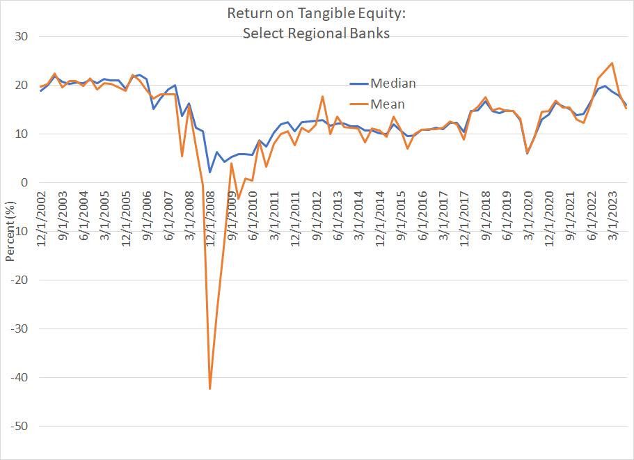
Source: Bloomberg
Return on tangible common equity (ROTE) is a key profitability metric for banks. Simply put, tangible common equity is a measure of the book value of a bank excluding intangible assets like goodwill as well as any preferred stock. ROTE would be the net income generated by a bank divided by tangible common equity.
I examined 20 of the largest regional banks in the KBW US Regional Banking Index ranked by total assets, limiting my analysis to banks that have been operating as public companies since at least 2002.
This chart shows the average (mean) and median ROTE for this list of banks since that time.
As you can see, the average quarterly mean ROTE for these 20 banks was 20.4% from Q4 2002 to Q4 2007, just ahead of the financial crisis years.
Of course, as you might expect, profitability collapsed amid the recession of 2007-09 and the worst global credit crunch since the 1930s and then recovered alongside the economy, and easing credit conditions, in 2010-11.
However, banking profitability never recovered to its pre-crisis levels – on average from Q4 2011 to Q4 2021, the quarterly mean ROTE for the same 20 banks I examined was just 11.4%, about 9 percentage points lower than the 2002-07 period.
There are several reasons that happened. One is that US banks needed to undertake significant balance sheet repair following the financial crisis years. Increased regulation, particularly for larger banks, also pinched profitability.
However, arguably the single biggest driver of weak profitability in the 2011-2021 era, particularly for the regionals, was consistently depressed interest rates that crimped rates banks can charge on loans. Net interest income – the difference between interest paid on deposits and interest earned on loans – was under pressure with rates pegged near zero for much of the 2011-2021 period.
The good news is that’s changed since 2021. As you can see in my chart above, the ROTE for the 20 banks I examined has rebounded to an average of about 18.1% since Q4 2021, more in-line with pre-2008 levels and significantly higher than the 2011-2021 norm. That’s a direct result of the return to a normal-for-longer interest rate environment I just outlined.
At the same time, banks continue to trade at a historically sizable valuation discount to the S&P 500:
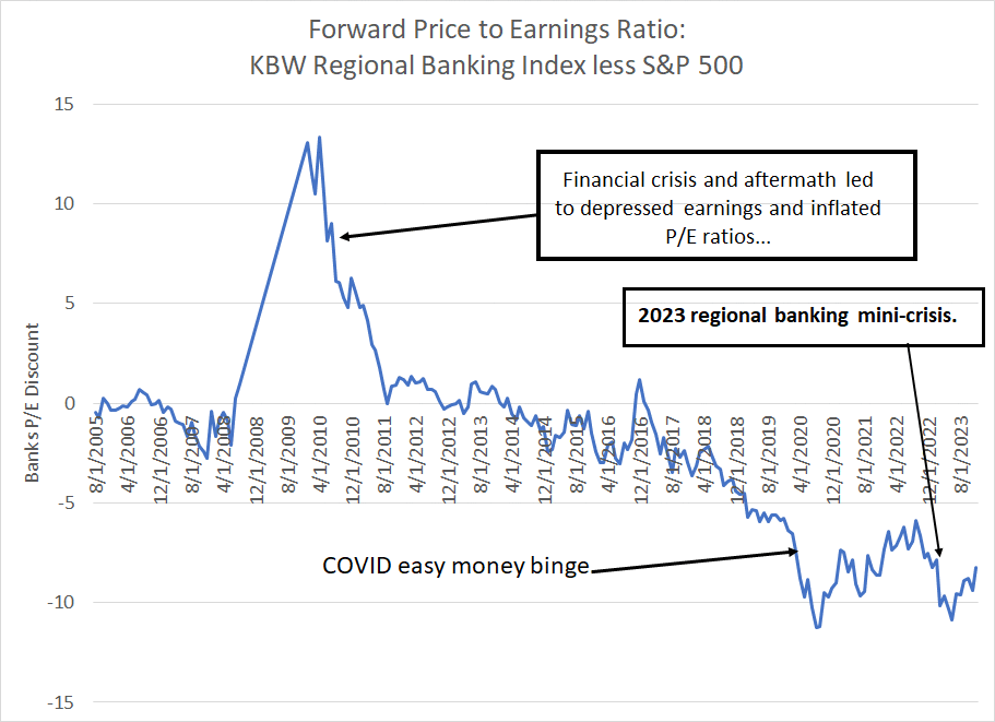
Source: Bloomberg
This chart shows the forward P/E ratio for the KBW Regional Banking Index less the S&P 500 since August 2005. I have excluded much of the data for the second half of 2008 and most of 2009 as depressed bank earnings in that period inflated P/E ratios (depressed the denominator of the ratio).
As you can see, this index tended to trade at a P/E in-line with the S&P 500 (a slight discount on average) up until the financial crisis of 2007-09.
Then, amid the depressed interest rate environment after 2011, and the consequent decline in profitability I just outlined, bank valuations generally cheapened against the S&P 500. The pace of downward rerating accelerated in 2017-18, as real interest rates plunged.
There have been two downside spikes in the past four years. The first came in early 2020 amid the COVID easy money binge and the second was last spring following the collapse of SVB Financial and Signature Bank. In both instances, the KBW Regional Banking Index traded to a greater than 10 turn discount to the broader market, an historically depressed relative valuation to the S&P 500.
Much the same pattern is evident in this longer-term chart of bank valuations:

Source: Bloomberg
This chart examines a second popular valuation metric for banks – price-to-tangible-book value. I’m using the Nasdaq Banking Index – a proxy for a long list of small and mid-sized US banks – to create this chart because we have a longer data history for that index compared to the KBW Banking Index.
As you can see, in the pre-crisis years this index traded at an average of around 2.6 times tangible book value compared to 1.5 times in the years since 2007. Today, the Nasdaq Banking Index trades roughly in-line with the post 2007 average level despite the tremendous improvement in profitability since 2021 amid the normalization of interest rates.
The bullish thesis here is simple.
First, if we’ve returned to a more normal interest rate environment (the end of crisis era financial repression) then I’d expect bank profitability to improve more in-line with the historic norm prior to 2007-09. There are clear signs that’s already happened – bank profitability has improved markedly as I showed you earlier over the past few years compared to the 2011 to 2021 average level.
Second, if bank profitability is improving on a sustained basis as I expect, these stocks shouldn’t trade at such a steep discount to the S&P 500 or to long-term historic norms for the group.
The implied upside is significant.
If the Nasdaq Banking Index were to return to a valuation of about 2.15 times tangible book value, the low end of its 2002-07 range and the peak valuation amid the 2015-2018 Fed hiking cycle, there’s almost 40% of upside for the Index from the current level.
And should the KBW Banking Index trade back to a 5-turn forward P/E discount to the S&P 500 as it did in late 2018 and early 2019, that would imply some 30%+ of valuation upside for that index.
Of course, there are some additional shorter-term risks and upside catalysts for the group to consider.
Let’s start with the elephant in the room:
What About the 2023 Crisis?
On March 8, 2023, SVB Financial, parent of Silicon Valley Bank, closed at $267.83. The next day, March 9th, it closed at $106.04 and the day after that the bank was seized by regulators.
The speed of SVB’s collapse shocked markets, and left investors scrambling to identify other banks that might be vulnerable to collapse. Bank customers, especially those holding balances above the FDIC’s $250,000 insurance limit, worried their deposits might not be safe if their banks collapsed, leading to an old school “run” on some institutions. Depositors moved their cash to Treasury Bills, money market funds or large money center banks like JP Morgan Chase (NYSE: JPM).
Between March 8, 2023, and May 11th, the KBW Regional Banking Index lost nearly a third of its value and losses would have likely been even greater had the Federal Reserve not stepped in, creating the Bank Term Funding Program (BTFP) to provide liquidity for banks facing elevated deposit withdrawals.
The contagion also spread outside the US, catalyzing a collapse in Credit Suisse that ended in an acquisition by its arch-rival UBS Group announced on March 19th and supported by the Swiss government.
However, amid all the drama last March, it’s clear investors’ worst fears of a sector-wide domino effect and credit contagion were overblown. The first three high-profile US banks to collapse outright – SVB Financial, Signature Bank and Silvergate – all had significant exposure to higher risk depositors.
In SVB’s case it was tech and biotech start-ups, many of which were withdrawing cash to support their operations as venture capital funding dried up and their underlying businesses burned cash. For both Silvergate and Signature, cryptocurrency-related deposits were a key risk.
First Republic Bank, headquartered in San Francisco, also weakened by deposit withdrawals, was acquired by JP Morgan Chase on May 1st. This bank catered to a mainly wealthy clientele in the San Francisco region and a large portion of its depositors held balances well above the FDIC insured limit of $250,000. This left the bank particularly vulnerable to a run as depositors withdrew funds above $250,000 to make sure their assets were safe in the event of the bank’s collapse.
However, beyond these high-profile headlines, there was no sustained sector-wide decline in deposits:
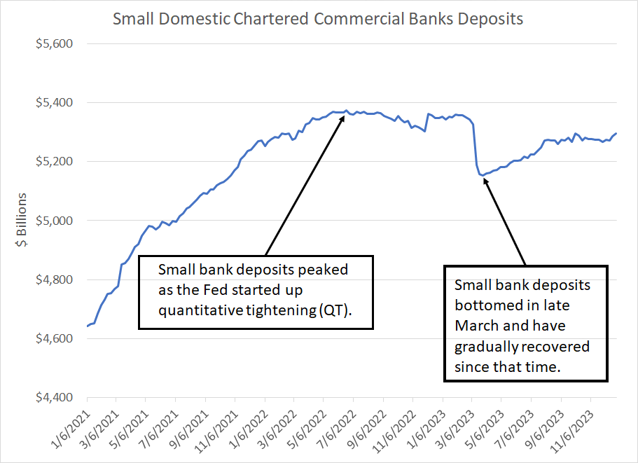
Source: Bloomberg, Federal Reserve H8
This chart is taken from the Fed’s weekly H8 report, which details the assets and liabilities of US commercial banks.
This chart shows total deposits held by small US commercial banks, defined as banks outside the 25 largest ranked by assets. This is the group most vulnerable to deposit flight in March, because larger US banks are subject to tighter regulation and are seen as too big to fail. Thus, large US banks benefited somewhat from the March deposit collapse; customers moved money to the likes of JP Morgan where deposits are seen as safer.
However, as you can see here, even this most vulnerable corner of the US banking industry saw limited stress after last March. There was some initial deposit flight – total deposits held by these banks fell roughly $200 billion between February 22nd and March 29th to a low of $5.195 trillion.
Yet, since that time, bank deposits have recovered gradually, reaching $5.295 trillion as of December 27th, the last week for which we have data from the Fed. Indeed, as of late 2023, small bank deposits were roughly the same as early 2022 before the Fed started quantitative tightening (QT).
That’s hardly a sign of stress.
I’m also often asked about the Fed’s emergency Bank Term Funding Program (BTFP), started last March, which allows regional banks to post Treasury securities as collateral to receive loans from the Fed.
I’ve mentioned BTFP before in this service on multiple occasions including the December 5th post “Stealth Easing and Bank Reserves.”
Towards the end of last year, we saw an increased take-up of BTFP:
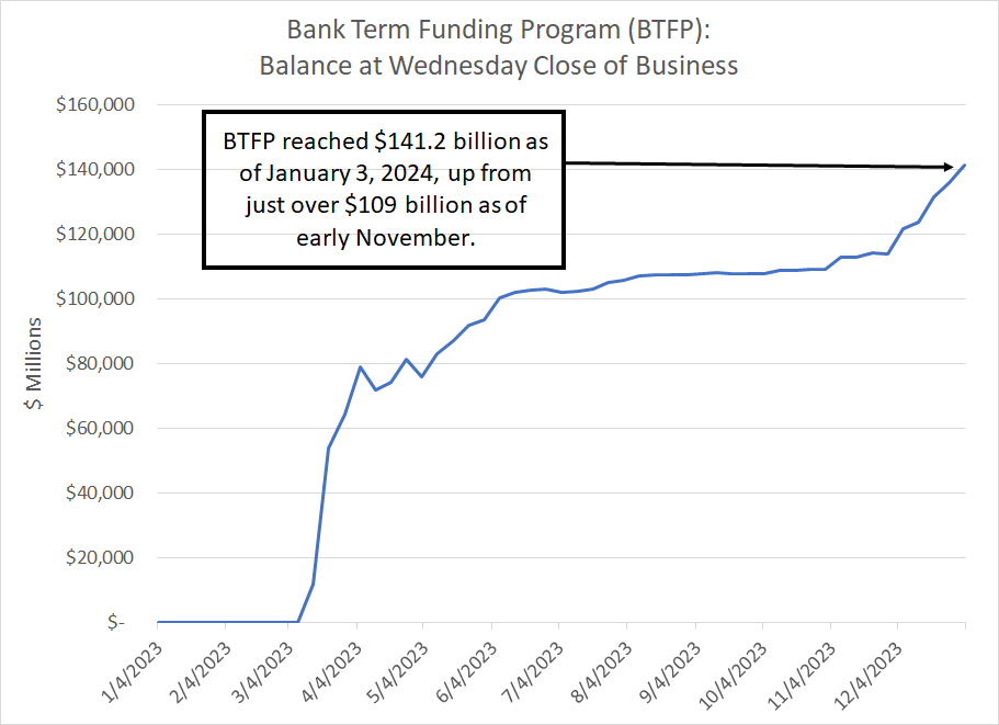
Source: Bloomberg, Federal Reserve H4
At first, I found this trend troubling; in particular, I wondered whether the increase in the size of BTFP could indicate some institution struggling with liquidity.
(An esoteric thing to be worried about for sure).
However, hat tip to the Bloomberg Markets Live chat, it appears that this rise in BTFP reflects an arbitrage on the part of some banks using BTFP to earn a risk-free return:
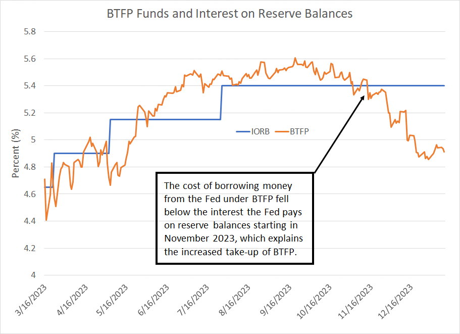
Source: Bloomberg
The BTFP allows banks to borrow money from the Fed, pledging Treasuries they hold as collateral on the loans at the face value of those securities. The orange line in my chart shows roughly the rate banks pay to borrow money under BTFP for terms out to a year.
The Fed pays interest on reserve balances banks hold at the central bank – the blue line shows the IORB (interest on reserve balance) rate.
As you can see, starting in November 2023, the interest rate banks pay on loans from the Fed under BTFP dropped below the rate they can receive on reserve balances at the central bank. The gap has grown steadily larger since that time especially since the Fed began to signal a pivot on rates in December.
Therefore, it appears some banks are borrowing money from the Fed under BTFP at a cost of 4.91%, using idle Treasuries on their balance sheet as collateral, and then posting that as reserves at the central bank to receive the IORB rate. That’s a riskless spread for the banks, NOT a sign of desperate lenders looking for liquidity to meet deposit withdrawals.
Increasingly, in fact, it looks likely that the emergency is over, and the Fed will allow the BTFP program to expire on March 11th rather than renewing the facility for an additional year. If that happens, loans taken out under BTFP should gradually roll off the Fed’s balance sheet over the ensuing 12 months.
And that brings me to this:
The Fed Pivot Catalyst
Earlier on in this issue I explained how banks struggle to make money when interest rates are depressed as they were in the decade following the 2007-09 Great Recession and financial crisis.
I also illustrated how the decline in bank profitability from pre-crisis norms helps explain the widening valuation discounts for regional banks starting in the 2011 era.
So, what I’m about to say may seem, at first blush, contradictory.
Simply put, I see a Fed pivot on rates as a significant upside catalyst for the group this year, helping solve some of the problems regionals have faced since early 2023.
The key point to understand is that while a prolonged period of ultra-low rates is terrible news for bank profitability, banks can also struggle near the end of a Fed hiking cycle. That’s because while rising rates drive up the interest banks receive on loans it also tends to drive up rates they must pay customers to attract deposits.
Take a look:
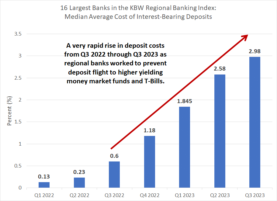
Source: Bloomberg
This chart shows the median average cost of interest-bearing deposits for the 16 largest banks in the KBW Regional Banking Index since Q1 2022.
As you can see, the cost of interest-bearing deposits jumped five-fold between the third quarter of 2022 and the third quarter of 2023.
And the actual ramp in interest costs for these banks is even higher than this chart suggests because the proportion of noninterest-bearing deposits fell over this period. Noninterest-bearing checking and transactional accounts are a cheap source of funding.
Banks were forced to ramp up the rates paid on deposit accounts to forestall the flight of customers to higher-yielding money market accounts and Treasury Bills.
However, as the Fed cuts rates through this year, yields on T-Bills and money market accounts will fall, making them less attractive to yield-seeking investors. This reduces pressure on smaller banks to keep raising rates paid on deposits; some banks that have been more aggressive in hiking deposit rates over the past year may even be able to reduce average rates paid on interest-bearing deposits this year.
A second issue facing US banks over the past year is unrealized losses on their portfolios of securities, especially those classified as held to maturity (HTM).
One of the main catalysts for the collapse of Silicon Valley Bank, in particular, was that the bank gorged on Treasury and mortgage-backed securities in 2020-22 when prevailing interest rates were at or near their lows. As of the end of 2019, SVB held just under $30 billion in securities, but that total soared to over $127 billion by Q4 2021, just before the Fed started hiking rates.
By definition, the value of Treasury and mortgage-backed securities falls when rates rise; carnage in the bond market through 2022 reduced the value of securities SVB held and unrealized losses on those bonds ballooned. When SVB sold a portion of its bond portfolio at a discounted price and realized a loss, it triggered the run on the bank that sparked the March ‘23 regional crisis.
SVB’s massive low-yielding securities portfolio position, and the corresponding unrealized loss black hole, was particularly egregious early last year. However, SVB was not alone – other US banks also hold significant unrealized loss positions on the portion of their securities portfolios purchased at elevated prices (low yields) in recent years.
The good news is that this trend cuts both ways. After all, US Treasury Bonds have already rallied significantly since the October peak in yields and, should the Fed cut rates this year as expected, fixed income securities could rally further. So, as banks report earnings over the next three weeks, look for a decline in reported unrealized losses on their securities portfolios; a peak in unrealized losses is another modest tailwind for the sector as the Fed pivots.
These factors may also help explain why regional banks have historically tended to find a low relative to the S&P 500 around the time the Fed starts cutting rates.
A classic example of this is 2001:
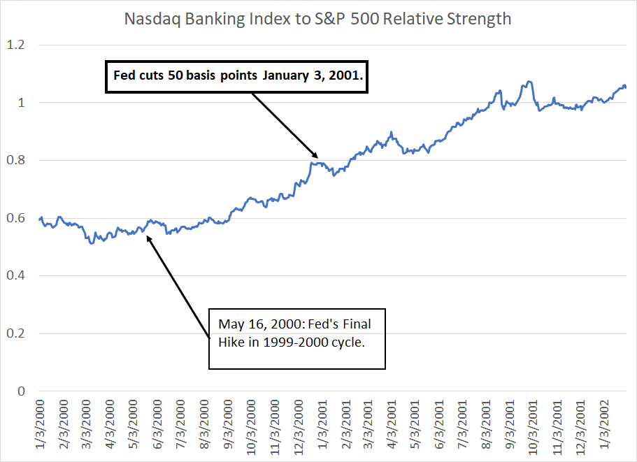
Source: Bloomberg
This chart is based on total returns – price appreciation and dividends – for the Nasdaq Banking Index vs. the S&P 500 from January 2000 through January 2002. A rising line indicates the Nasdaq Banking Index is outperforming the S&P 500 and vice-versa.
Banks, like most non-tech sectors, underperformed the S&P 500 through the late 1990s. On a relative basis, however, the banks bottomed in early 2000 and the rally accelerated in the months ahead of the Fed’s first rate cut in that cycle in early January 2001.
Banks then dramatically outperformed the S&P 500 through early 2002 even as the US economy entered recession in March 2001 and losses for the Nasdaq accelerated.
Also, consider the 1995 soft landing cycle I wrote about earlier this week in “To Recession or Not to Recession?” :
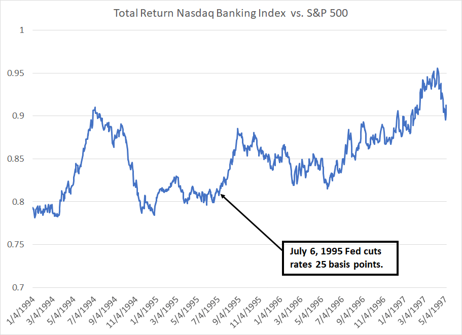
Source: Bloomberg
The US economy didn’t experience a recession in the mid-1990s. However, the Nasdaq Banking Index did experience a bout of outperformance starting in the summer of 1995, as the Fed started cutting interest rates. That outperformance continued through (roughly) the middle of 1997.
As you may have guessed, the only major exception to this rule was the 2007-09 cycle – in the financial crisis years, regional banks underperformed until 2009 and there was no discernible benefit from the start of Fed cuts in September 2007. However, the 2007-09 recession and credit crunch represent an unusual cycle to which the banks were uniquely exposed and vulnerable. That’s not the case this year.
And that brings me to my final point about the regional banks – stock selection is crucial.
While most US banks are sitting on adequate capital and reserves there are still some vulnerabilities in the US banking system. For example, some banks have significant exposure to troubled commercial real estate (CRE) loans.
However, not all CRE loans are bad; there’s a big difference between a loan collateralized by an office building in San Francisco and a loan backed by a self-storage facility in rural regions of a state like Texas or Florida. The former may well struggle with elevated vacancy rates while the latter continues to generate steady, reliable cash flow.
In crisis markets like last March, all stocks in a sector get hit hard as a group. However, as time passes, investors begin to make distinctions between banks like SVB exposed to weak deposit markets and sitting on massive underwater securities portfolios and banks with more conservative fundamentals.
As I outlined earlier, some banks stand to benefit more from falling interest-bearing deposit costs in 2024 than others. For example, banks that were most aggressive hiking rates to attract deposits now may even have an opportunity to cut rates and lower the cost of deposits.
Regional banks represent one of the most idiosyncratic sectors I follow – differences in geographic exposure, loan types, deposit strategies and customer bases can result in dramatic variation in stock performance and upside in different economic and market environments.
Simply put, when adding exposure to regional banks in the model portfolio, I’m focusing on stock selection – picking individual names with upside catalysts – rather than recommending more diversified exposure via an exchange-traded fund (ETF).
Specifically, in this week’s issue I’m adding a small US regional bank to the model portfolio that’s particularly well-placed to benefit from falling short-term interest rates later this year. I’m starting out with a single recommendation and will look to add new regional names to the portfolio over time on dips.
Also, recall that banks are the first stocks in the US to report earnings each quarter with JP Morgan Chase (NYSE: JPM) and Citigroup (NYSE: C) both slated to release results before the opening bell tomorrow January 12, 2024. Earnings season is likely to spark some volatility in the group and should offer up an opportunity for us to accumulate positions in well-placed banks.
Here’s what I’m recommending:
Keep reading with a 7-day free trial
Subscribe to The Free Market Speculator to keep reading this post and get 7 days of free access to the full post archives.