


Growing Risk of Correction
A classic growth scare is supporting bonds...

Editor’s Note: The stock and bond markets are inextricably related; even if you have little or no interest in bonds, you can’t afford to ignore the economic and stock market signals provided by fixed income.
The action in Treasuries this year, something I’ve written about a few times here on Free Market Speculator, is warning about a budding growth scare for the US economy.
I’ll cover some of the messages we’re getting from stock market breadth in this issue of FMS and I’d encourage all readers to also check out my detailed (and primarily free) commentary about bond and fixed income markets over on FMS sister publication, Smart Bonds.
My latest Smart Bonds piece, titled “A Classic Growth Scare", was released earlier today and mt February 6th piece “Duration, Value and Relative Strength” offers some additional context.
—EG
A furious rally in the last two hours of trading helped erase the majority of what was shaping up to be a 2.5%+ weekly decline in the S&P 500.
Technology, growth stocks, and the Nasdaq 100 remained relative underperformers this week with the latter ending the week down 3.4% compared to a less than 1% decline in the S&P 500.
This is nothing new:
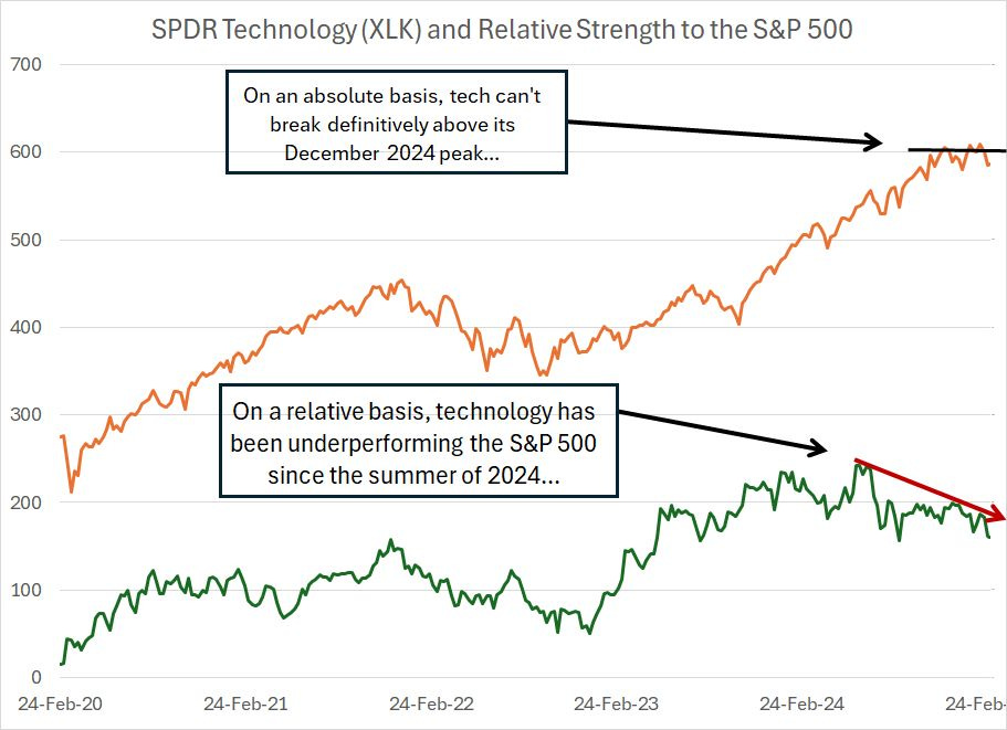
The orange line on my chart represents the SPDR Technology ETF (XLK), which tracks tech stocks in the S&P 500. The green line represents the relative strength of the XLK to the SPDR S&P 500 ETF (SPY), where a rising line represents tech outperformance and vice versa. Both lines are presented on a weekly basis over the past 5 years (since 2020).
A few interesting points on this chart.
First, on an absolute basis, XLK has stalled at the highs from late last year and, unlike the S&P 500 as a whole, hasn’t managed to set significant new all-time closing highs in 2025.
The relative chart is even more interesting in my view.
Coming off the late 2022 broader market low, XLK was a leader with the relative strength line rising consistently until the middle of last year. However, since June-July 2024, technology has generally underperformed the broader market.
The XLK relative strength line is now at risk of breaking down below its lowest weekly close from 2024, a notable loss of what’s been a key leadership group for stocks.
However, it would be unfair to say tech is the only source of market weakness lately – there’s plenty of underlying deterioration underway right now:
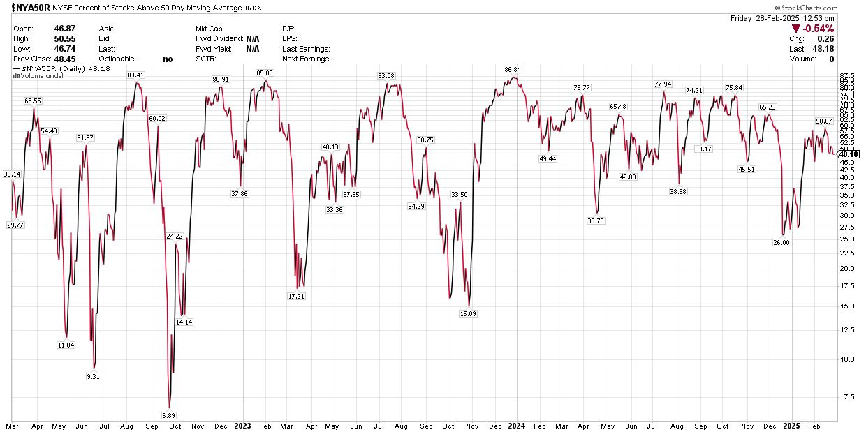
Source: Chart Courtesy of StockCharts.com
This chart shows the percentage of stocks traded on NYSE trading above their respective 50-day moving averages – this chart represents 3 years of daily data.
What’s interesting here is that throughout 2023 and 2024, when the broader market rallied, we’d see around 75% or more of NYSE stocks trading above their 50-day moving averages.
Consider the evolution of market breadth since late 2023. At the lows in October 2023, barely 15% of NYSE stocks were trading above their 50-day MAs.
However, the S&P 500 rallied about 20.7% from October 2023 into late January 2024, and the percentage of NYSE stocks above their 50-day MAs soared to over 86% by late December 2023 before pulling back to around 70% in late January 2024.
At the July 2024 peak for the S&P 500 almost 78% of NYSE stocks were over their 50-day MAs and in October, in the wake of a 2+ month rally off the early August panic lows and just before the election, about 76% of stocks were above their 50-day MAs.
The S&P 500 then went on to set fresh all-time highs in late-November/early December and once again in February 2025; however, the percentage of stocks trading above their 50-day MAs reached just 65.23% at the end of November 2024 and a lower high of 58.67% in February 2025.
Simply put, while technology and growth stocks are the epicenter of the recent market pullback, fewer and fewer stocks and sectors have been supporting the rallies in the broader market since last autumn. The market is losing breadth at an alarming pace.
A Struggling Bull Market
The elephant in the room:
Does this mean the big rally in the S&P 500 that started at the end of 2022 is now over?
No, it does not.
However, deteriorating market breadth does point to elevated risk of at least a significant near-term correction.
We saw similar deterioration in market breadth on this basis through the summer and early fall of 2023. The SPY peaked at $450.20 in July 2023, pulled back and then rallied to a little above $440 by late August of the same year, down less than 2.5% from that July peak.
However, market breadth diverged then as well – at the August 2023 peak almost 87% of NYSE stocks were above their 50-day MAs while the late-August/early-September 2023 peak was 50.75%.
In the end this breadth divergence resulted in a 10%+ correction from the summer 2023 peak to the October 2023 lows.
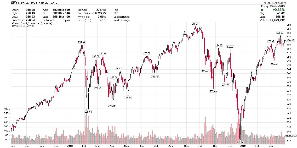
And I’m confident many of you remember the action back in 2018-2019:
Source: Chart Courtesy of StockCharts.Com
This chart shows the SPDR S&P 500 ETF from the summer of 2017 through March 2019.
As you can see, there were two major periods of market turmoil in 2018 – a sharp correction from late January through early February of 2018 and then an even more severe near 20% “crash” between early October 2018 and late December of the same year.
NYSE breadth data helped flag that late 2018 correction as well:
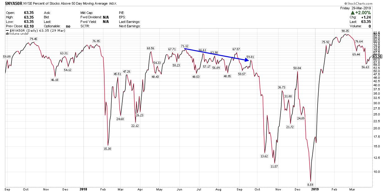
Source: Chart Courtesy of StockCharts.com
I’ve marked the relevant period here with a blue arrow.
In June 2018 around 71% of NYSE stocks were trading above their 50-day moving averages. And, while the S&P 500 rallied around 6% from its June 2018 peak to its September 2018 peak, the number of NYSE stocks trading above their respective 50-day moving averages shrank to less than 60%.
This wasn’t a bear market – 2019 was a great year for the S&P 500 and the S&P 500 didn’t peak until February 2020, some 18.5% above its highs in September 2018 and at a significant new all-time high for the index. However, that near 20% crash in late 2018 was painful to say the least.
A few words of caution:
Historically, bull market peaks take months to form and represent a gradual deterioration in trends rather than a sudden market “crash.”
One of the most dangerous things an investor can do is try to anticipate the peak of a bull market – stocks have a way of bouncing back, ripping higher and punishing the over-eager bears.
Here’s the 2008 market peak in SPY:
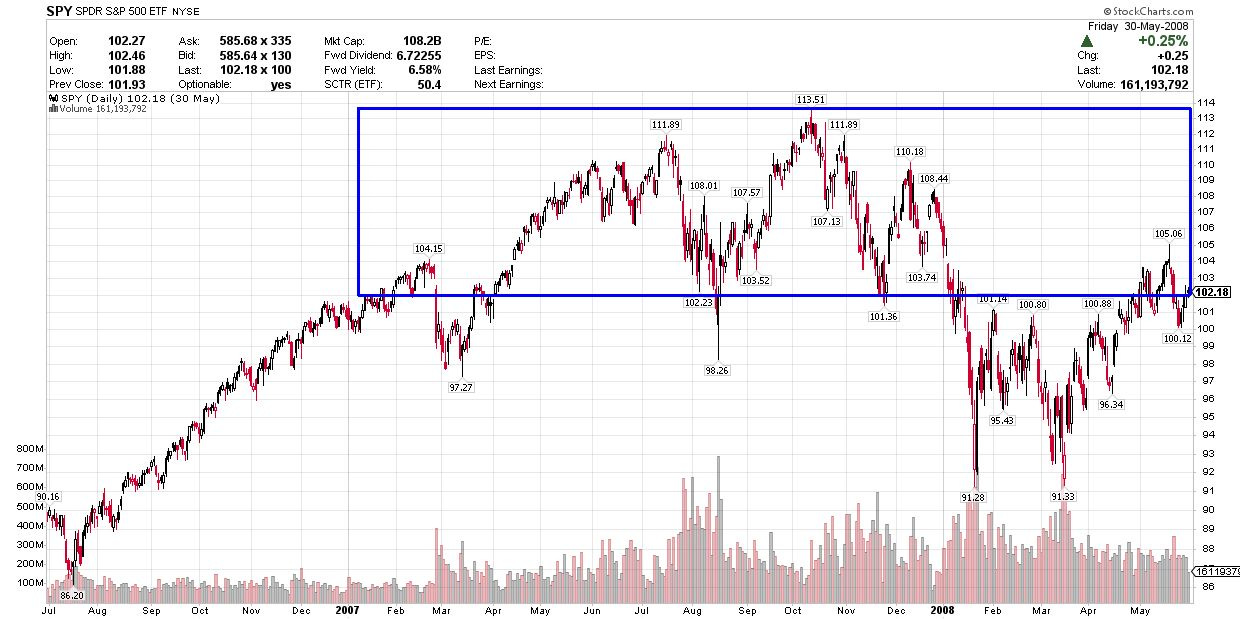
Source: Chart Courtesy of StockCharts.com
The absolute peak of the 2002-08 bull market was set in October 2007.
However, the blue box I’ve drawn on the chart above shows trading action in the S&P 500 within 10% of those absolute highs. As you can see, the S&P 500 first entered this range in January-February 2007 and was right back in that box again as late as May 2008, some 15 months later.
It wasn’t until August-September 2008 when the most severe selling of the 2007-09 bear market really kicked off.
The same thing happened in 2000:
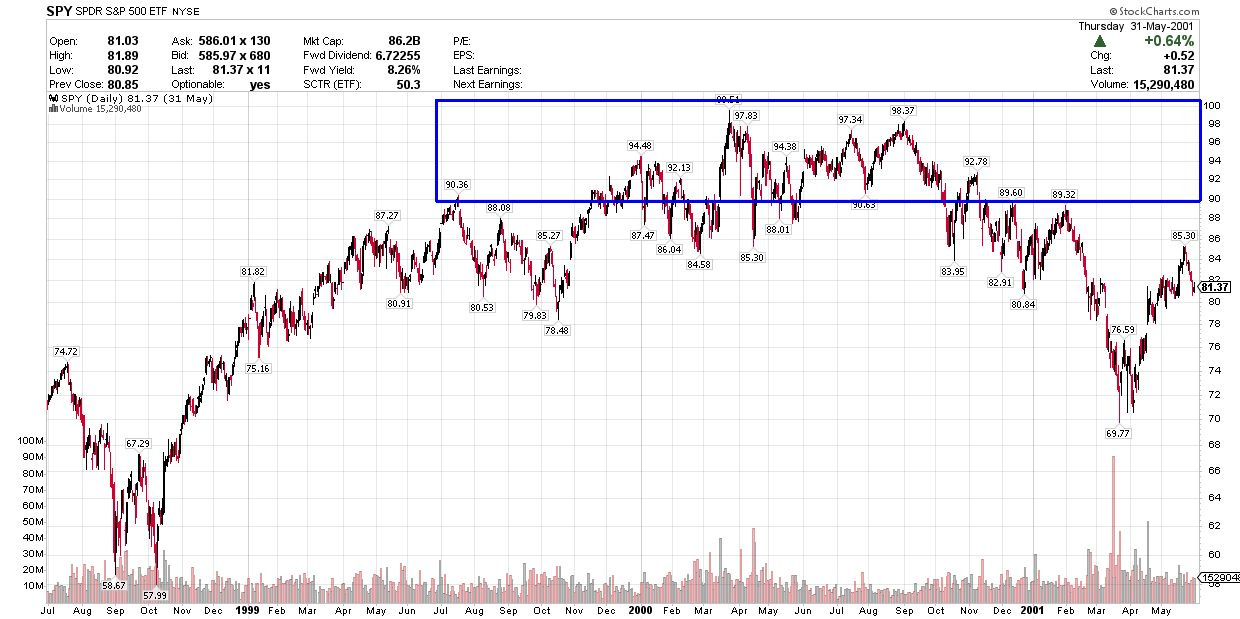
Source: Chart Courtesy of StockCharts.com
The absolute peak in this cycle was late March 2000; however, the market first came within 10% of that peak in the summer of 1999 and didn’t fall significantly below that range until February 2001, a “topping” period of about 18 months.
And there’s also nothing unusual about leadership stocks and groups experiencing significant short-term pullbacks in the context of a longer-term bull market:
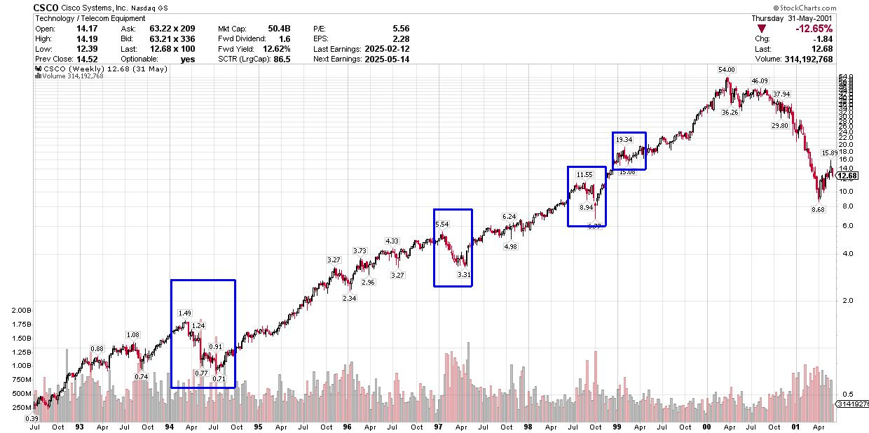
Source: Chart Courtesy of StockCharts.Com
Here’s Cisco Systems (CSCO), one of the leaders of the late 1990s Nasdaq bull market.
From July 1992 through the year 2000 peak, CSCO rallied from a split and dividend-adjusted $0.39 to $54.00. However, there were some truly nasty corrections along the way in years like 1994, 1997, 1998 and early 1999 – I’ve indicated these episodes with blue boxes
In short, I believe some near-term caution is in order, but don’t get carried away – the bulls are still in charge over the intermediate to long-term and should get the benefit of any doubt.
Long-time readers know that I don’t believe in making dramatic changes to the model portfolio in a short period of time. The good news is that we have plenty of recommendations in the model portfolio that have continued to perform well through this latest market sell-off.
However, with these points in mind, I am looking to make some adjustments to the model portfolio next week including the sale of one or more existing holdings along with a handful of potential new additions.
DISCLAIMER: This article is not investment advice and represents the opinions of its author, Elliott Gue. The Free Market Speculator is NOT a securities broker/dealer or an investment advisor. You are responsible for your own investment decisions. All information contained in our newsletters and posts should be independently verified with the companies mentioned, and readers should always conduct their own research and due diligence and consider obtaining professional advice before making any investment decision.
Great use of historical lessons to help understand what might lie ahead for the overall market. Depicting the similar patterns between late 1999-2001 and 2007-2008 was instructive, as were the details offered around the percentage of stocks trading above their 50-day MAs. Thank you!