

How About Those Bonds?
How About Those Bonds?
Inflationary cycles and crowding out

At first blush, last week’s Consumer Price Index (CPI) inflation report looked bullish for both stocks and bonds.
After all, while the market had expected a rebound in the year-over-year rate of inflation due to base effects (more on this in just a moment) the rise was somewhat less than expected.
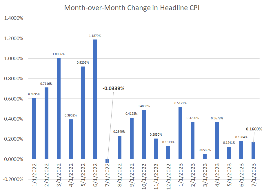
More important, while technically in-line with the Wall Street consensus before the release, that month-over-month sequential rise in CPI looked soft. You see, most news services, in keeping with the Bureau of Labor Statistics (BLS) release, report inflation figures rounded to the nearest 0.1%, but I like to watch the unrounded figures as well:
Source: Bloomberg, Bureau of Labor Statistics (BLS)
A few points to note here.
First up, let’s look at that year-over-year base effect. In July 2022, the headline CPI index fell 0.0339% on an unrounded basis, the only negative sequential change in CPI last year, or so far this year. In contrast, the sequential change in June 2022 was 1.1879%, the highest of any month on my chart.
So, the June CPI report, released about a month ago, compared current price levels to June 2022, the worst single month for inflation data so far this cycle. In comparison, the July 2023 CPI report released last Thursday morning compares year-over-year to that July 2022 CPI report, when inflation was lower sequentially.
Like most economic series, inflation rarely moves in smooth trends over time – there are months that see surges in inflation and there are months where price increases are comparatively benign. So, when you try to compare the current CPI index to the year-ago reading, it’s worth having a look at the base month before drawing any major conclusions about trends in prices.
In this case, the June year-over-year reading released a little over a month ago had a downside, disinflationary bias because the year-ago comparable from June 2022 was such a “hot” number. The opposite is true when comparing July 2023 to the soft July 2022 reading. While base effects are just basic mathematics, I’m often shocked by discussions in the mainstream media which fail to point out these obvious distortions or derive erroneous conclusions based on naïve year-over-year comparisons.
The more important trend to watch in my view is the unrounded figure. Specifically, the month-over-month CPI for July 2023 was up 0.1669% compared to June 2023, which BLS reported as +0.2% on a rounded basis.
However, consider that +0.165% and +0.224% would both get rounded to +0.2%, despite the fact there’s a significant difference between a monthly inflation rate of 0.165% and 0.224%. A monthly increase of 0.165% annualizes to just under 2%, while 0.224% would annualize to a touch over 2.7% -- two very different outcomes for inflation and, quite possibly, the conduct of Fed monetary policy.
Simply put, the July 2023 CPI up 0.1669% unrounded represents a weak +0.2%.
Initially, stocks and bonds reacted positively to the news, however that strength quickly faded, and the selling pressure picked up into the close. The S&P 500 gapped higher at the open last Thursday, trading as high as 4,527.37 intraday (+1.33% on the day), only to give up most of those gains by the close, ending the day up just over 1 point.
The intraday action in the bond market was even more fascinating with the yield on the 10-year touching lows well under 4% around the time of the 8:30 AM eastern Time CPI release, then rocketing higher to over 4.1% by the 4 PM stock market close.
Some CPI Details More Troubling
If you care to dig into the CPI release a bit deeper, you’ll find some more concerning signs including this:

Source: Bloomberg, BLS
“Supercore” inflation is a measure of services cost inflation that excludes housing – both rent of primary residence and Owners’ Equivalent Rent – as well as energy services. I must admit I’m not a fan of dissecting inflation data to this degree as if you exclude enough components, it’s easy to manipulate data to back up just about any market view.
However, the Federal Reserve is known to watch some of these adjusted inflation metrics, including supercore, and it’s notable inflation on this basis, while off its highs, remains in danger of stabilizing at an uncomfortable level above 4%.
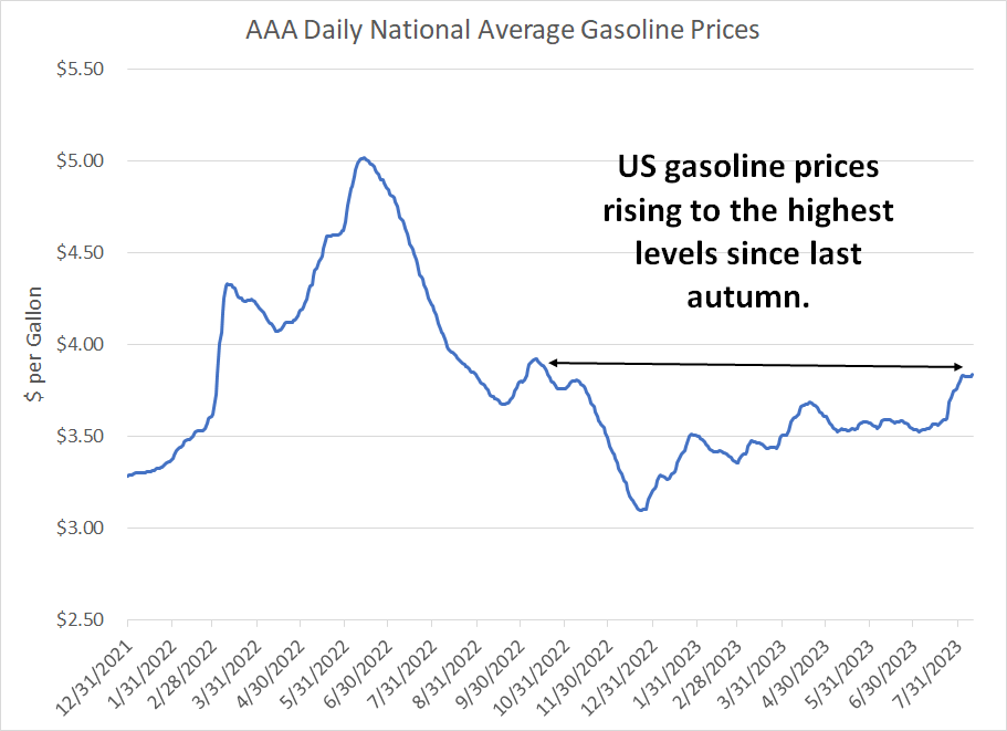
Moreover, while oil and gasoline prices have ticked higher in recent weeks, that move didn’t show up in the headline CPI data released last Thursday. Energy prices rose just 0.1% sequentially in July 2023 and energy services prices – electricity and natural gas utilities – fell 0.1%.
That’s likely to change in upcoming reports:
Source: Bloomberg
As you can see, US average retail gasoline prices are now back to the highest levels since last autumn. That’s crucial because, over time, gasoline prices are a major driver of consumers’ inflation expectations; there’s growing risk the US could tip into a 70’s style self-reinforcing inflation episode where rising prices lead consumers to expect still higher prices and react accordingly.
Adding to inflation entrenchment risk is the recent deal struck between package delivery giant UPS (NYSE: UPS) and the Teamsters union, resulting in some workers receiving a 55% pay increase. The deal would bump up starting pay for a package handler to $21 per hour from $16 with more experienced handlers earning as much as $36/hr.
UPS, and its main US rival FedEx (NYSE: FDX), are not alone – some have even dubbed this the “Summer of Strikes,” with General Motors (NYSE: GM) and Ford (NYSE: F) also in contract negotiations with the United Auto Workers (UAW) union ahead of the expiration of a key contract on September 14th.
Of course, surging labor costs on top of commodity price inflation further underlines risks the US inflation problem is far from solved.
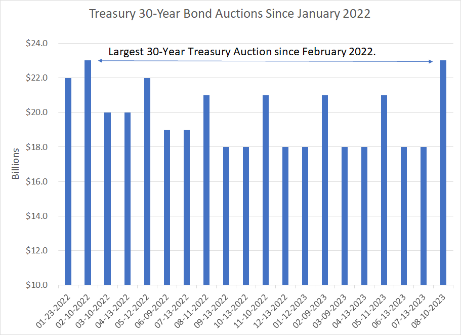
However, it wasn’t really the CPI release that drove the most dramatic moves in last Thursday’s session but the US Treasury’s 30-Year bond auction at 1 PM:
The Treasury, Inflation, and the Economy
On Thursday, the US Treasury auctioned $23 billion in 30-year bonds, the largest such auction since February 2022:
Source: Bloomberg
The highest yield accepted (lowest price bid) for this auction was 4.189%, the highest for a 30-year auction since July 2011.
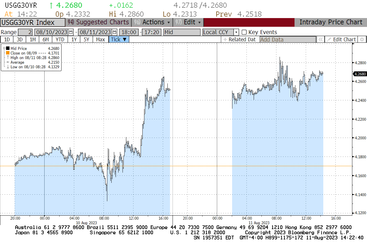
It’s important not to read too much into the results of a single Treasury auction, especially since it’s August and auction demand can be seasonally weak this time of year. However, it’s notable that just before the bidding closed at 1 PM, 10-Year Treasury bonds offered a yield of around 4.175% but the Treasury had to sell more than 10% of this issue at that 4.189% level.
Simply put, that means Treasury had to offer a higher yield (price discount) to induce buyers.
Just take a look at the intraday chart for 30-Year Yields Thursday afternoon and into Friday’s session:
Source: Bloomberg
Immediately after the 30-year auction bidding concluded at 1 PM, yields rocketed higher, well above that 4.189% peak yield bid, reaching a high of over 4.26% by around 4 PM. The stock market also responded with the S&P 500 selling off from a peak of around 4,490 at around 10 minutes before 1 PM, falling to under 4,460 just over an hour later at 1:57 PM.
Of course, this brings up a risk I’ve written about on multiple occasions since late May– the Treasury has been forced to auction an avalanche of new bonds to fund the nation’s yawning deficit. In the current quarter alone –Q3 2023 – Treasury announced early this month it will need to sell more than $1 trillion in new bonds net of maturing debt, well above market expectations.
As with any other market, when the supply of something increases, that tends to put downward pressure on prices and, in fixed income markets, lower prices equate to higher yields.
I’m also seeing troubling signs Treasury’s insatiable appetite for funds will soon start to impact bank reserves – and the real US economy – more meaningfully.
As I’ve explained in past issues, the Treasury stepped up issuance of new short-term debt – Treasury Bills – following resolution of the debt ceiling standoff in early June. From lows around $23 billion in early June, the Treasury General Account (TGA) – the government’s “checking” account at the Federal Reserve – stood at $432.262 billion as of the close on Wednesday August 9th.
However, because the government relied on short-term Treasury Bill issuance rather than longer-term government bonds to borrow, most of this money came out of the Fed’s own Reverse Repo (RRP) facility. The RRP allows banks and other institutions to park money on a short-term basis at the Fed to earn an annualized yield north of 5%; by far the largest users of the RRP are money market funds.
Since T-Bills have offered slightly higher yields than RRP, money market funds took cash out of RRP and used it to purchase T-Bills.
The problem remains that money market funds can’t buy longer-term Treasury notes and bonds like last week’s 30-Year Treasury issue, but the money Treasury needs to borrow must still come from somewhere. The most likely candidate is bank reserves – when an individual or corporation buys a Treasury Bond, they might be expected to fund that purchase with cash on deposit at a commercial bank.
What’s interesting is that funds held in the Fed’s RRP facility plummeted from $2.626 trillion at the end of May 2023 to reach a low of $2.059 trillion on July 19th. The Investment Company Institute (ICI) reports that over the same time, assets held in US money market funds increased by a little over $100 billion, so the fall in the RRP does NOT reflect consumers withdrawing money from money market funds.
Rather, as I outlined, the $567 billion decline in RRP likely represents money market assets shifted out of RRP and into T-Bills to earn a higher yield.
However, since July 19th, the size of the RRP has been creeping higher – RRP rose to $2.096 trillion as of August 9th, the latest data from the Fed.
Of course, a less than $4 billion increase in RRP since mid-July is nothing compared to the plunge since late May. However, with RRP no longer draining, some other liability on the Fed’s balance sheet will need to absorb the increase in the Treasury General Account.
The latest data from the Fed shows bank reserves at $3.22 trillion, down only slightly from the $3.31 trillion at the end of May and higher compared to levels that prevailed in late 2022. However, this data is from August 9th, before last Thursday’s 30-year Treasury auction. And, of course, this past week was only the start of Treasury’s heavy auction calendar.
So, I’ll be watching for a more definitive answer to two main questions over the next few months:
1. Was weak demand for the 30-Year bond just a light-volume August phenomenon, or will longer term bond yields need to rise further to encourage demand?
2. Will stepped-up issuance of Treasury bonds and notes start to pull down bank reserves, leading to a larger decline in bank credit – even a credit “crunch” – later this year? This is the “crowding out” risk I’ve been highlighting for weeks now, where stepped-up government spending and borrowing begins to negatively impact private sector credit and economic activity.
Broadly, my view remains the US economy will continue to weaken and the growing consensus behind a “soft landing” is misplaced, just as was the case back in 2000 and 2007, just months before the economy slipped into recession.
If that view holds, I’d expect the stock market to weaken eventually and bonds to rally (yields to fall) as a haven trade, at least for a time. Longer term, I continue to believe we’re entering a market environment like the 1965 to 1982 period, where there will be dramatic cyclical rallies and sell-offs in the broader stock market, but returns will remain sub-par and real returns (adjusted for inflation) could even be negative over a 10+ year holding period.
For now, however, I’m not convinced equity markets have peaked as what we’ve seen so far is little more than a garden-variety correction following a powerful rally through the first half of 2023:
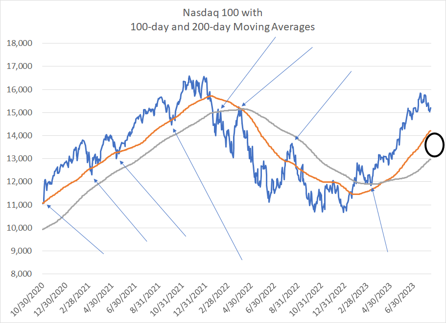
Source: Bloomberg
This is a chart of the Nasdaq 100, which has seen the largest pullback from its July peak of any major US index. However, as I’ve labeled here, the 100 and 200-day moving averages (the grey and orange lines respectively) tend to act as support for the NDX during uptrends and as resistance during downtrends.
The top end of this support range (black circle on the chart) is around 14,200 for the Nasdaq 100, about 1,000 points below yesterday’s close. While it’s certainly possible markets could crash straight through support, a more likely topping process would involve a retest of this support range, followed by a bounce higher and then more downside after a failed bounce. This is the sort of process that plays out over many weeks rather than just a few trading days.
Inflationary Cycles
I’ve received a few questions from readers in recent weeks asking about a historical statistic that’s been making the rounds on the Internet lately and “X,” formerly known as Twitter. Simply put, the idea is that when the recovery from a bear market low retraces more than 76.4% of the entire bear market decline (this is a Fibonacci number) then the market has never failed to log fresh all-time highs.
I took a quick look at bear market cycles since the 1930s and technically that’s true.
Two points.
First, I don’t put a great deal of stock in statistics like this for the simple reason that there have been only a handful of true bear markets since the 1930s, so the sample size isn’t significant. With only a dozen or so examples, it’s just too easy to mine the data and identify random patterns that lack predictive power.
Second, I’ve posted this chart before, but it’s worth reiterating:

Source: Bloomberg
This is a chart of the S&P 500 from late 1965 through late 1975. Over this 10-year period there were two major bull markets and two major bear markets even though the level of the S&P 500 in late 1965 and late 1975 was (almost) the same.
What’s interesting is the “megaphone” pattern here – a series of 3 higher highs in 1965, 1968 and 1973 as well as three consecutive lower lows in 1966, 1970 and 1974. In other words, the S&P 500 did make a new high in 1973 relative to the 1968 peak; yet that was cold comfort by late 1974 when the market reached the lowest trading levels since late 1962.
The truth is that it’s tough for the stock market to decline outright in nominal terms when inflation is spiking – the price of everything, including stocks, will tend to rise. So, the historic pattern during inflation cycles favors relatively short and violent cyclical rallies and sell-offs with flat nominal returns and negative real, inflation-adjusted returns.
Humans are fundamentally creatures of habit and most investors today have become accustomed to the secular uptrend pattern of the past 40 years where bull markets have persisted for many years, bear markets have been relatively short and mild, and inflation has been increasingly benign. In short, the market has tended to make both higher highs and higher lows over time.
Of course, a return to a more cyclical inflationary market like 1965 to 1975 (really 1965 to 1982) would come as a shock and upend the passive index-driven and growth-focused methodologies that have come to dominate the investing landscape over the past 15 to 20 years.
With those points in mind, I’m making a change to the model portfolio recommendations in this issue:
Keep reading with a 7-day free trial
Subscribe to The Free Market Speculator to keep reading this post and get 7 days of free access to the full post archives.