

Inflation Complacent
Inflation Complacent
The danger of the recency bias

Recently, I received a question from a long-time reader regarding the correlation between the S&P 500 and the yield on 10-year Treasury bonds.
While I monitor the relationship between yields and stocks on an ongoing basis, that question prompted me to take a deeper dive into the data; the results hold some important implications for the market over the next 12 months.
So, let’s start with this:
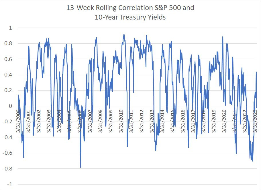
Source: Bloomberg
This chart shows the rolling 13-week (one quarter) correlation between changes in the S&P 500 and changes in the 10-year US Treasury Yield since 2000. A positive correlation means that yields and stocks move in the same direction – the higher the positive number, the stronger the relationship. Vice versa for a negative correlation.
It's important to remember bond yields and bond prices move in opposite directions, so a positive correlation between stocks and yields (depicted in my chart above) means bond prices and stock prices are inversely correlated.
As you can see, correlation reached a low of around -0.70 in late 2022 and early this year, the largest negative correlation between yields and stocks since 2006, on the eve of the Great Recession and financial crisis of that era. Before 2006, the only other time this century with a negative correlation as strong as we saw in late 2022 was back in the autumn of 2000, in the early stages of the 2000-02 bear market and just ahead of the 2001 recession.
Lately, however, the correlation flipped back to positive in late May and it’s currently sitting near zero, implying there’s not much consistency in the relationship between stocks and bonds over the past 3 months.
So, the initial question I received is this:
What’s Going on Here?
My initial knee-jerk reaction is the outlier in the history of this dataset is a negative correlation, so in late May the market simply reverted to the long-term mean.
At first blush that might seem odd – after all, conventional wisdom in the financial media seems to be that when the Fed cuts interest rates, and bond yields fall, it supports the economy, interest rate sensitive sectors like housing and, by extension, the stock market.
However, while that narrative might seem logical, the actual historical record says just the opposite – the average 13-week correlation between 10-year yields and the S&P 500 since the spring of 2000 is +0.30, meaning that when yields are rising, the stock market tends to rise as well.
The explanation for this positive correlation: When bond yields are rising it usually means investors are pricing in stronger economic growth and tighter monetary policy from the Fed in future quarters. Since stronger economic growth generally means rising corporate profits and consumer spending, that’s bullish for the stock market.
So, let’s look at those prior historical examples – May 2006 and October 2000 – when the correlation flipped as deeply negative as it was in late 2022.
In both cases, the market seemed to be warning the Fed had gone too far with tightening policy.
The Fed hiked rates from 1% in June 2004 to 5.25% in June 2006 and, over a similar time frame, the yield on 10-year rates jumped from below 4% in the spring of 2004 to a peak of around 5.25% in June 2006.
For most of this period, the stock market was rising; however, the market started to grow nervous around the time of the Fed’s final hike in June 2006 and the S&P 500 pulled back a little under 8% from early May to mid-June 2006. For a brief period, that was enough to flip the stocks-yield correlation negative.
Of course, while the stock market resumed its advance later in the summer of 2006 and through to the autumn of 2007, concerns the Fed had tightened too much proved prescient. Undoubtedly, Fed tightening contributed to pricking the US residential housing bubble, and touched off a global credit crunch and economic downturn starting in late 2007.
A similar story in October 2000. The yield on the 10-year bond actually rose slightly from early September 2000 through early November of the same year as some market participants felt the economy might avoid recession despite the collapse of the high-flying Nasdaq in the spring of 2000. Yet, even as yields remained buoyant in autumn, the stock market accelerated to the downside late in the third quarter and through the fourth quarter of the year.
So, viewed through this prism, it appears the negative correlation between yields and the S&P 500 in late 2022 reflected concerns the Fed would go too far with tightening rates as it (arguably) did in 2000 and 2006. The subsequent return to a positive correlation reflects a reversion to the long-term “normal” relationship.
Reversion to the mean is a common phenomenon in financial markets though it can be painful for investors at times.
However, I decided to dig a bit deeper into the data and uncovered a more sinister possibility:
Phillips Revenge
The Federal Reserve is often said to have a dual mandate of maximum employment and stable prices.
(The central bank also has a third mandate for “moderate long-term interest rates,” though you don’t hear much about that one these days.)
The Fed, like central banks in many developed countries, has adopted an inflation target of 2% -- so, let’s suppose “stable prices” now means prices that rise at a 2% annualized pace or less. And using that definition, the Fed has really had only one mandate to worry about since the late 1990s:
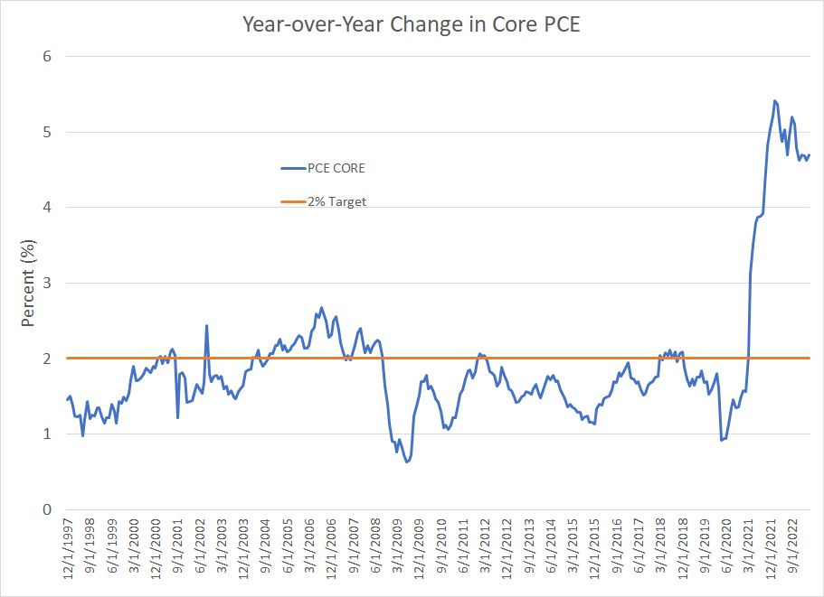
Source: Bloomberg
This chart shows the year-over-year change in the Core Personal Consumption Expenditures (PCE) price index – the Fed’s preferred inflation gauge -- since December 1997 with the 2% target depicted as a horizontal orange line.
For most of this period, the PCE has remained below 2%. And for virtually the entire period since the 2007-09 financial crisis, the Fed seemed more worried about fighting low inflation, and the threat of deflation, rather than bringing down elevated price gains. Concerns about deflation even led the Fed to consider experimenting with an average inflation targeting methodology back in 2019-20.
In short, the stock market has not really had cause to worry about the Fed trying to stomp on economic growth to bring down inflation since at least the 2006-07 era.
Instead, markets have generally been free to focus more on the positive side of central bank policy – the potential for the Fed, and other central banks around the world, to ride to the rescue at the first sign of trouble in markets by slashing rates and, more recently, through quantitative easing.
By extension, it should come as little surprise there’s been a strong, positive correlation between the S&P 500 and 10-Year yields over this period. Rising 10-year yields simply meant stronger economic growth rather than central bank efforts to tighten policy and bring down inflationary pressures.
It has not always been that way:
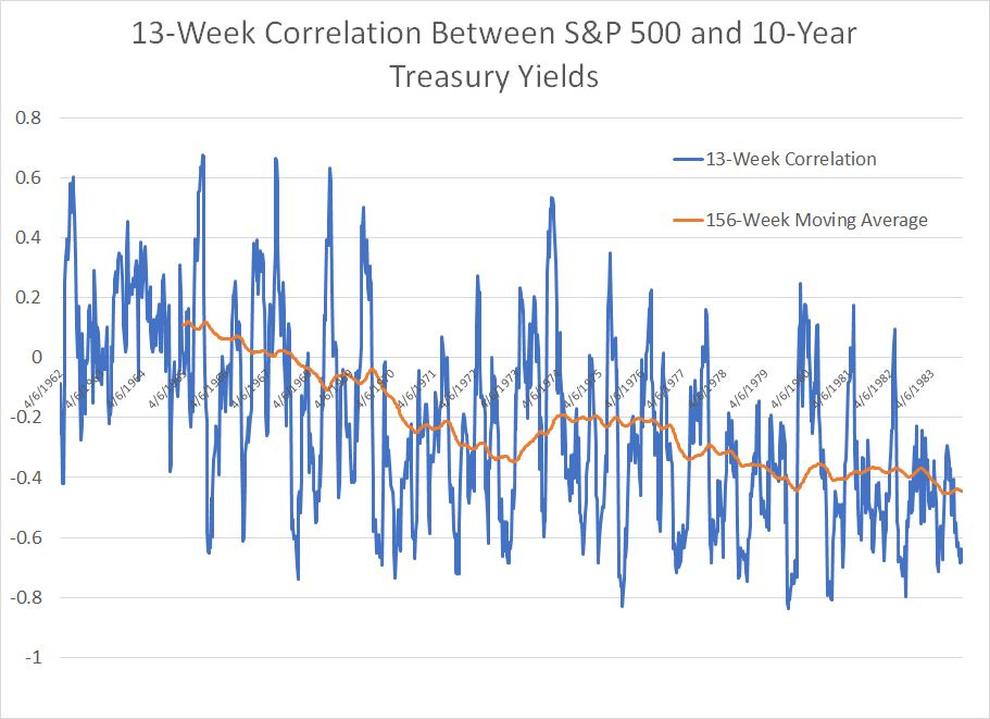
Source: Bloomberg
This chart shows 13-week rolling correlations between the S&P 500 and 10-year Treasury yields from the early 1960s through to the end of 1983. It’s identical to the first chart in today’s issue except for the dates covered by my chart. Since the raw correlations data can be noisy, I’ve also overlaid a 156-week (3-year) moving average in orange to make the longer-term trend clearer.
As you can see, the correlation between yields and the S&P 500 was positive through the early and into the mid-1960s, just as it has been over the past 25 years or so. However, starting between 1965 and 1967 that correlation weakened; by the time of the 1973-1975 recession, the correlation between yields and stocks was consistently negative.
This negative correlation continued straight into the mid-1980s, beyond the period covered by my chart.
Consider the shift in stocks-yield correlations in light of this chart:

Source: Bloomberg
In the early and mid-1960s, core inflation was subdued and generally sub-2%, not unlike the trend over the past 15 years.
However, starting in roughly the middle of 1966, core inflation broke out to the upside, reaching highs over 5% in 1970-71. The recession of 1969-70 helped relieve some of the cyclical upside in inflationary pressures; however, inflation bottomed in late 1972-early 1973 at levels well above the pre-1966 norm.
And, from 1973 through 1982 the US endured several waves of sky-high inflation – even the severe recession of 1973-75 and the double-dip downturn in the early 1980s failed to bring down inflation on a sustained basis.
The Phillips Curve, named after economist William Phillips, posits a relationship between unemployment and inflation. It’s a tradeoff where higher rates of unemployment and a weaker labor market tend to bring down inflation; the flip side is lower unemployment comes at the expense of higher inflation.
The Phillips Curve is most closely associated with the 1970s. It’s bad news for the Fed since the dual mandate of “stable” prices and maximum employment (low unemployment) aren’t consistent in an economy facing a strong Phillips Curve relationship.
The Great Inflation of the 70s and the strength of the Phillips Curve help explain why the relationship between bond yields and stock prices flipped to a powerful inverse correlation starting in the late 1960s as inflation took off.
Simply put, in the 70’s markets had to be concerned with both sides of the dual mandate because, unlike the early 1960s and the 2000-20 period, inflation well above target was a real problem. In the 70’s rising bond yields signaled growing inflation pressure and the need for the Fed to hike rates and slow economic growth to bring down prices.
Bottom line: In an era where inflation is a problem, rising rates tend to be bearish for the S&P 500.
The risk is that the inverse correlation between yields and stocks in 2022 and early this year is not transitory but the beginning of a period of more elevated inflation, and a powerful Phillips Curve, like the 1966 to 1983 period.
Whistling Past the Graveyard
It’s often said the biggest risks in markets are those least expected.
And, right now, the market is complacent about inflation:

Source: Bloomberg
Breakeven inflation rates are market-implied rates calculated by comparing the yields on conventional Treasury Bonds and Treasury Inflation-Protected Securities (TIPS) of equivalent maturity.
I’ve plotted two breakeven measures on this chart. The first is the 5-year breakeven, a measure of market expectations for the annual rate of inflation over the next 5 years. The second is the 5-year, 5-year forward rate which is the expected annual rate of inflation over the 5-year period starting five years in the future. The latter is considered a good benchmark for the market’s long run expectations for inflation that filters out some of the shorter-term cyclical considerations baked into short-term breakeven estimates.
As you can see, breakevens spiked last year with the 5-year breakeven reaching a high of around 3.73% annualized in March 2022 and the 5-year, 5-year forward metric hitting a high of 2.57% in April of last year. Today, however, both measures are back below 2.25%, which is pretty consistent with the Fed’s long-term target for 2% annualized inflation.
In other words, even with the current rate of inflation more than twice the Fed’s target, the market believes the problem is well in hand and inflation will glide effortlessly back to target at some point next year without causing much in the way of economic pain.
The market assumes the Phillips Curve is dead – inflation expectations are falling even though the US unemployment rate is close to the lowest levels since the late 1960s. There’s no tradeoff between the two sides of the Fed’s dual mandate for maximum employment and stable prices.
There’s a theory in psychology and behavioral economics called the recency bias; the basic idea is humans have a natural tendency to project recent trends and experience well into the future. That is why we, as a species, don’t handle change particularly well and why investors often miss key turning points in financial markets.
The (growing) risk is that much like the mid-to-late 1960s, investors today have been lulled into a false sense of security regarding the relationship between unemployment and inflation, and the power of central banks to keep inflation below target.
They’ve become accustomed to the post-2000 “normal” of low inflation, low rates and central banks targeting growth rather than the “old normal” of higher rates, higher inflation, “Whip Inflation Now” campaign slogans and elevated economic volatility that prevailed from 1966 to the mid-1980s.
One of the clearest signs such a regime change is underway would be a persistent negative correlation between 10-year yields and the stock market such as we saw in late 2021 and through much of last year.
One possible catalyst this summer would be persistently elevated inflation even as the economy continues to slow and a Fed decision to implement additional tightening to keep prices in check.
This phenomenon also has implications for sector and quantitative factor performance that I covered to some extent in the April 25th issue of FMS, “Earnings Alchemy, Rates and the Nasdaq,” as well as the subsequent April 27 issue “A Bear in Bull’s Clothing.”
I’ll leave a more detailed dive into those implications for a future update.
DISCLAIMER: This article is not investment advice and represents the opinions of its author, Elliott Gue. The Free Market Speculator is NOT a securities broker/dealer or an investment advisor. You are responsible for your own investment decisions. All information contained in our newsletters and posts should be independently verified with the companies mentioned, and readers should always conduct their own research and due diligence and consider obtaining professional advice before making any investment decision.