

Services and Manufacturing
Services and Manufacturing
Plus: The Big 3 Time Frames for Markets

I recently received a question regarding the ISM Manufacturing Purchasing Manager’s Index (PMI) and its counterpart ISM Services Index.
As long-time readers know, ISM is one of my favorite economic indicators and the New Orders component of the manufacturing index is also one of the 10 indicators that comprise the Conference Board’s Leading Economic Index (LEI).
Both ISM indicators are based on a monthly survey of managers in key US industries regarding business conditions, the pace of new orders, supply chain issues and labor market conditions.
The question I received went something like this:
The US economy is predominantly a services-based economy, so who cares about manufacturing activity, isn’t the ISM Services index more important?
Look at this chart:

Source: Bloomberg, Bureau of Labor Statistics (BLS)
This chart shows US manufacturing payrolls (jobs) as a percentage of total US payrolls since December 1949; as you can see, manufacturing accounted for about a third of all US jobs in the early 1950’s, declining to 8.4% in the most recent month.
So, it’s a good question – why bother analyzing the twists and turns in ISM Manufacturing when well over 90% of the working population is employed in service industries?
First, ISM only started publishing Services PMI in July 1997 while we have data on the Manufacturing PMI since the late 1940s.
Yes, 1997 is more than 25 years ago; however, in economic cycle terms, there have been just 3 recessions since 1997. Also, most of the period since the late 90’s has been dominated by low inflation and low interest rates.
If you’re trying to establish an indicator’s reliability in monitoring the business cycle, it’s best to focus on indicators we can evaluate through more than just 3 cycles and through more than just the low-inflation, low-growth, and easy money regime of the past 25 years or so.
Second, based on the track record of ISM Services we do have, the ISM Manufacturing Index is usually more sensitive in picking up turning points in economic conditions.
Take a look:

Source: Bloomberg
The orange line in my chart above is the headline ISM Manufacturing Index while the blue line is ISM Services since the latter’s first publication in 1997.
Do you see how Manufacturing tends to lead Services?
For example, look at the two indices in the late 1990s. In November 1999, the ISM Manufacturing Index reached a peak of 58.1. Levels over 50 indicate expansion in manufacturing activity and a level of 58.1 is indicative of rapid growth.
Readings that elevated are rare. Since the 1950’s, the manufacturing index has only been at or above 58.1 in about 22% of all months and since the 1970’s it’s been at or above that level in less than 14% of all months.
Less than a year later in August 2000, the ISM Manufacturing Index had fallen below 50, the level that divides expansion from contraction in manufacturing. And by December 2000, ISM Manufacturing had plummeted below 45; generally, levels below roughly 45-46 have been consistent with an imminent US recession.
Now look at the Services Index. The peak for this index in the 1999-02 cycle came months after the manufacturing index in April 2000 at a level of 58.0. By August that year, even as the Manufacturing index plummeted into contraction, ISM Services (then known as the Non-Manufacturing Index) had fallen only slightly to 57.6.
And by December 2000, as ISM Manufacturing was flashing a red warning sign of recession ahead, Services was still sitting at 54.0. Indeed, it wasn’t until April 2001, a month after the economy entered recession and more than a year after the market peaked, that Services finally fell below 50, the dividing line between expansion and contraction.
In short, ISM Manufacturing offered a much better, and timelier, signal of the coming economic storms in 2000-02.
Manufacturing once again offered a timelier signal of weakening economic conditions in 2018-19. Services remained elevated at levels above 55 from the second half of 2017 until the second half of 2019. Indeed, this index didn’t dip below 50 until April 2020, just as the shortest recession in US history was ending. Meanwhile, the Manufacturing index peaked in February 2018 and weakened steadily starting in the autumn of 2018, falling below 50 by August 2019.
The 2020 recession cycle was unusual, driven by an exogenous shock in the form of economic lockdowns followed by unprecedented monetary and fiscal stimulus. However, monitoring ISM Manufacturing would have signaled the economy was weakening and prone to an accident as far back as late 2019 when Services was still all sunshine and roses.
While there have been only three recessions in the past 25 years, there have been multiple economic soft patches and slowdowns that catalyzed significant market pullbacks, corrections and pockets of volatility including 2010-12 and 2014-16. A quick glance at my chart above shows that in these cases also, manufacturing has tended to weaken some months before services and has registered clearer signals of potential trouble ahead via dips below the 50 level.
And that brings me to 2007-09, the only recession cycle since the late 1990s where manufacturing clearly lagged services. ISM Services remained at a healthy 52.5 at the end of 2007 as the US entered recession only to plummet to 44.8 in January 2008.
Meanwhile, while Manufacturing did fall to 48.8 in February 2008, the index didn’t collapse to recessionary levels until October 2008, a year after the market peaked and 10 months after the US slipped into recession. Manufacturing activity remained reasonably steady through 2007 and the first half of 2008 even as ISM Services clearly decelerated beginning as far back as 2006.
To understand why, consider that ISM divides companies into the Services and Manufacturing buckets depending on their industry group – with commodity industries like “Petroleum & Coal products,” “Chemicals,” and “Paper” all in manufacturing while “Finance & Insurance,” “Real Estate,” and “Construction” all qualify as services.
The 2007-09 downturn started as a credit event – a housing bust that infected mortgage credit – which spread to torpedo the rest of the US and global economy through 2008. Indeed, while big services groups like finance, real estate and construction were already in real trouble by the middle of 2008, manufacturing groups like the energy and chemicals industries were in fine shape with oil, natural gas and petrochemicals prices soaring, and refining margins at healthy levels.
The bottom line is that while I certainly pay attention to both ISM indices – Manufacturing and Services -- if I were forced to pick just one, it would be Manufacturing without question.
That’s because while manufacturing is less important than services in terms of share of gross domestic product (GDP) and employment, these industries tend to be more cyclical and more sensitive to changes in the health of the US and global economies.
Manufacturing not services is the proverbial canary in the coalmine.
So, let’s examine the recent trend:
Why is Services Strong and Manufacturing Weak?
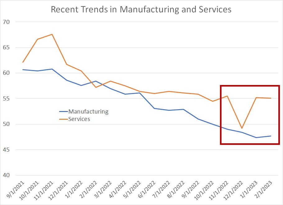
Last week, ISM released both its Manufacturing PMI and Services PMI indices and they offer very divergent reads on the current health of the US economy.
The Services index, released on Friday, came in at 55.1, roughly steady with a 55.2 reading for January and well above consensus Wall Street estimates for a decline to 54.5. Just two months ago, in December 2022 this index broke below 50 to 49.2, the lowest reading since the 2020 recession.
Meanwhile, the Manufacturing index, released last Wednesday came in at 47.7, just off January’s cycle low of 47.4 and well below expectations for a bounce to 48.0. We’re not quite at recessionary levels near 45-46 just yet, but the steady decline in manufacturing activity registered by ISM since the middle of last year is consistent with the pattern in the months leading up to prior economic downturns over the past 50+ years.
The strong services number released Friday has fueled the “no landing” argument while the manufacturing number suggests a more sinister economic outcome.
So, why the divergence and which is more meaningful?
I suspect it’s ISM Manufacturing and not ISM Services that’s the better indicator of economic health right now for two main reasons.
First, as I just explained, manufacturing leads in most economic cycles and the steady deterioration in this index contrasts the volatility we’ve seen in services over the past 18 months:
Source: Bloomberg
Second, look at the past few months indicated in the red box. Services saw a shock decline from a strong level over 55 in November 2022 to a reading under 50 in December 2022; at the time the December numbers were released, Wall Street economists had forecast a reading of 55 for the prior month, not 49.2.
The numbers have since rebounded to the 55 region, roughly the same level as last autumn.
I suspect both the shock weak December number and the shock strong January-February numbers are weather-related.
December 2022 brought a cold snap across much of the US, which hit some key services industry groups including construction and real estate hard. As I outlined in last week’s issue, retailers (a services group) also saw generally weak trends in sales for December, which was likely due, in part, to shifts in seasonality following the 2020 COVID lockdowns.
In January and February, weather across the US improved markedly, flattering the same services industries most impacted by the December cold snap.
As much as I value the monthly ISM releases and believe both to be among the most powerful leading indicators we get each month, a look at their performance over the past 25 years underlines why it’s so important to focus on multiple economic indicators with a long track record of useful signals.
It’s equally important to keep tabs on markets across multiple time frames:
(Still) Too Early to Sell
As I explained in “The Most Powerful Indicator of Long-Term Market Returns,” long-term market trends are driven primarily market valuations. In that Free Market Speculator issue, I studied returns for the S&P 500 since the 1960s and the normalized price-to-earnings ratio explains 70% to 80% of 10-year returns from the broader market.
The S&P 500 is currently expensive on this basis, trading at valuations that typically indicate sub-par long-term returns from buying the index.
Intermediate-term market trends tend to be driven by factors including the health of the economic/market cycle and credit conditions – this is the time frame I probably spend the most time analyzing in FMS.
Typically, the market peaks ahead of a US recession, and the bulk of declines in a bear market occur after the US economy is in recession as corporate earnings start to deteriorate meaningfully.
I’m still looking for the US economy to enter recession this year, though that’s unlikely until this summer or early fall in my view. We are clearly seeing expectations for corporate earnings deteriorate, and I suspect we’ll see more downside revisions as we approach Q1 2023 earnings season in the middle of next month:

Source: Bloomberg
This shows consensus Wall Street estimates for year-over-year earnings growth in each quarter of 2023.
As you can see, Q1 and Q2 earnings growth expectations turned negative following Q3 earnings season late last year. Expectations for Q3 2023 are still positive, but down to less than 1.3% year-over-year from just under +5% towards the end of last year.
Finally, analysts are still looking for +7.7% year-over-year earnings growth in Q4 of this year, down from 10% in early January, but still indicative of a V-shaped recovery for the economy following a brief recession this year. I suspect it’s only a matter of time before those estimates start falling meaningfully alongside estimates for Q1 – Q3 2023.
Again, an average decline for the S&P 500 in a recessionary bear market is more than 30%, which still supports an eventual downside target for the S&P 500 in the current cycle of 3,000 to 3,100.
Finally, short-term market trends tend to be driven by market technicals, investor sentiment/positioning and levels on the charts; unlike long-term and intermediate-term market conditions, the short-term picture for markets remains constructive.
I covered some of the indicators I follow in my “The Bear in Hibernation” piece released last month.
Suffice it to say the market has remained remarkably resilient of late despite a significant ramp in expectations for the Fed’s terminal interest rate:

Source: Bloomberg
This chart shows the peak rate priced in the Fed Funds futures market over the next 9 monthly contracts.
As you can see, the expected peak for Fed Funds was around 3.5% at the end of June and is now almost 2 percentage points higher at 5.5%.
Just consider: Between mid-August and mid-October, the expected Fed Funds rate rose from 3.75 to 5% and the S&P 500 plunged as much as 17%. Between February 2nd and today the peak Fed Funds rate has risen from 4.88 to 5.5% yet the S&P 500 is down less than 3%. Even the rate-sensitive Nasdaq 100 is down just 3.9% over this time while cyclical value groups are down just over 3.15%.
So, markets are steady despite “bad” news on rates that catalyzed some pretty nasty and messy sell-offs last year.
Meanwhile, even the Nasdaq 100 has failed to break down below its 200-day moving average over the past month:

Source: Bloomberg
The lower pane of this chart shows the Moving Average Convergence Divergence (MACD) Indicator for the Nasdaq 100 Index. This indicator registered a clear sell signal on February 16th and the Nasdaq 100 pulled back, but did not break down below that key technical support at the 200-day MA (the yellow line).
That’s characteristic of bull markets, not bear markets.
Indeed, look back at the chart in 2022 – similar sell signals for Nasdaq on April 8th and August 19th proved successful, signaling selloffs to fresh cycle lows in June and October.
Of course, this could change at any time and catalysts abound this week including testimony from Jerome Powell over the next two days and Friday’s monthly Employment Report from BLS. However, as long as the market continues to hold up well, and shrug off any and all bad news on the economy and corporate profits, I struggle to get more bearish short-term.
Further, typically at market tops and at the peak of major bear market rallies, investors turn bullish stocks:
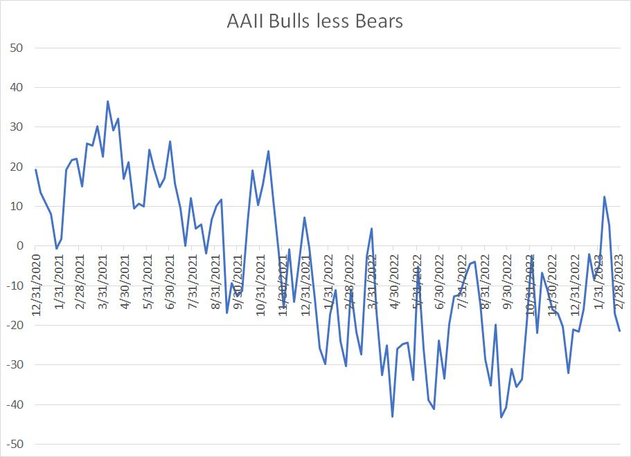
Source: Bloomberg
This chart shows the results of a weekly survey conducted by the American Association of Individual Investors (AAII) – readings above 0 indicate more bullish sentiment than bearish sentiment and vice-versa.
As you can see, sentiment turned bullish briefly in early February near the short-term peak for the indices; since that time, investors have turned bearish once again, not far off the levels late last year when the market was testing its bear market lows to date.
It’s normal to see bears outnumber bulls in a protracted bear market; however, the reluctance of investors to embrace the S&P 500’s 5.8% rally year-to-date suggests that, perhaps, there remain underinvested bears on the sidelines who could power an additional leg higher in markets this month.
In many ways, this is the toughest market condition for investors and traders alike – I remain a bear for the broader market over the intermediate to long-term but, for now, that bear remains in hibernation.
DISCLAIMER: This article is not investment advice and represents the opinions of its author, Elliott Gue. The Free Market Speculator is NOT a securities broker/dealer or an investment advisor. You are responsible for your own investment decisions. All information contained in our newsletters and posts should be independently verified with the companies mentioned, and readers should always conduct their own research and due diligence and consider obtaining professional advice before making any investment decision.