

Stock Market Trends and Buying the Dip
Stock Market Trends and Buying the Dip
Is something different this cycle?

Back in March, Michael Burry, the hedge fund manager of Big Short fame, wrote on Twitter:
“Going back to the 1920s, there has been no BTFD generation like you. Congratulations.”
Source: X (formerly known as Twitter).
Of course, BTFD is an acronym for “Buy the Dip” with the present participle of a rude, four-letter verb I won’t repeat on Substack added between “the” and “Dip.”
So is Burry right and, more specifically, has something truly changed in the very character of the way markets trade, and trend, over time?
This week I decided to take a deeper dive into this question, examine the quantitative evidence, and explore the practical implications for investors and traders.
The Crossover
Moving average crossovers are one of the oldest trend-following strategies you’ll encounter.
One of my long-time favorites is the 13- and 26-week moving average crossover.
Let’s use the S&P 500 back in the 1970’s as an example:
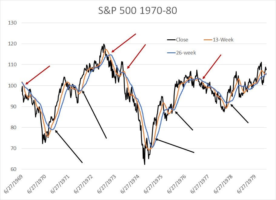
Source: Bloomberg
The concept is simple: Each Friday you calculate the average closing price of the S&P 500 over the past 13 weeks and the past 26 weeks. I’ve plotted these averages as an orange line and a blue line respectively.
When the shorter-term moving average (13-week, orange line) crosses above the longer-term moving average (26-week, blue line), the stock market is in an uptrend. And, when the 13-week crosses below the 26-week moving average, the market is in a downtrend. I’ve labeled some of the major bearish crossovers in the S&P 500 from 1969-1980 as red arrows and some of the major bullish crossovers as black arrows.
At this point, you might be wondering:
Why did I choose the 13-week and 26-week moving averages rather than a different weekly average or, perhaps, the 50-day and 200-day moving averages?
To be honest, there’s no entirely satisfactory rationale for that choice. My choice is based on 3 reasons:
There are 13 weeks of trading in a quarter and 26 weeks in a half-year, and traders and investors in the stock market tend to think about returns and portfolio rebalancing on a quarterly basis, so these periods are logical.
Over the years I’ve seen a lot of weekly charts for all sorts of markets on trading monitors and I’ve probably seen the 13-week and 26-week moving averages used more often as an overlay on this chart than any other set. For daily charts, the 50-day and 200-day seem to be the popular default choice and sometimes you’ll see the 40-week average because 40 weeks is roughly equivalent to 200 trading days.
I have back tested these crossover signals on various markets and time frames and 13- and 26-week crossovers tend to work well across several markets and sectors of the stock market.
Take a quick glance at my chart above and you’ll see these crossover signals were useful back in the 1970s.
You will find some false signals or “whipsaws,” instances where the moving average crossovers did not lead to a long-term change of trend. However, some of these signals were truly golden and could have helped an investor avoid the worst of the bear markets of this era – particularly the 1969-70 and 1973-74 cycles -- while participating in the lion’s share of the bull markets.
So, here’s how this simple trend-following indicator performs over the long-haul:
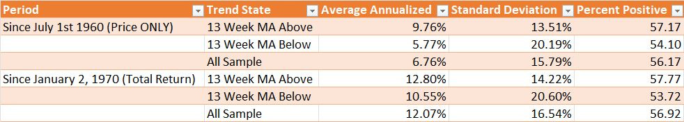
Source: Bloomberg, FMS
Look at a long-term chart of the S&P 500 and it’s undeniable stocks have a long-term upward drift. So to evaluate the utility of this sort of signal, I like to compare weekly returns from the S&P 500 when the 13-week moving average is above the 26-week to the entire sample of weekly returns and returns when the 13-week is below the 26-week.
The table above shows returns from the S&P 500 on a price-only basis since 1960 and on a total return basis – dividends reinvested – since 1970.
For the entire sample, since 1960 the S&P 500 provides an average annualized price-only gain of 9.76% on weeks where this moving average crossover is bullish compared to just 5.77% when the indicator is bearish and 6.76% annualized for the entire sample. That’s impressive – almost 4 percentage points of outperformance for the stock market on weeks where the 13-week moving average is above the 26-week moving average over the past 63 years.
And what’s even more impressive is the standard deviation of returns – a measure of risk – is far higher in weeks when the 13-week moving average is below the 26-week moving average.
So, in short, this simple crossover can help identify periods when you can go long the stock market and enjoy higher returns with below-average risk. It can also provide a simple warning to reduce your stock market exposure or pare risk – when the 13-week moving average is below the 26-week, the stock market still produces positive returns, but they’re lower on average and carry higher risk and volatility.
Looking at total return data since January 2, 1970 paints a similar picture – returns for the S&P 500 when this indicator is bullish average 12.8% annualized, some 2.25% annualized better than average returns when the indicator is bearish. The standard deviation of returns during bull phases for the stock market is more than 6 percentage points lower when the indicator is bullish at 14.22% annualized.
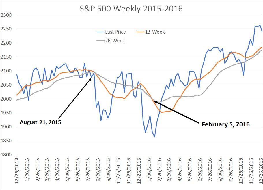
Trends and Times Have Changed
Moving average crossovers have proven useful over the entire sample period I studied since 1960.
However, the efficacy of these signals has changed over time:
Source: Bloomberg
This table includes returns from 13-week/26-week moving average crossovers broken down by decade, using the total return dataset.
As you can see, in the 1970s and 1980’s, the S&P 500 produced superior returns with lower volatility when the crossover signal was bullish. And in the 2000s – yearend-1999 to yearend-2009 – the return from the S&P 500 was actually negative in weeks when the 13-week was below the 26-week with sky-high volatility of 25% plus annualized. Meanwhile, the 13/26 crossovers helped to avoid the worst of the 2000-02 and 2007-09 bear markets with the S&P 500 producing a +7.3% annualized gain when the indicator was bullish.
However, this indicator failed in the 1990s and has failed again since January 2010.
In the 2010s for example, the S&P 500 generated a total return of 25.21% annualized when the 13-week moving average was BELOW the 26-week, more than double the 12.0% annualized return in bullish weeks. While the standard deviation was lower in bullish weeks, that’s cold comfort amid underperformance of that magnitude.
So, what’s changed to make this simple time-tested trend-following indicator “fail” in the 1990s and since 2010?
Well, the first factor to note is that the S&P 500 spent only 11.3% of weeks in the 1990s with the 13-week moving average below the 26-week, compared to 32.22% for the entire sample. In the 2010s, this indicator was only bearish 20.69% of the time. So the sample size of bearish weeks is relatively small compared to prior decades.
Keep that statistic in mind and take a look at this:

Source: Bloomberg
This chart shows weekly returns from the S&P 500 since 2010 in weeks where the 13-week moving average is below the 26-week average, when the crossover signal is bearish.
Look at the groups of hefty positive weekly market returns I’ve labeled on the chart in years like 2010, 2016, 2019 and (especially) 2020.
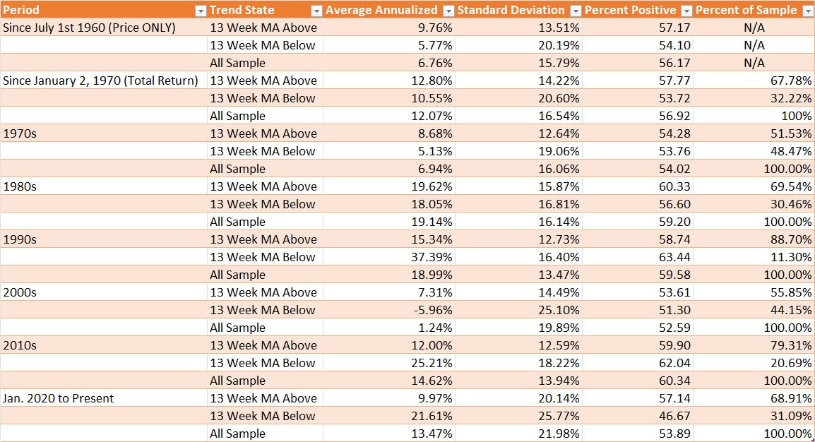
Simply put, these periods all correspond to “V-shaped” bottoms for the S&P 500. Let’s look at the 2015-16 period as an example:
Source: Bloomberg
This is a weekly chart of the S&P 500 in 2015 and 2016 showing the closing price of the S&P 500 as well as the 13- and 26-week simple moving averages. I’ve labeled two “sell” signals over this period in August 2015 and February 2016.
These sell signals were costly.
You see, while the S&P 500 did decline a total of 14.2% from its May 21, 2015 peak to its February 11, 2016 closing low, most of the decline happened in sudden bursts of selling pressure and the 13- and 26-week moving averages were simply too slow to register timely signals.
That’s particularly true in early 2016. This model didn’t signal a sell until February 5, 2016, less than a week before the market bottomed and the crossover signal didn’t flip bullish again until May 6, 2016. Between the early February sell signal and the early May buy signal, the S&P 500 jumped more than 10%.
Here’s a similar chart from 2019-2020:
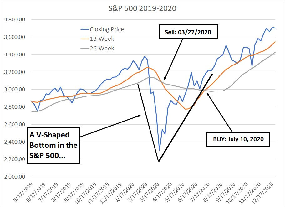
Source: Bloomberg
The S&P 500 traced a V-shaped decline and recovery between late February 2020 and the summer of the same year and, once again, the 13-, 26-week crossovers were too slow to register useful signals.
Between that March 27th sell signal and the July 10, 2020 buy signal, the S&P 500 soared 26% -- that’s an annualized gain of more than 123%.
Simply put, since 2010 the S&P 500 has spent almost 80% of weeks trading with the 13-week moving average above the 26-week average. So, the sample size of bearish signals is significantly smaller than in decades like the 1970s, 1980s, or the 2000s.
Meanwhile, the prevalence of V-shaped corrections in recent years means that this traditional crossover signal has been too slow to shift, missing out on some sky-high weekly returns on the up-slope of these V-shaped recoveries. A handful of 5%+ weekly gains in a small sample size is enough to skew the results.
So, if you’ve had a nagging feeling that something has changed for markets since the 2007-09 financial crisis years, you’re right – the very nature of correction cycles in the S&P 500 is different that it was in the 2000s and in every decade prior to roughly 1990.
And that brings me to this:
The More Things Change…
My first working hypothesis was that perhaps the failure of markets to trace well behave trends since 2010 has to do with the rise of electronic and high-speed trading in the past 15 years or so.
Specifically, perhaps the good, old weekly moving averages are just an anachronism and too slow to track modern markets.
However, take a look at this:
Source: Bloomberg
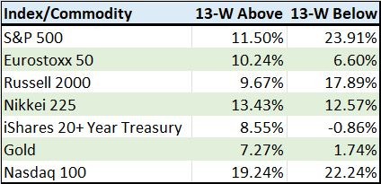
This chart shows the return from the 13-, 26-week crossover signal for a number of equity market indices and ETFs since January 2010.
What’s interesting is that many markets have continued to trend well on this basis. For example, the Eurostoxx 50 (Europe) has generated stronger average returns during bullish weeks than bearish weeks with a heathy spread of a little under 4 annualized percentage points.
The same can be said of assets as diverse as gold (the “GLD” ETF), the iShares 20+Year Treasury Bond ETF (NYSE: TLT). And what’s even more interesting is to compared the performance of crossover signal between the S&P 500 and the Nasdaq 100.
The Nasdaq 100 is more volatile than the S&P 500 and is a good proxy for market leadership over the past 13+ years. However, bullish crossover signals have performed far worse for the S&P 500 since 2010 than for the Nasdaq 100.
If the failure of these weekly crossover signals were truly the result of faster moving markets and the ubiquity of high-speed electronic trading then I’d expect us to see more uniform trend failure across markets.
Rather, I believe the BTFD mentality and the failure of these moving average crossovers is more a function of this:
The Policy-Driven “V”
As I said, the failure of 13-, 26-week crossovers since 2010 is generally due to the V-shaped nature of corrections and recoveries over the past 13+ years.
Specifically, markets have tended to sell off suddenly and then recover just as quickly. In contrast, look at major market bottoms in the 70s and the 2000s and you’ll see more of a gradual topping and “W-shaped” bottoming process. The latter is, of course, more likely to trigger a weekly trend-following indicator.
And why do market move in V’s?
Look at recent examples like 2011, 2016, 2018-19 and 2020 and you’ll see V-shaped moves are primarily the result of rapid changes in monetary policy conditions. Simply put, with inflation well below-target for much of the period since 2010, the Federal Reserve has been able to focus most of its attention on the second half of its mandate, targeting growth.
The central bank claims NOT to target the level of stock prices.
So, I’m sure it’s a coincidence, but isn’t it uncanny how rapid stock market selloffs since 2010 seem to have always resulted in an about-face, some tangible shift in policy, from the monetary authorities?
I also find in interesting that over the past 2 years (since August 2021), the traditional efficacy of the 13-, 26-week moving average crossover signal appears to have returned with a vengeance.
Indeed, in weeks since 2021 where the 13-week average is above the 26-week, the S&P 500 produced an annualized return of +6.30% compared to -2.13% for weeks when the crossover signal is bearish.
The summer of 2021 isn’t a random date I’ve pulled out of thin air. It corresponds (roughly) to the glorious moment when it began to dawn on the Fed and other central banks that the generational surge in inflation might not be transitory and that, perhaps, there was a need to refocus attention on price stability or even — shock horror — to raise rates to some level north of zero and cease quantitative easing.
This missive is already on the long side, so I’ll leave additional exploration of these key market shifts to a future issue. For now, I’ll leave you with two key points to consider.
First, there has been a change in the way markets trade, and trend, since the Global Financial Crisis years of 2007-09, the “BTFD” phenomenon is real as is the prevalence of policy-driven V-shaped moves in stocks.
Second, with inflation very much a problem , central banks’ capacity to respond to every stock market sell-off, every minor sniffle for the global economy, with a flood of liquidity and free money is limited to non-existent. In short, since 2021 we’ve entered a more conventional economic and market environment where “V-Shaped” moves are likely to become far less common.
The 70s are back, at least for the stock market.
DISCLAIMER: This article is not investment advice and represents the opinions of its author, Elliott Gue. The Free Market Speculator is NOT a securities broker/dealer or an investment advisor. You are responsible for your own investment decisions. All information contained in our newsletters and posts should be independently verified with the companies mentioned, and readers should always conduct their own research and due diligence and consider obtaining professional advice before making any investment decision.