

The Coming Employment Collapse
The Coming Employment Collapse
The key leading indicator that's flashed a warning of recession ahead

In last Thursday’s issue of The Free Market Speculator, I explained why the headline payrolls number from the monthly employment report released by the Bureau of Labor Statistics (BLS) can be such a misleading indicator of US economic health.
However, there are some useful — and often overlooked — indicators within this report that I follow, and one of those is flashing a red warning sign on the health of the economy right now.
The consensus narrative on the December 2022 employment report, released on January 6th, seemed to be the release represented a Goldilocks report – the data was neither too hot to heighten concerns about inflation and the need for significant additional rate hikes, nor was it soft enough to suggest imminent risk of economic downturn.
Some even suggested this BLS release heightened the probability of a US soft landing similar to the 1994-95 experience I covered in last Thursday’s issue.
And, this soft landing narrative appeared to gain additional steam following last week’s relatively in-line Consumer Price Index (CPI) inflation release.
The commentary following the December employment report centered on three bullish points.
First, the US added 223,000 jobs in December, which was close to in-line with economists’ estimates for 205,000 payrolls. BLS also revised lower the past two months’ worth of payrolls by a total of 28,000, which makes the labor market appear a bit less “hot” than some had feared towards the end of last year.

Source: Bloomberg
This chart of total monthly payrolls gains (the latest-available estimate) has slowed markedly since the spring of 2022. While that clearly indicates the economy is slowing, it’s also a welcome development for the Federal Reserve, which has been concerned about the tight labor market.
Second, along a similar vein, average hourly earnings – a measure of wage growth – softened to 0.3% month-over-month in December against expectations for a 0.4% gain. Even more important, BLS revised down estimates for November average hourly earnings from 0.6% sequentially to 0.4%.
Much like payrolls, there’s been a moderation in the pace of wage growth over the past year:

Source: Bloomberg
Again, the Federal Reserve has highlighted the tight labor market as a reason to both hike rates and maintain higher rates until there’s progress on inflation. The fear is, of course, a repeat of the 1970’s wage-push inflation spiral where rising wages led companies to push through price increases; the resulting increase in cost of living led to further wage demands.
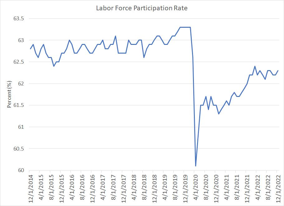
Third, look at this:
Source: Bloomberg
This chart shows what’s known as the Labor Force Participation Rate, a measure of the percentage of the US working age population who are in the labor force. The labor force is, in turn, defined as the sum of those who are employed and those that are not employed but are actively seeking employment.
This number is crucial because it’s a measure of labor supply.
If the labor force participation rate is low or falling that indicates a large number of working age people who are neither working nor looking for a job – these sidelined workers decrease labor supply. The implication is that weak labor supply is bullish for wages, because it means that if companies need more employees they must raise wages in order to attract qualified workers by tempting them back into the labor force.
For example, consider an experienced worker in the energy industry who retired amid the 2020 commodity price collapse – that worker, though technically still of “working age” left the labor force. With energy prices rising today, demand for experienced labor in the industry is high and companies are actively trying to hire people back out of retirement. Doing so likely requires offering an attractive wage and benefit package.
One major concern over the past few years is the labor force participation rate fell sharply amid lockdowns in the spring of 2020 from about 63.3% in February 2020 to a low of 60.1% in April of the same year. However, while the participation rate has recovered somewhat, it’s still at about 62.3%, a full 1% below its pre-lockdown peak.
While that might not seem like a big number, the estimated working age population in the US is almost 265 million, so even a 0.1% change represents more than a quarter million jobs. A stubbornly low participation rate even as the number of job openings in the US soared has been viewed as a major upside risk for wages and, in turn, inflation.
What’s interesting is that as part of its initial estimates for November 2022 employment released in early December, BLS had reported a drop in the labor force participation rate to a four-month low of 62.1%. As part of the December Employment report released in early January, BLS revised higher their November 2022 estimate to 62.2% and reported a further 0.1% increase to 62.3% in December.
Simply put, taken together these three items – moderate growth in payrolls, slowing wage growth and rising labor supply – represent a benign picture for the US labor market.
However, I’d argue the Goldilocks interpretation is naïve at best and quite likely dead wrong.
First, there are the usual caveats about the monthly BLS numbers I outlined in last Thursday’s post – they’re always vulnerable to significant subsequent revisions that can completely change the picture. Indeed, that’s been an even bigger problem over the past few years:

Source: Bloomberg
This chart shows BLS revisions to monthly payrolls numbers from December 2020 through August 2022.
There have been some truly huge revisions to monthly payrolls releases since the end of 2020 including several upside revisions to jobs growth in late 2021, which helps explain why inflation was so much more persistent that the central bank anticipated into early last year.
In the first 8 months of 2022, there were some large downside revisions including a 79,000 downward revision to the June 2022 BLS estimate of jobs growth.
The December 2022 initial estimate is very likely to change and even a relatively modest revision – say higher or lower by 50,000 to 100,000 jobs – could skew the overall picture entirely.
What Leads Payrolls?
Further, there are some troubling signs within the payrolls report itself:

Source: Bloomberg
This chart shows the monthly change in temporary payrolls from December 2006 to December 2009. As you can see, significant declines in temporary payrolls in this cycle started in the spring of 2007, almost a year before we started seeing meaningful declines in total payrolls.
That’s logical if you think about employment from a business owner’s standpoint. If demand for your products or services weakens, you might look for ways to cut costs and terminating full-time employees can be an expensive option. That’s particularly true right now; just consider, a year ago many businesses were desperate for employees and struggled to find qualified labor, so there’s always a risk that if demand recovers, you’d be forced to hire and train new workers.
So, one of the first actions a business owner might take is to lay off temporary help to cut costs while maintaining full-time jobs for as long as possible.
Thus, one of the first signs of a weakening labor market is often a drop in temporary payrolls – only months later do the headline non-farm payrolls numbers, so often discussed by talking heads in the financial media, begin to weaken as well.
Here’s a slightly different look at the same data:

Source: Bloomberg
This chart shows the year-over-year change in Temporary Help payrolls in blue and the year-over-year percent change in total non-farm payrolls in orange since December 1997.
Look at the relationship between these two series over the past few economic cycles:
Temporary payrolls began to decline on a year-over-year basis in December 2000, the US economy entered recession in March 2001, and total nonfarm payrolls began to shrink in the summer of 2001.
Temporary payrolls declined in November 2006, rose a bit into early 2007 and then turned consistently lower starting in April 2007; the US economy entered recession in December 2007 and the year-over-year change in payrolls turned lower starting in May 2008.
The year-over-year change in temporary payrolls went negative again in January 2019, the US economy entered recession in February 2020 and total non-farm payrolls began shrinking year-over-year in April 2020.
The December 2022 BLS employment report released earlier this month showed the first-year-over-year decline in temporary payrolls for this cycle – a decline of 1.05% even though total payrolls are still growing at a roughly 3% year-over-year pace right now.
Simply put, temporary help staffing offers a useful early read on the health of the US labor market. In each of the 3 recessions since 1997: The 2001 recession, the 2007-09 Great Recession and the 2020 Lockdown panic, temporary staffing has turned lower on a year-over-year basis BEFORE the US economy enters recession and long before total US payrolls begin shrinking on a year over year basis.
While many pundits seized on the positives from the December 2022 BLS Employment Report released on January 6th – all lagging indicators for the US economy – the first year-over-year decline in temporary help staffing in the current cycle caught my eye. Perhaps even more interesting is the speed at which temporary staffing trends have deteriorated – just 4 months earlier in August 2022, temporary staffing was still expanding at a double digit year-over-year pace.
If history is any guide, the rapid downturn in temporary staffing in late 2022 portends a sharp downturn in the broader US labor market and the start of a US recession later this year.
Like all economic and market indicators, temporary staffing is not an infallible guide to US economic or labor market trends.
As you can clearly see in my chart above, temporary staffing growth turned negative for several months from May through December 2016; the US economy didn’t enter recession in 2016 nor did overall payrolls growth shrink on a year-over-year basis.
However, there was an economic slowdown back in 2016 and a decline in payrolls growth as part of what many described as a soft patch for the US economy. Moreover, the year-over-year decline in temporary staffing payrolls never exceeded 0.86%, compared to a more than 1% decline in December 2022.
This is also the reason why I always focus on multiple leading indicators of economic conditions rather than focusing on a single “pet” indicator or, even worse, taking queues from a well-known lagging indicator like the payrolls numbers from the monthly employment releases from BLS.
If you liked today’s issue, do me a favor and tap the heart-shaped “like” button at the top of this page — it does a great deal to help support my work.
And if you’re interested in free market and economic commentary from me — I’m aiming to post here at least twice per week in 2023 — then type your e-mail in the box below for a free subscription. I’d like to commit more time to The Free Market Speculator and Substack this year; more “likes” and more free subscribers let’s me know that time commitment is worthwhile.
Don’t worry — if you decide you no longer want to follow my work, you can always unsubscribe at any time.