


The Turn of the Great Cycle
Global Stocks, Commodities and the US Dollar

You may, or may not, have heard the old warning that nothing good happens after 2 AM.
In markets, there’s an equivalent saw I’ve seen attributed to Paul Tudor Jones:
“Nothing good happens under the 200-day simple moving average.”
As I’ve written before, I’ve always watched the 200-day moving average closely and I’m amazed how often this level does act as support or resistance for the S&P 500. My theory is that the 200-day works because so many traders and investors see it on their charts every day – many charting packages and services default to include the 50- and 200-day moving averages on a daily chart.
Regardless, during equity bull markets, by definition, the S&P 500 spends most of its time above a rising 200-day moving average.
Take a look:
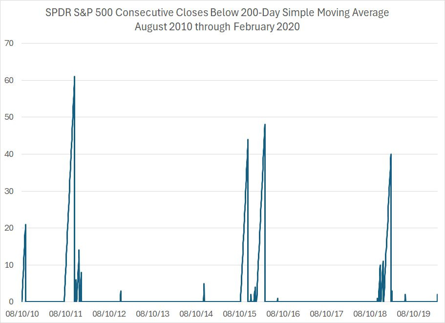
This chart covers the S&P 500 over the period from August 2010 through February 2020.
This entire period represents a bull market in the S&P 500 and a period of economic expansion. The bear market that accompanied the Great Recession of 2007-09 ended in March 2009, about three months before the US economy exited recession. So, this chart starts about a year into that bull market.
This chart ends in February 2020, just as the S&P 500 was coming off all-time highs and rolling over into the short-lived bear market and recession caused by COVID-era economic “lockdowns.”
The line on the chart represents a running count of the number of consecutive daily closes for the S&P 500 under its 200-day simple moving average.
Two points to note.
First, for most of this period, the S&P 500 did not close under its 200-day. From early 2012 until mid-2015, for example, the S&P 500 didn’t close under the 200-day for more than four consecutive days; the best strategy in that environment was to regard dips in the S&P 500 as buying opportunities and to focus solely on trading the market from the long-side.
Second, there are some prominent spikes on my chart, and they appear in clusters –2010-11, 2015-16 and 2018-19 are obvious examples.
The common definition of a bear market is a peak-to-trough closing decline in the S&P 500 of 20% or more. That definition is flawed in many ways; however, it’s a useful starting point as most 20%+ stock market pullbacks in the post-war era accompanied economic downturns (there are only 3 exceptions since the 1940’s).
And, by that definition there was no bear market between August 2010 and February 2020. So, you can certainly see the S&P 500 trading 10+ consecutive days below its 200-day MA without a bear market; however, when that happens it’s often the precursor to some bouts of unpleasant market volatility.
The problem right now is the S&P 500 appears to be entering one of these high-volatility clusters:
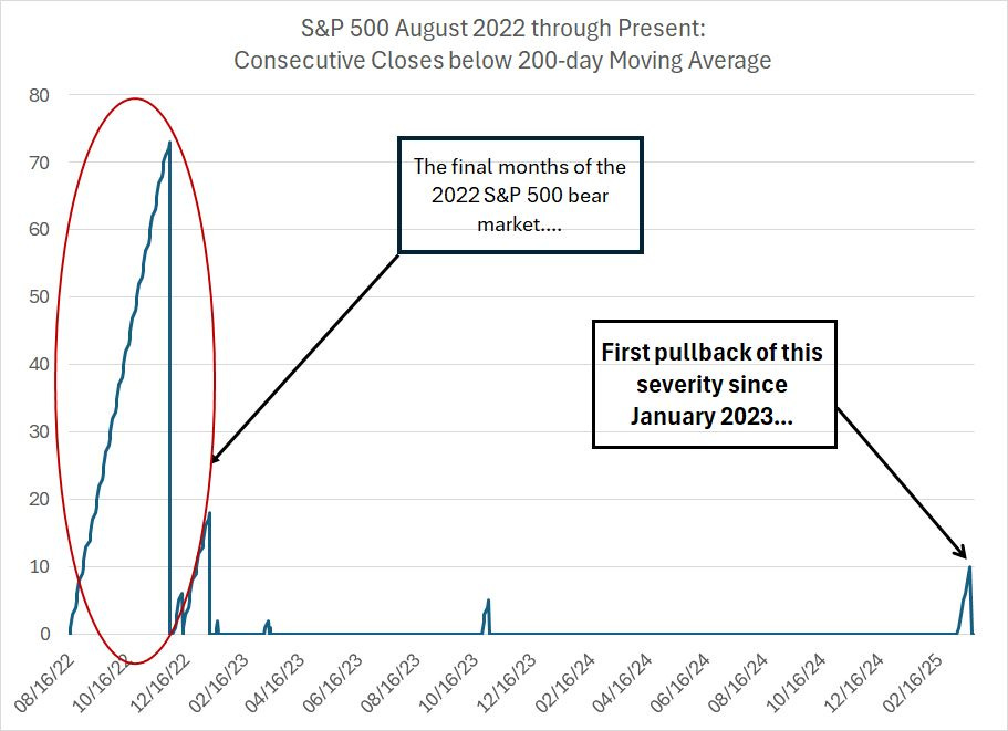
This is the same chart except it’s covering the period since August 2022.
The left-hand portion of my chart represents the final weeks of the 2022 bear market. By definition, bear markets in the S&P 500 occur with the market trading below a falling 200-day moving average so you’ll see long streaks of consecutive closes below the 200-day during bear markets.
However, since January 2023, the S&P 500 has never seen a streak of 10 or more closes below the 200-day until last week.
Up until this month, the largest correction in this bull market came in the autumn of 2023 when the S&P 500 managed 5 consecutive daily closes under the 200-day.
Last Friday was the S&P’s 10th daily close under the 200-day. The S&P 500 managed a close above its 200-day on Monday and Tuesday this week but closed back below this key technical marker on Wednesday.
This doesn’t necessarily mean the bull market is over; however, the signs are mounting that, at a minimum, we could be in for a period of heightened volatility this year.
And let’s take a quick look at market breadth:
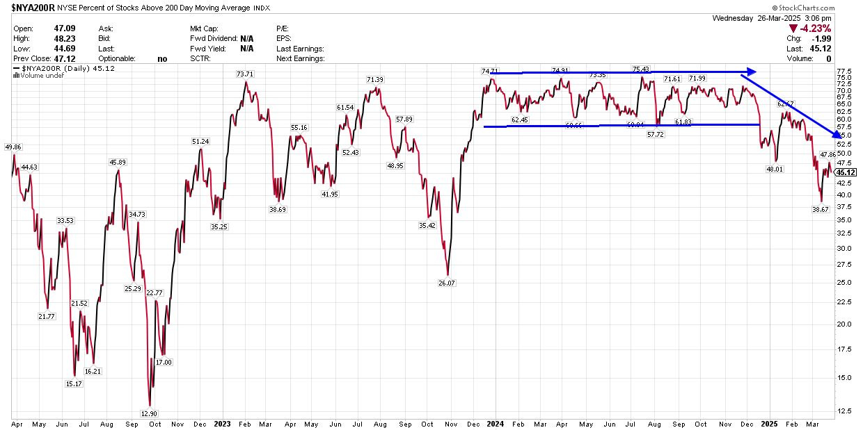
Source: Chart Courtesy of StockCharts.com
This chart shows the percentage of NYSE stocks trading above their 200-day moving averages.
As you can see, throughout the rally from late 2023 through November 2024, this indicator ranged between roughly 60% and 75% of NYSE stocks above their 200-day averages. In early 2025, we saw a plunge to under 50% as the market pulled back, followed by a rally into February.
However, even as the market rallied in the second half of January, we never saw more than 62.7% of NYSE stocks trading back over their 200-day moving averages, well below the “normal” levels we saw last year. More recently, as the market saw renewed selling pressure into early March, market breadth deteriorated even more, with less than 39% of NYSE stocks trading above their 200-day MAs.
That’s the worst breadth we’ve seen on this basis since October 2023.
Greener Grass Abroad
What’s interesting is that even as the S&P 500 has been weak, we’re seeing a surge in international equities:
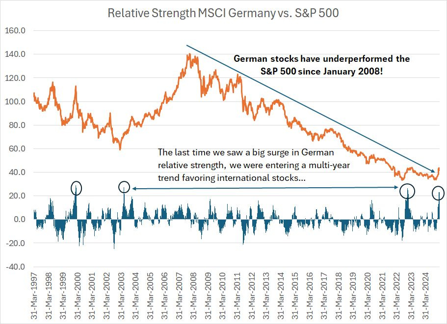
The orange line on this chart is a relative strength line comparing the MSCI Germany Index to the S&P 500 on a total return basis – including dividends – since the end of 1996. I set the relative strength line to an index value of 100 at the end of 1996. A rising line indicates Germany outperforming and vice-versa.
The blue columns below my chart show the 13-week relative performance of German vs. US stocks – a positive number indicates German equity outperformance. I chose 13 weeks because that’s one quarter, which is long enough to hold meaning without resulting in too much “noise” in the data.
What’s shocking here is that the S&P 500 steadily outperformed Germany over a period of 17 years!
As you can see, relative strength in international markets tends to proceed in multi-year trends. MSCI Germany outperformed the US from March 2003 into January 2008. And, prior to 2003, the S&P 500 outperformed Germany through much of the mid and late 1990s.
Over the past 13 weeks, however, MSCI Germany has outperformed the S&P 500 by more than 23 percentage points. There was a similar burst of relative strength in early 2023; however, prior to that, you must go back an additional 20 years to the 2003 relative strength lows to find a similar surge.
I’d argue there are some similarities between the current period and the early 2000s.
Then, as now, we were coming off a period of US economic exceptionalism and superior stock market performance driven, at least in part, by a surge in technology and growth stocks. The collapse in the Nasdaq started in March 2000 and ended in the fall of 2002. However, tech and growth continued to lag the recovery in the broader market until the Great Recession and financial crisis in 2007-09.
Since most international markets have far less weight in technology and growth than the S&P 500, that likely contributed to the shift favoring international in 2003 and back to the S&P 500 after 2008.
Also note that these trends don’t turn suddenly and without warning. In the last cycle, we saw a big surge in relative strength for Germany in early 2000 and then a handful of additional surges in early 2003 (see the blue columns on my chart which I’ve circled).
That’s similar to the action we’ve seen on this chart since 2022. The first surge in relative strength ended in early 2023 and now, two years later, we’re seeing renewed strength.
And, of course, it’s not just Germany.
Here’s a look at relative strength in the MSCI Emerging Markets Index:
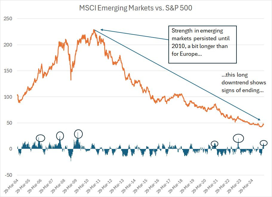
The timing of this cycle is a bit different than for Germany because strength in emerging markets persisted into late 2010 compared to early 2008 for Germany.
That was due, in part to strength in Chinese stocks in the 2008-11 period as the Chinese government was among the more aggressive with fiscal stimulus amid the financial crisis back in 2008-09. As a result, Chinese stocks saw a stronger recovery from the 2007-09 bear market than the S&P 500.
At any rate, there are signs the relative strength downtrend for emerging markets is coming to an end, such as a series of relative strength surges over the past 2 years (see circled columns on my chart).
China has been one of the big winners in that regard with the widely owned iShares China Large Cap ETF (FXI) up 19.2% year-to-date compared to a decline of about 2.7% for the S&P 500 and over 5% for the Nasdaq 100.
And that brings me to this:
The Dollar’s Slide
Cycles in US equity performance relative to the rest of the world historically overlap cycles of strength or weakness in the US dollar and US Dollar Index.
Take a look:
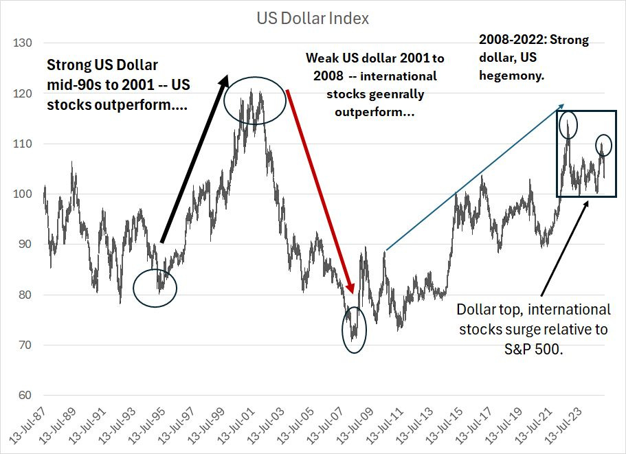
I took this weekly chart of the US dollar back to the late 1980s so you can get a read on the longer-term trends at work.
From the mid-1990s through to the spring of 2001, the US dollar was strong, and the US economy was generally regarded as outperforming most other major developed economies around the world. It should come as no surprise this period of US hegemony roughly corresponds to strong relative strength for US equities relative to stocks outside the US.
The US Dollar Index peaked in the spring of 2001 at an index level over 120, entered a choppy period, and then began to weaken in earnest by the spring of 2002. That bear market ended in 2008.
The period from 2002 – 08 roughly corresponds to a period of international stock outperformance over the US.
The cycle then repeated – broader strength in the US Dollar Index from 2008 through the late 2022 peak, which represented a lower high relative to that 2002 top. This also corresponded to a bout of record-setting US equity market performance relative to the rest of the world.
And that brings us to the current situation.
As you can see, the absolute peak for the US dollar was in late 2022 with the dollar making a second run at those highs early this year.
However, the dollar has now logged a lower high – the 2022 peak was higher than the 2025 peak for the US Dollar Index – and it appears the US currency may be rolling over into a new downtrend.
Right on cue, international stocks have started to show signs of life since late 2022 and early 2023. These multi-year trends in relative strength take time to develop, and even trends in the dollar can be choppy at times, however, I believe we’re witnessing an historic shift similar to the mid-1990s, 2002-03 and 2008.
That’s a tailwind for international stocks relative to the S&P 500.
Underweights and Overweights
It’s only natural that after a multi-year trend you’ll see signs of investor complacency.
Anecdotally, I can remember just how popular international investing was back around the Global Financial crisis years. Prior to the Great Recession, the acronym BRICs entered the popular investing lexicon, referring to the strong economic growth in countries like Brazil, Russia, India and China.
And, coming out of the Great Recession, some political talking heads envied the Chinese government’s ability to push massive top-down stimulus, helping to drive China’s strong economic recovery from the crisis years.
One of the narratives making the rounds in Washington DC was that the US fiscal crisis response was too timid in 2008-09, resulting in a sub-par recovery. Vows not to make the same mistake again led to the (arguably) over-the-top US fiscal response to the 2020 COVID outbreak.
At the end of 2024 the pendulum had swung to the extremes in the opposite direction to 2008.
Long-time readers know I follow the Bank of America Global Find Manager Survey released monthly. It’s a survey conducted of 200 or so active global fund managers with around half a trillion dollars under management collectively.
Well, the December 2024 version of this always-fascinating survey was titled “Max Americana.”
As the title suggests, global fund managers reported a record-high overweight in US stocks based on data going back to 2001, and the biggest underweight in European stocks since October 2022. Investors were most overweight the US relative to emerging markets since June 2012.
Investors were also heavily underweight commodities with the lowest net allocation there since the summer of 2017.
Remember the Lord Rothschild quote from the early 19th century:
“Buy to the sound of cannons, sell to the sound of trumpets.”
Rothschild was speaking about the Napoleonic Wars of his era. The famed financier bought Gilts – that’s UK government bonds – when the news looked most ominous and then made a fortune when bonds rallied following Napoleon’s defeat at the Battle of Waterloo in June 1815.
Or perhaps you prefer Warren Buffett’s equivalent:
“Be fearful when others are greedy and greedy when others are fearful.”
Regardless, my point is simple:
Late last year, investors were more excited about the prospects for the US economy and tech-heavy S&P 500 than they’ve been at any time since 1999/2000 and were positioned accordingly.
That’s the sound of celebratory trumpets in my book.
Or how about the fact that even after the recent retrenchment, the S&P 500 trades at close to 24 times this year’s earnings estimates compared to around 18 times for MSCI Germany Index, a little over 17 times for the United Kingdom, 16.5 times for MSCI Japan and 15 times for the MSCI Emerging Markets Index.
And that’s how sentiment works – when investors have piled all their chips on one outcome, there aren’t many marginal buyers left to power a continuation trend. And that’s when you tend to see reversals.
I believe we’re in the early stages of just such a reversal in favor of international stocks right now.
Historically, rotations in favor of global stocks and out of the dollar also favor commodities as an investment class including precious metals, energy and agriculture among others.
We already have significant exposure to both international stocks and commodities – precious metals and energy -- in the model portfolio and added significantly to the latter in January this year. I plan to continue shifting the portfolio in favor of these trends as I expect this rotation to continue for years to come.
A few words of caution are warranted.
First, I still believe the S&P 500 will see some additional rally attempts in coming weeks and it’s not even clear that we’ve seen the absolute peak of this bull market just yet. Indeed, since the end of 2022 the broader market has pulled back on multiple occasions, and we’ve heard talk of recession, resurgent inflation and a budding credit crisis. Each time, the market bottomed as sentiment turned negative and then ripped higher, punishing the anticipatory bears.
Those are some painful scars and it’s hard for investors to forget those lessons.
That’s why when bull markets ultimately peak, you’ll usually see multiple retests or rallies close to all-time highs before the market rolls over.
That’s also why I’m not going to recommend a dramatic, sudden reallocation out of US stocks in the model portfolio. With trends like this it’s better to be patient than to try to be a hero and call the top or bottom.
Further, there remain multiple corners of the US market that remain interesting, and I believe should continue to perform well in coming years. Since technology and growth stocks dominate the US averages, US underperformance would likely take the form of more modest gains in tech stocks in coming years while other sectors claim the leadership mantle.
Second, and in a related note, I have some good news and some bad news.
Let’s start with the good:
Relative strength “rotation” themes like this tend to persist for years and, for investors who recognize what’s happening they can be enormously profitable.
The bad news is that it’s all easier – a LOT easier—to recognize these trends in hindsight, such as in the longer-term charts I showed you earlier on, than to stick with a rotation theme at the proverbial hard right edge of the chart.
Look back at the 2000-2008 cycle. We saw the first signs of US relative strength weakening relative to international markets back in 2000. We saw a similar surge in commodities at that time
However, there was significant chop in these trends between 2000-02 before the real strength in global equities and groups like energy got underway in 2003. Similarly, in this cycle, international stocks saw their first upside breaks in late 2022; many international markets then proceeded to see new relative strength lows to the S&P 500 by 2024.
Now, more than two years after the first signs of this global rotation theme, and after the US dollar peaked, we’re finally seeing further signs of a longer-term shift underway.
And while my base case remains for the US to skirt recession in 2025, we might well have to hit the pause button on this theme should a US recession and bear market rise into view. After all, while global stocks peaked relative to the US in early 2008, the US market still fell dramatically in 2008 and early 2009; the carnage in markets like Germany was just somewhat worse in percentage terms.
Market trends usually take the form of a few steps forward followed by a step in reverse; they rarely proceed in a straight line. In my experience, longer-term trends are the most profitable you’ll encounter, but also more prone to these gut-checks in the form of periodic nasty corrections and pullbacks.
Again, this argues for patience as these rotations unfold.
Third, some of these trends are extended near-term. For example, I recommended adding exposure to European financials just over two months ago on January 21st and that recommendation is already up about 18% while the US market is trading lower over an equivalent holding period.
I wouldn’t recommend adding to that recommendation at this time and it remains well above my recommended “Buy Under” price listed in the portfolio table. However, it’s a theme I’m watching closely and I’m likely to recommend adding on the (inevitable) pullback.
Readers interested in how to profit from the Great Cycle rotation favoring global stocks and commodities like energy and precious metals can now take advantage of my limited time FREE trial offer to the paid tier of Free Market Speculator available only via this link:
Gain access to all of our model portfolios and updates for the next 60 days. If you decide FMS isn’t for you, simply cancel your membership before your 60-day free trial expires and you won’t be charged.
This week, however, I’m recommending adjustments to the model portfolio to benefit from this ongoing rotation theme. Specifically, I’m bidding adieu to one recommendation in the model portfolio while paring our exposure to a second. Meanwhile, I’m boosting exposure to one international market I see as a timely buy as we move into April; I believe we could see this market play catch-up to European markets in the next 3 to 6 months.
I’ll also provide a brief rundown of the main recommendations already in the model portfolios that represent leading beneficiaries of the multi-year rotations I’m writing about in this issue. These include my top plays on energy, precious metals and global markets that have helped the model portfolio outperform the S&P 500 year-to-date in 2025. I’m updating my buy advice and raising targets on several of these recommendations.
Here's a rundown:
Keep reading with a 7-day free trial
Subscribe to The Free Market Speculator to keep reading this post and get 7 days of free access to the full post archives.