


Wake Up: Energy is a Growth Business
Energy valuations are still cheap...

Editor’s Note: This week I’m excerpting the bulk of my feature article from a note I recently published for The Free Market Speculator’s sister publication, Energy & Income Advisor, because it’s entirely relevant to the topics I cover here as well.
For FMS paid tier readers who are also EIA subscribers, my apologies for the repeat; however, I’m also making several changes to the model portfolio including the sale of a longstanding recommendation, a new addition to benefit from the rally in commodities and a hybrid fixed income (bond) ETF with a yield of 5.7% right now.
Those additions, and relevant commentary, are included in the “Actions to Take” section below.
-- EG
Energy and commodity stocks have been on a tear this year and, for that matter, the past 3 years.
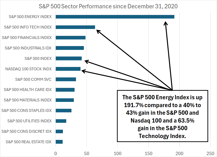
Year-to-date, energy is the second best-performing sector in the S&P 500, up 15.9%, well over double the S&P 500’s return of around 7%. And, since the end of 2020, there’s just no contest:
Source: Bloomberg
Over the past 3-plus years since the end of 2020, the S&P 500 Energy Index is up more than 191%, triple the gains of the next best-performing sector in the S&P 500, Information Technology, up just 63.5%.
After a rally of that magnitude, it’s only natural I’d start to get questions, asking if the big run-up in energy might be over or if these stocks might be getting close to overvalued.
Well, it’s quarterly earnings season and, over the past few days, I’ve studied earnings releases from the handful of energy stocks that have already reported and I’ve started updating my models and notes on some of the key names I follow due to report over the next few weeks. I, like most analysts who follow the sector, have taken to valuing energy stocks a bit like a butcher might approach a side of beef.
For the butcher, what’s important is how many steaks he can cut, how many pounds of ground meat it’ll yield and how the value of all those products compares to his raw material cost.
The equivalent for valuing an energy producer is to assess how much free cash flow a company can earn assuming commodity prices near current levels, how many years of drilling inventory a producer has left, how much hedging they perform to protect against short-term downside in commodity prices and how much capital they need to spend to maintain current free cash flow.
I then string together these cash flow estimates and use a discount rate like 10% to derive a present value of future cash flows.
In other words, it’s broadly implied there’s little or no real growth in the energy industry over the long haul – most have been looking at, and valuing, producers like a fixed, finite pile of potential free cash flow to exploit and pay as dividends, use to pay down debt and/or buy back stock over the next decade or so.
If you valued technology stocks, or stocks in just about any other industry group out there, using a similar “finite” approach you’d be laughed out of the room.
Take a look:
Source: Bloomberg
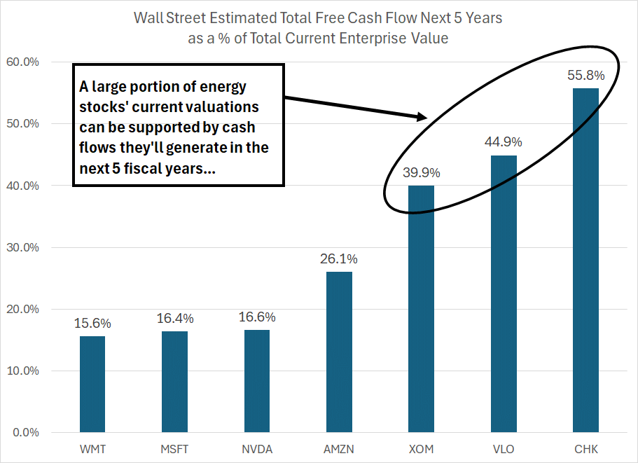
To create this chart, I examined consensus Wall Street expectations for annual free cash flow in each of the next 5 fiscal years, comparing the sum of 5 years expected future cash flow to the current enterprise value of the stock. Enterprise value is a measure of the total market value of a company including both market cap (the value of outstanding equity), the value of preferred stock and net debt.
I’ve included three energy companies – refiner Valero (NYSE: VLO), major Exxon Mobil (NYSE: XOM) and gas-focused producer Chesapeake Energy (NYSE: CHK) – as well as three prominent tech or growth stocks, NVIDIA (NSDQ: NVDA), Amazon.com (NSDQ: AMZN) and Microsoft (NSDQ: MSFT). For good measure, I threw in an “Old Economy” bellwether, retail giant Walmart (NYSE: WMT).
Note that, in most cases, Wall Street free cash flow estimates for energy companies 3 or 4 years in the future are on the low side; certainly, well below our long-term estimates based on $85/bbl West Texas Intermediate oil prices and natural gas in that $3.50 to $4/MMBtu region.
However, even using low (sometimes insanely low) Wall Street free cash flow estimates, cumulative free cash flow from Exxon over the next 5 years is equal to just under 40% of the stock’s current enterprise value. It’s even higher for the other two energy names in this list, Chesapeake and Valero.
So, one need not make Herculean assumptions about the state of the world in 2030 or 2035 to justify the current valuation for a name like Chesapeake.
In contrast, the current valuations for names like Microsoft, NVIDIA and Wal-Mart is approximately 80% to 85% based on money they won’t earn until after 2030 or so.
In year 5, Wall Street expects Microsoft’s free cash flow to grow at a year-over-year pace of 27.6% and for NVIDIA the consensus sees 46.1% growth on the same basis. In contrast, for Exxon and Chesapeake the current estimates imply year 5 cash flow growth of 1.6% and negative 10.6% respectively.
Please understand, I’m not necessarily saying Microsoft and NVIDIA are overvalued at the current quote, that a mature energy stock like Exxon should be valued in a similar way, or that today’s growth high-flyers won’t continue to show solid growth into the 2030s. However, the gap in expectations is extreme.
In particular, the willingness to ascribe higher valuations to a stock like NVIDIA based on expected growth in revenue and cash flow 10 years from now is remarkable in contrast to a name like Exxon.
Of course, the subtext of all this is a view that fossil fuels – crude oil, natural gas, and coal -- are living on borrowed time.
Rumored Death Greatly Exaggerated
Even as the 2014-2020 bear market in energy commodities ended, and oil prices began to ramp higher into 2021, there was plenty of talk of “the last cycle,” the final rally in oil and natural gas prices before fossil fuel demand peaked.
In December 2020, a tiny activist hedge fund called Engine No.1 launched a campaign to install new members on Exxon Mobil’s board. One of their main arguments against the supermajor was the company’s $30 billion annual capital spending campaign to boost production.
Engine No. 1 wrote:
In 2018, ExxonMobil announced plans to spend ~$30 billion annually on capex from 2020-25. While oil and gas companies must spend to offset natural decline rates in producing assets, this spending plan went far beyond that needed to maintain the Company’s current production and targeted growing production by ~25% to ~5.0 mboe/d by 2025, highest among the Oil Majors.
Source: Engine No. 1 Letter to the ExxonMobil Board December 7, 2020
The letter went on to say that Exxon had “little material exposure to newer growth areas” like renewable energy in comparison to peers like BP (NYSE: BP) and Norway’s Equinor (NSDQ: EQNR).
Engine No. 1’s campaign against Exxon clearly captured the attention of the mainstream media, which went on to gush headlines like “The Little Hedge Fund Taking Down Big Oil,” appearing in The New York Times as recently as June 15, 2023.
The implication was the world didn’t need more of Exxon’s oil and natural gas because it was rapidly transitioning to alternative fuels. Fast forward 3-plus years and Engine No. 1’s arguments advanced in 2020, and parroted endlessly in various mainstream media outlets ever since, look woefully off-target:
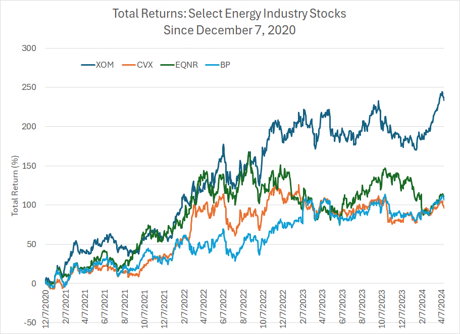
Source: Bloomberg
Since December 7, 2020 Exxon shares are up a whopping 233.3% compared to gains of 110.1% for Equinor and about 106.8% for BP. In other words, Exxon’s production-growth focused strategy produced more than double the gains of the two more “forward-thinking” energy giants directly referenced in Engine No. 1’s letter.
Why have Exxon’s shares outperformed?
Precisely for the reasons cited back in 2020 when we recommended buying the stock in Energy & Income Advisor. Big oil’s main advantage is cost of capital – the ability to borrow money to invest in the downcycles when costs are low, so that they’re able to grow production and harvest cash flows during the inevitable industry upturns. Exxon followed that successful time-worn script in 2020, most of its peers did not.
The result: World-class growth projects like Guyana for Exxon, superior cash flow growth and a soaring stock price.
More recently, the International Energy Agency (IEA) published a report predicting global oil, natural gas ,and coal consumption would each peak globally by 2030. Again, that report was widely cited in the mainstream media, ignoring the IEA’s well-known propensity to dramatically underestimate global oil demand and the tightness of the global oil market.
The problem with all this, of course, is that the industry isn’t dying – it’s growing:
Source: Energy Institute, Statistical Review of World Energy 2023
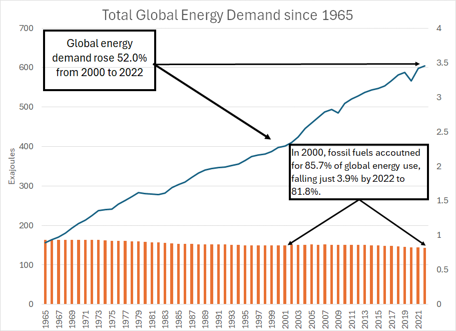
Each June, the Energy Institute publishes its annual Statistical Review of World Energy including a wealth of statistics on global energy markets.
One statistic is primary energy consumption – that’s energy from all sources consumed for all uses including transportation, electricity generation and industrial consumption. They measure consumption in Exajoules and, as you can see here, total global energy demand has increased by a factor of about 3.9 times since 1965 and roughly 52% since 2000 alone.
The orange bars along the bottom of the chart show the contribution from the three most important fossil fuels – oil, natural gas and coal. For example, in 1965 these 3 fossil fuels accounted for about 93.4% of global energy demand and by 2000 it had fallen to around 85.7%.
Over the 22 years from 2000-2022, global energy demand rose 52% while the share of that total generated by oil, gas and coal fell less than 4% to a still dominant 81.8%.
So, if you’re forecasting peak demand for fossil fuels by 2030, that implies at least one of the following two scenarios:
1. A drop in global energy demand the likes of which we’ve not seen in modern history.
2. A sudden, dramatic transition away from the sources of energy that account for almost 82% of global demand today.
Neither is realistic.
Energy demand is a consequence of economic growth:
Source: Energy Institute, Bloomberg
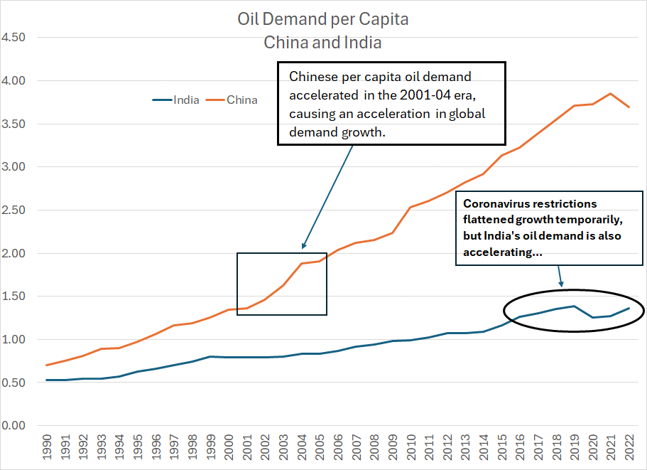
This chart shows total per capital oil consumption in China and India from 1990 through 2022.
Back in 2000-01, Chinese oil demand was just under 1.5 barrels per person per year. As economic growth accelerated in this era, oil demand on a per capita basis spiked; since China’s population is so vast, this translated into a parabolic increase in actual demand which upended the global supply/demand balance for crude.
The simple fact is that as consumers become wealthier and the economy grows, energy demand accelerates – that’s exactly what happened in China 20 years ago.
Today, China is the second-largest oil consumer in the world. While the government’s draconian efforts to control coronavirus in 2020-22 curbed growth, China still consumed more oil in 2022 than all countries in Europe combined.
Look at India.
Today, the country consumes about the same amount of oil as China did in 2001, around 1.36 barrels of crude per person per year. India’s population is overtaking China’s due, in part, to the country’s relative youth – a median age of 32.4 years compared to 37 in China – and a higher birth rate.
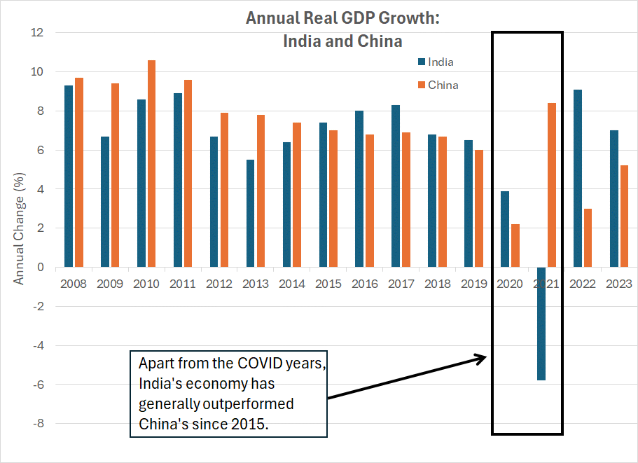
While smaller, India’s economy has also been growing at a faster pace since roughly 2015:
Source: Bloomberg
This chart shows annual growth in real (inflation-adjusted) Gross Domestic Product (GDP) for India and China since 2008.
As you can see, apart from 2020-2021 – years where growth patterns were distorted by COVID lockdowns – India’s economy has been outperforming China in terms of overall growth.
Given that impressive growth backdrop, we’re likely approaching a tipping point for Indian energy demand much as we saw for China back in 2002.
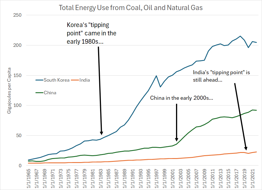
That point is underlined even more dramatically if you consider overall primary energy demand from fossil fuels per capita rather than solely oil:
Source: Bloomberg
This chart shows total per capita primary energy demand from coal, oil and natural gas for three countries – South Korea, China and India.
The key point to understand is that every country reaches a tipping point of demand – a point in its economic development – where per capita energy demand accelerates rapidly.
For South Korea, that was the early 1980s and for China it was the early 2000’s as I’ve outlined.
India’s energy demand is already growing at a steady clip – on this basis, the country’s per capita demand grew by about 26.2% between 2012 and 2022. Multiplied by the nation’s vast population, that’s significant especially when you consider the temporary global volatility in energy demand amid coronavirus lockdowns in 2020-2021.
However, the true “tipping point” for India likely lies ahead and given the acceleration in economic growth I believe it’s imminent.
In 2022, oil, gas and coal accounted for more than 88.5% of India’s primary energy consumption, 82.4% in China – even 83.5% in South Korea. So, when a massive country like India reaches the tipping point that means not just more energy, but more oil, more natural gas, and more coal.
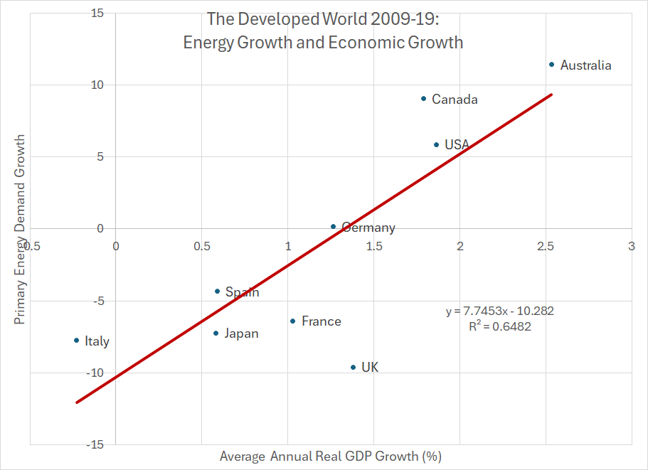
Even in developed countries like the US, Japan and nations across western Europe, there’s a clear correlation between economic performance and energy demand:
Source: Bloomberg, Energy Institute
To filter out the effects of country-to-country variations in coronavirus lockdowns and restrictions, let’s compare primary energy demand growth from 2009 to 2019 with the average annual real GDP growth over the 2009-19 period inclusive.
On this scatterplot you’ll find a list of nine developed countries across Asia, Europe, and North America. Primary energy demand growth is plotted on the vertical (y-axis) and annual average GDP growth on the horizontal (x-axis).
I’ve also traced a trendline here and overlaid the corresponding equation and R-squared value.
The relationship is clear – countries that enjoyed above-average economic growth in this period such as Australia, Canada and the US also saw the strongest growth in primary energy demand. Countries with weaker economies over this period such as Italy, Spain and Japan saw outright declines in primary energy demand.
The R-squared value suggests relative rates of economic growth explain almost two-thirds of energy demand growth from 2009-2019.
Simply put, energy demand is growing and that’s a trend that’s likely to continue for the foreseeable future as it has for the past century. Since the three main fossil fuels – oil gas and coal – still account for over 80% of global energy consumption, companies in the business of producing, refining and transporting these fuels are also growing.
Fossil fuels aren’t dying, not even close, and this isn’t the last cycle for the industry.
And that brings me to this:
Strong Returns Yet Still Cheap
Considering the inexorable rise in global energy demand and economic development of emerging markets like India, the current valuation standard for the industry makes little sense.
The energy industry, sitting at the heart of the global economy, is a going concern not an industry living on borrowed time.
Moreover, when you consider fossil fuels account for almost 82% of global energy demand and have only shed around 3.9% of global market share since 2000, it’s hard to imagine a scenario where the world doesn’t derive MOST of its energy from the same three fuels 10, 20, even 30 years in the future.
That’s not to say alternative energy won’t grow – it will. And it’s not to say technological advancements won’t continue to make the world more energy efficient and less dependent on imported fuels. These are all trends that have been underway, in one form or another, for at least the past 60 years.
What it does mean is that if the oil and gas industry has decades of life ahead, then many high quality energy companies in our coverage universe are dramatically undervalued.
In conversations with readers and following presentations and interviews I’ve done over the past few months, I’ve fielded several questions regarding the potential upside for various energy stocks in light of dramatic gains over the past three years.
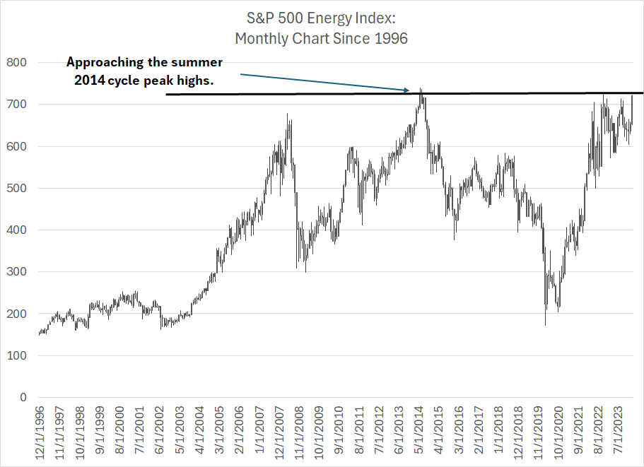
On an absolute basis, the S&P 500 Energy Index is now close to its all-time highs:
Source: Bloomberg
This is a monthly chart of the S&P 500 Energy Index since 1996.
As you can see, the previous cycle peak for the industry was the summer of 2014, a time when US oil production was soaring thanks to an unrestrained boom in shale production. This peak occurred just ahead of OPEC’s Saudi-led decision to boost output and cease their efforts to prop up prices, a price support campaign that had literally fostered, and financed, the shale boom of the preceding 5 years.
As I’ve written before, the cycle low was 2020 and, in my view, we’re now in a new energy supercycle.
Look at that chart and you’ll see that on an absolute basis the S&P 500 Energy Index is approaching its 2014 peak. That implies most energy-focused stocks are also near multi-year highs; it’s only natural to wonder if these stocks might be fully valued, or if it’s time to take some profits, in light of that move.
However, energy stocks only look expensive relative to recent price history – in terms of underlying fundamentals this move is just getting started:
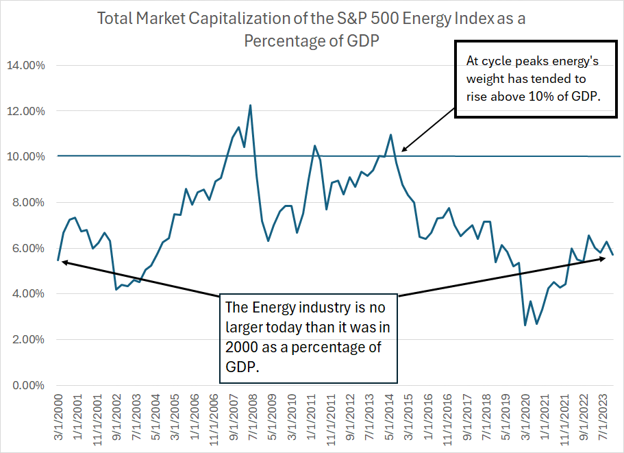
Source: Bloomberg
This chart shows the total market capitalization of the S&P 500 Energy Index – the largest energy companies in the US – as a percentage of US Gross Domestic Product for each quarter from Q1 2000 through Q4 2023.
As you can see, energy’s share of GDP on this basis is unchanged at a little under 6%.
However, there have been two major cycles for energy in the past 24 years that have occasioned some major swings in the Energy-to-GDP ratio. The first began back in the early 2000s and ended in 2014. This long cycle can be divided into three waves – two upcycles from 2002 to 2008 and 2009 and 2014 and one (short) downcycle amid the Great Recession and financial crisis of 2007-09.
The industry then entered a downcycle in 2014 and a new (multi-year) upcycle in 2020.
As I’ve explained, energy sits at the heart of the global economy and there’s a strong correlation between economic growth and energy demand over time.
Moreover, every energy inflation supercycle since the 1970s has ended only after years of investment that brought about new energy supply that ultimately brought down prices. It wasn’t the Fed that brought down oil prices in the early 1980s, it was a surge in new non-OPEC production from Mexico, the North Slope of Alaska, and the North Sea of the UK and Norway that broke OPEC’s grip on global supply.
And in 2014 Saudi didn’t purposely allow oil prices to crash for the fun of it – they did so because a decade of investment in new techniques to produce oil and natural gas from US shale fields resulted in a boom in US production starting around 2010-11.
Simply put, the key to ending an energy supercycle is capital spending from energy companies like those in the S&P 500 Energy Index and their ability to finance the needed investment is correlated to size.
Comparing the S&P 500 Energy Index market cap to GDP makes sense – when this ratio is elevated it’s the market’s way of providing an incentive to encourage new supply.
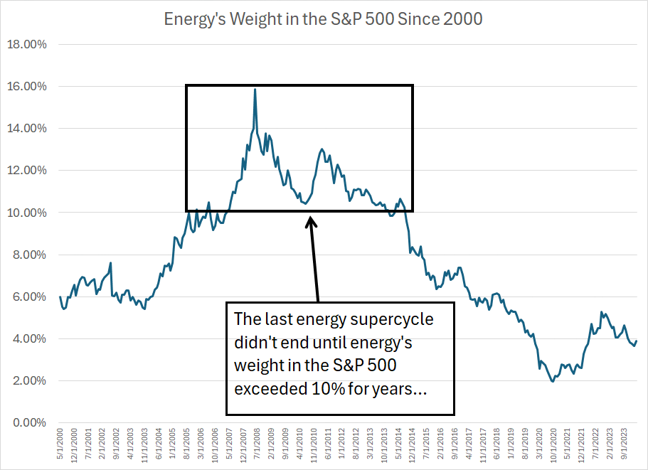
At the peak of the last big supercycle in 2008 and 2014, the S&P 500 Energy Industry reached a market cap north of 10% of GDP. I believe we could see something similar this time around.
A slightly different way to look at this is energy’s weight within the S&P 500, which currently sits at just 4.13%:
Source: Bloomberg
As you can see, energy’s weight in the S&P 500 is miniscule by historical standards, even lower than it was in 2000-02, just before the big run-up in commodities and stocks from 2002 to 2014.
The last cycle didn’t end until energy’s weight in the S&P exceeded 10% for a period of around 7 years, reaching as high as just under 16% at the 2008 peak.
Simply put, affordable energy sits at the heart of the US economic engine, and we rely on capital spending from these companies to provide these vital fuels. Clearly, energy companies need to be bigger – potentially many times the current size – to fund the level of investment needed to secure the nation’s economic future.
I believe we’re nearing a crucial tipping point, and the tide is clearly shifting.
Party Like it’s 2005
I’m often asked where I believe we are in the current energy cycle.
To use the last supercycle from 2002 to 2014 as analogy, I think it’s the autumn of 2004:
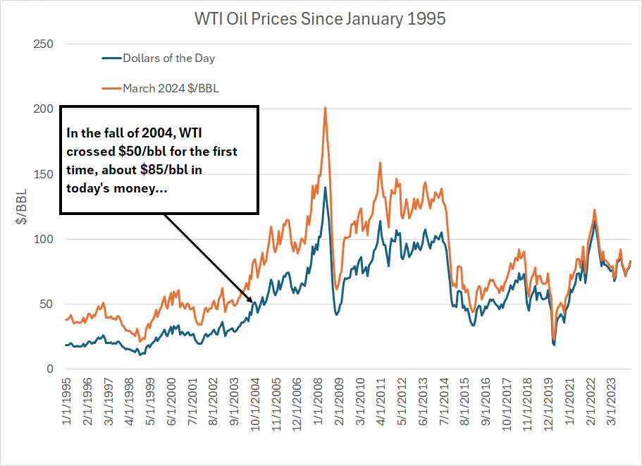
Source: Bloomberg
This chart shows the price of West Texas Intermediate (WTI) crude oil on a monthly closing basis since January 1995. I’m using two different measures here – the blue line shows the actual closing price of oil each month in dollars of the day while the orange line is inflation-adjusted, priced in March 2024 US dollars inflated using the Consumer Price Index (CPI).
As I’ve labeled, WTI crossed above $50/bbl for the first time around October 2004 and, as a young analyst running a new energy-focused research service at the time, I was delighted to be invited as a guest on a radio program regarding the then-recent jump in oil prices.
The (guest) host of the show argued oil prices over $50/bbl were unsustainable, citing the prevailing view at that time, grounded in the experience of the late 1990s. The view then was that the world was awash in supply, demand growth was slowing, and new fields were under development, holding out the prospect of endless cheap energy. It was the same basic idea behind The Economist magazine’s now (in)famous cover story “Drowning in Oil,” published in early March 1999.
I argued then that China’s demand was on the rise, many of the world’s largest fields were ageing and seeing declining production and that, thanks to low energy prices, global energy companies weren’t investing enough to replenish supply and enable the next wave of accelerating global economic growth.
Well $85/bbl is the new $50/bbl – on an inflation-adjusted basis, $85/bbl WTI today is roughly equivalent $50/bbl in October 2004.
And I’d make -- indeed I’ve just made -- the very same arguments as I did (almost) 20 years ago. Global energy demand is growing, India today looks a lot like China in 2004 and years of low oil and natural gas prices have resulted in a collapse in capital spending from global energy firms.
Investors then were complacent about global supply, looking at established producers like Venezuela, Mexico, even the UK to continue growing and for OPEC to maintain millions of barrels of spare capacity year-after year.
Today, investors are arguably even more complacent than they were two decades ago, penciling in dramatic growth in US shale supply despite clear signs it’s slowing. They’re also using unrealistic demand assumptions based more on ever-shifting government targets, and political campaign speeches, than the economic and physical realities of growing global energy growth in a world that relies on fossil fuels to meet 81.8% of that demand.
Then as now, far too many investors treated energy as some sort of Old Economy anachronism with, at best, a decade of life remaining. Stocks were valued accordingly, and many wondered if the sector was overvalued as energy stocks approached the top of their 1990s range.
However, not long thereafter in 2005, a switch flipped in markets – there was something about that jump over $50/bbl that catalyzed an historic re-rating in valuations for energy stocks. And, from the middle of 2004 through the middle of 2014, the S&P 500 Energy Index returned more than 254%, the best-performing sector in the S&P 500 and more than double the S&P 500’s 111.6% gain.
I believe we’re seeing tangible signs of a similar re-rating in energy markets right now.
Case in point, just 3 years ago in April 2021, shale giant Pioneer Natural Resources (NYSE: PXD) announced a deal to acquire privately held DoublePoint for about $6.3 billion. The stock was smoked, tumbling more than 14% in a matter of days while some analysts published notes decrying a potential loss of capital discipline.
In February of this year, Diamondback Energy (NSDQ: FANG) announced a deal to acquire Endeavor Energy Resources for $25.9 billion – on a per acre and flowing barrel basis this was multiples of the valuation paid for DoublePoint – and the stock soared on the news. The rationale: Diamondback was paying a reasonable price for great acreage and given its low-cost structure would be able to generate significant free cash flow as a result of the deal.
And, as I already outlined, Exxon’s capital spending and production growth plans, denounced by many on and off Wall Street in late 2020, have resulted in superior performance relative to its peers. Meanwhile, Equinor and BP, have U-tuned on their prior plans to cut CAPEX, allow production to fall, and redeploy spending to alternative energy.
Twenty years ago, analysts started to shift their long-term commodity price assumptions from $35 or $40/bbl in 2004 to $50 or $60/bbl a few years later, resulting in a significant re-rating for the group. Today, I believe we’re seeing a similar pattern and changing your assumed long-term oil price assumption from $70 to $75/bbl to $85 to $95/bbl implies a massive surge in free cash flow and significantly higher price targets.
Ultimately, I believe oil prices could move even higher than that.
In the model portfolio that’s part of the paid tier of FMS, we already have significant exposure to the energy sector as well as other commodity levered groups that appear to be in the early stages of major upcycles. I’ve also written several posts this year regarding the ongoing rotation we’ve been seeing into groups like energy and how it all looks similar to the real asset decade of the 1970’s.
With these points in mind, I’m making some changes to the model portfolio this week:
Keep reading with a 7-day free trial
Subscribe to The Free Market Speculator to keep reading this post and get 7 days of free access to the full post archives.