


A Pullback Looks Likely
Here's why and changes I'm recommending

In last week’s market update I previewed the busy week ahead for US markets including a deluge of economic news, corporate earnings, the US Treasury’s quarterly refunding statement and a Federal Reserve meeting.
Overall, the stock market had a decent week with the S&P 500 up about 1.4% and the Nasdaq up 1.3%.
Even Treasury bonds rallied overall (yields fell) despite the sell-off Friday and following the January Employment Report with the the iShares 20+ Year Treasury ETF (NYSE: TLT) rallying 2.8% including distributions. The yield on 30-year Treasuries hit a year-to-date peak of 4.41% on January 24th and now stands closer to 4.32%.
At first blush, trends in equity and fixed income markets appear benign; however, I see rising risks for stocks this month and believe it’s now time to act, adjusting our exposure in the model portfolio that’s part of the paid tier of Free Market Speculator.
Investors interested in trying the paid tier of FMS, including the model portfolio and access to my soon-to-be-released special premium report on fixed income ETFs, can do so absolutely free by taking advantage of my limited-time 30-day free trial offer available by tapping here:
Let’s start with this: The January employment number was strong – very strong.
Not only was the headline number -- +353,000 total payrolls – far above the 185,000 economists had expected leading up to the report, it was above the highest estimate on Wall Street (+300,000).
Moreover, in a dramatic change from the trend of the past year, we saw some significant positive revisions to prior months’ releases this month:
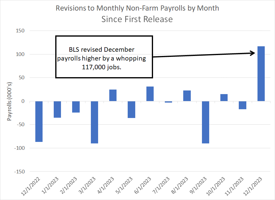
Source: Bloomberg, Bureau of Labor Statistics (BLS)
Of course, as always, there are some details within the report that weren’t quite so red-hot including a drop in Household Survey payrolls and a 0.2 decline in average weekly hours worked. However, given strength in other data we’ve seen in the past few days, it’s clear the US economy gained a bit of momentum at the end of last year and into early 2024.
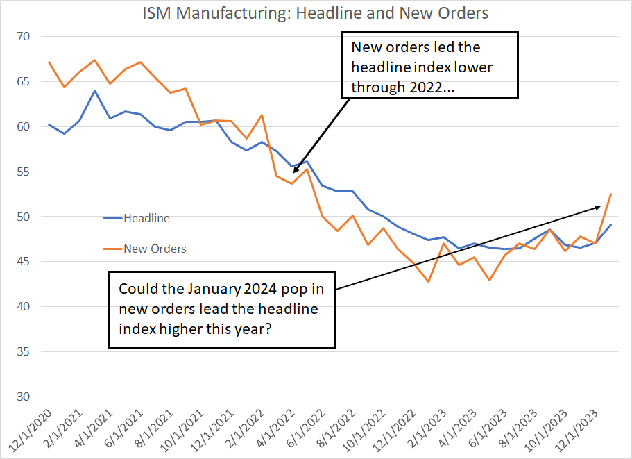
For example, look at the Institute for Supply Management (ISM) Manufacturing Purchasing Manager’s Index (PMI) released last Thursday:
Source: Bloomberg, Institute for Supply Management
Generally, the ISM Manufacturing Index is one of my favorite economic indicators because of its historic tendency to lead economic activity. And, within ISM, the New Orders component is a leading indicator of future trends in manufacturing. That’s logical because when a manufacturer sees a rise in the pace of incoming orders, they tend to boost production to meet rising demand.
It also turns out theory holds up in practice. As you can see in my chart, the New Orders component slipped below the headline ISM in the spring of 2022 and then led the headline lower through the remainder of that year. Then, in 2023 the headline ISM remained stuck below 50 – the level that divides manufacturing expansion and contraction – and continued its gradual deterioration into last summer. Again, new orders continued to lead on the downside.
However, in January, the new orders component popped over 50 for the first time since mid-2022 to a reading of 52.5. While the headline index remains mired in contraction below 50, it’s entirely plausible the bump in the ISM New Orders index will once again lead, suggesting a reacceleration of the economy into early 2024.
Stronger Economy, Higher Rates?
At the press conference following last week’s Fed meeting, Chair Jerome Powell pushed back forcefully against market pricing speculating on a March rate cut. At the beginning of January, the Fed Funds futures market had priced a near-certainty of a 25-basis point cut at the Fed’s meeting on March 20, 2024 and, one week ago, this market was priced for about a 50% chance of a cut next month.
However, following last week’s Fed meeting and the positive economic news out over the past few days, Fed funds are pricing in just a 1-in-5 shot of a Fed cut next month while the probability of a cut on May 1st stands at 75% down from a near-certainty just a few days ago.
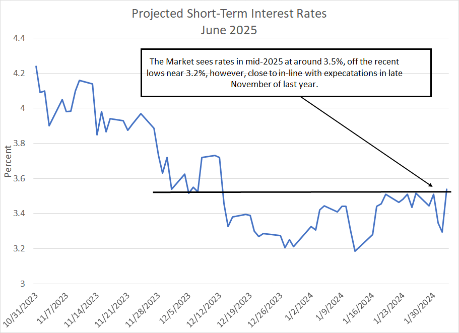
While the path for the Fed has changed in dramatic fashion, the destination hasn’t:
Source: Bloomberg
This chart shows the rate priced into SOFR futures (a benchmark short term interest rate) for June 2025, the middle of next year.
Today, these futures are priced for a mid-2025 rate a little over 3.5%, which is up from the early January 2025 lows around 3.2%. However, that’s almost exactly the rate market participants were looking for at the end of November and it still represents some 175 basis points in interest rate cuts over the next year-and-a-half.
Moreover, it’s worth noting that despite all the events of the past week, the market isn’t exactly embracing the higher-for-longer rates and economic “no landing” narrative that prevailed from August through mid-October last year.
Indeed, benchmark 10-yields yields currently stand at about 4.13%, which is slightly lower than the 4.16% close on December 5th, around two months ago. Indeed, last year’s low for the 10-year yield on April 6, 2023 was 3.31% and the peak was 4.99%, so the current yield of 4.13% is close to the midpoint of the range since the end of 2022 (around 4.15%).
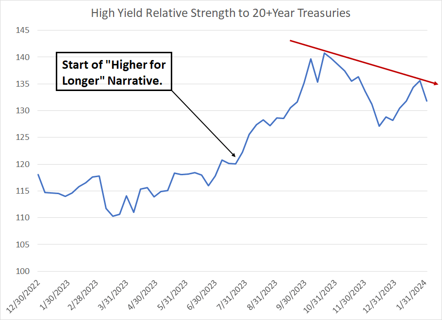
The bond market generally doesn’t seem particularly convinced by the no landing scenario:
Source: Bloomberg
I created total return indices for the iShares 20+ Year Treasury Bond ETF (NYSE: TLT) and the iShares iBoxx High Yield Corporate (NYSE: HYG) exchange-traded funds (ETFs). This chart shows the relative strength of the HYG compared to the TLT, where a rising line suggests high-yield (junk) bonds are outperforming long-term US government bonds and vice versa.
Normally, when the economy is booming, you’d expect to see high-yield bonds outperform long-term Treasuries. That’s because long-term Treasuries have no real credit risk but have significant interest rate risk – if rates rise, long-term Treasuries decline in price (yields go up). So, if the economy is strong, you’d expect to see yields rise as the market prices in higher interest rates needed to control inflation.
In contrast, high-yield bonds have significant credit risk and default rates historically rise during recessions. So, when the economy solid, and prevailing rates rise, high-yields bonds can still rally because the risk of default – and the yield spread over Treasuries – tends to contract.
This scenario was evident when the higher-for-longer interest rate narrative held sway from August through mid-October last year – as my chart shows, the ratio spiked over this time. However, since last October this ratio has dropped and, over the past week, despite the positive economic news and hawkish Fed, this ratio is down slightly.
And that brings me to the stock market:
Seasonal Headwinds Meet Overbought Stocks
Back in October I began to write about the prospects for a year-end rally and, late last year I explained how the rally could extend into early this year.
It has been a solid run – from the end of October 2023 through the end of January 2024, the S&P 500 jumped almost 16%, the Russell 2000 rallied 17.7% and the Nasdaq 100 was up about 19.2%.
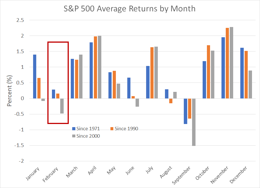
Source: Bloomberg
This chart shows average monthly returns for the S&P 500 since 1971, since 1990 and since 2000. As you can see, February is seasonally a week month for the broader market; seasonal strength resumes in the March-April period.
As always, I never make market forecasts based solely on seasonality. However, just as the year-end rally in October dovetailed nicely with some of the other technical and economic indicators I follow, I see a good set-up for a period of seasonal weakness this month. As I pointed out last week, the Nasdaq is coming off an extreme overbought reading:
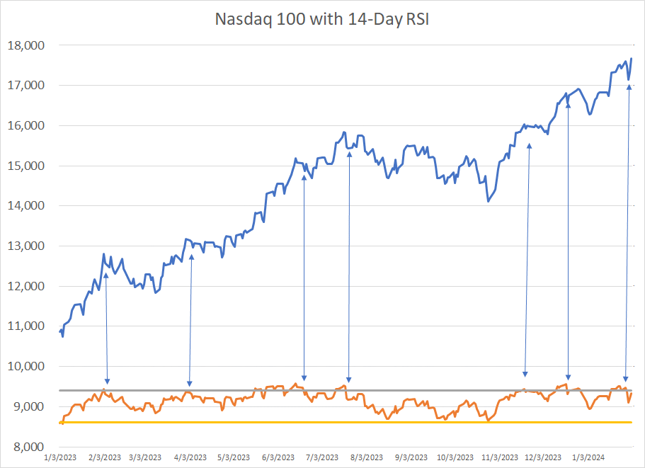
Source: Bloomberg
As you can see, these overbought readings don’t always work out immediately; however, over the past year extreme overbought readings have tended to precede at least short-term bouts of profit taking in the Nasdaq 100.
And that brings me to this:
Strong Indices, Spreading Weakness
On Friday, February 2nd, the Nasdaq 100 rallied over 1.7% following strong earnings releases from Meta (NSDQ: META) and Amazon.com (NSDQ: AMZN) as well as a hotter-than-expected January Employment Report.
However, while the Nasdaq 100, Nasdaq Composite and S&P 500 were all higher in Friday’s session, decliners led advancers on the Nasdaq by a margin of 1,079 issues and on the NYSE by a margin of 1,190.
I took a quick look at the history of this data for the Nasdaq since the late 1990s and it turns out that it’s unusual to see such a strong one-day advance with so much underlying market weakness:
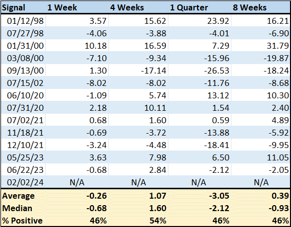
Source: Bloomberg
Since the end of January 1997 (about 6,800 trading days) I could find only 14 days, including Friday, where the Nasdaq 100 rallied more than 1% while declining issues traded on Nasdaq outnumbered advancers by 750 issues or more.
This table shows median, and average (mean) returns for the Nasdaq 100 following these dates over the ensuing 1 week, 4-week, 8-week, and 13-week (1 quarter) holding periods.
Let me put these numbers into a bit of perspective. The average gain over all one-week holding periods since the late 90’s is about 0.29% and the Nasdaq 100 is positive 56.6% of the time. In contrast, in the 5 trading days following each of the weak breadth signals I just outlined, the Nasdaq 100 falls 0.26% and is positive only 46% of the time.
Interestingly, the return over 13 weeks (1 quarter) following these bad breadth days is even more negative. Over the entire sample period, the Nasdaq 100 is higher in 68.6% of all 13 week holding periods for an average gain of about 3.74% while the 13 weeks following poor breadth signals, the Nasdaq 100 is higher only 46% of the time for an average return of -2.12%.
We can’t draw too many conclusions about a single day’s trading action or a signal that’s only registered 14 times since the late 1990s.
However, take a quick look at some of the signal dates highlighted on my chart and you’ll find some troubling precedents including a series of signals in 2000, just ahead of the Nasdaq-led bear market of 2000-02 and a signal in the summer of 1998 when the Nasdaq 100 fell over 22% from its July highs to its early October lows that year.
More recently, poor breadth signals on this basis generated useful signals in the summer and winter of 2021, before and after the cycle peak for the Nasdaq 100 on November 19, 2021.
And when you combine this signal with poor seasonality in February and additional breadth signals I’ll outline in just a moment, it’s sufficient to give me pause and take a more defensive tact.
Declining New Highs
There’s no such thing as an infallible indicator for divining near-term market trends, which is why I watch multiple technical and fundamental indicators that have a history of providing useful signals.
If a balance of those indicators points to elevated risks, I sit up and take notice.
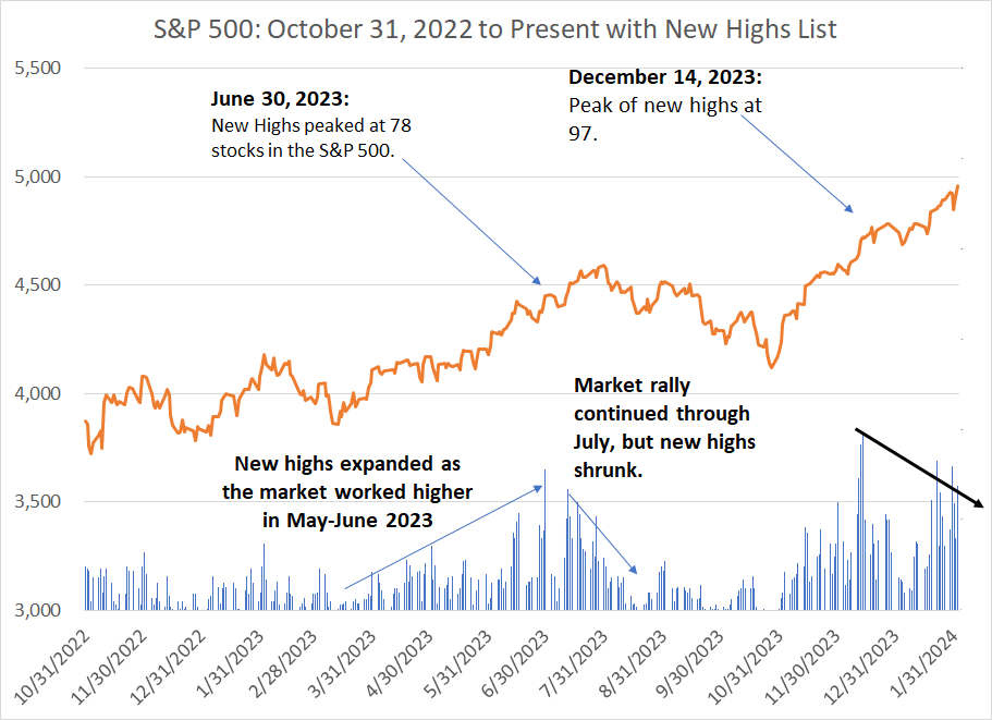
One useful market breadth indicator is to watch the number of stocks making new 52-week highs:
Source: Bloomberg
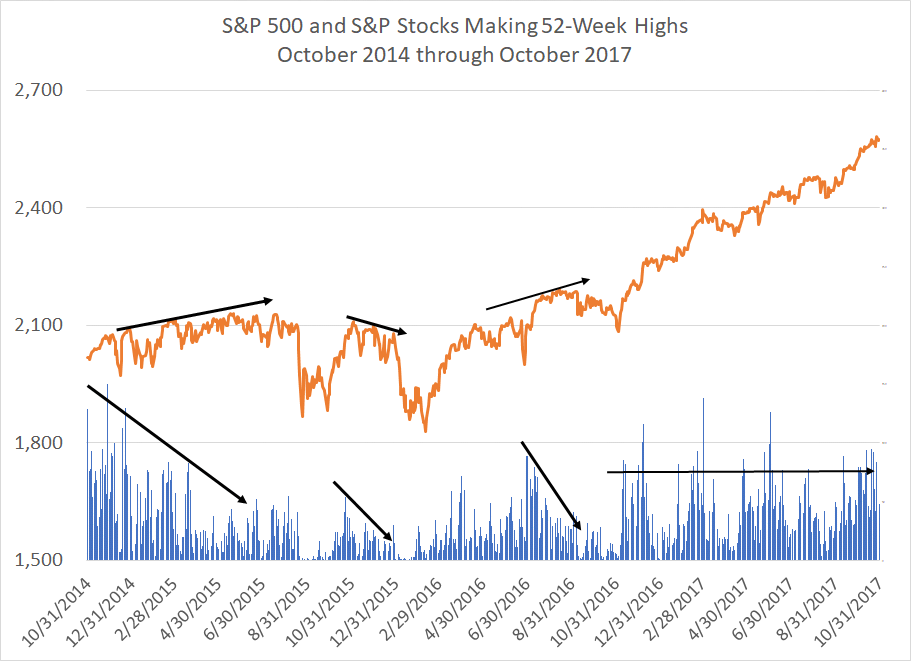
The orange line on this chart simply shows the daily closing price of the S&P 500 while the blue bars underneath track the total number of stocks within the S&P 500 that are making new 52-week (one-year) highs.
In a healthy rally you’ll see the S&P 500 trending higher and a significant and rising number of S&P components making new 52-week highs. When there are divergences in these two trends it can signal trouble ahead.
I chose this period – late 2014 through late 2017 – because 2015 and early 2016 represented a volatile period for equities featuring two major selloffs. Then, following that period of elevated volatility, stocks embarked on a powerful rally higher though the end of January 2018.
Watching new highs provided an early warning signal of trouble ahead in late 2015. Specifically, look at how the S&P 500 rose at a slow-and-steady pace from late 2014 through much of the summer of 2015. This was not a powerful bull market; rather, a shallow uptrend. However, flip down to the new highs bars below this chart and you’ll see the number of S&P 500 stocks reaching new 52-week highs peaked in late 2014 with 150 stocks hitting new one-year highs on November 30, 2014.
While the market continued to grind its way higher through the first 7 months of 2015, the new highs list made a series of lower highs and by the late spring and summer of that year the new highs list never reached much higher than 40 to 45 S&P 500 stocks on any given day. Broader market gains measured by the index itself continued, powered by only a handful of leadership groups.
Finally, in August 2015 even the leaderships groups and stocks in the index hit a wall and the broader market experienced a steep sell-off. A brief bounce ensued into November 2015 followed by renewed weakness in the late December 2015 to early February 2016 period.
Look at the new highs list and you’ll see that while it expanded during the fall 2015 snap-back rally in the S&P 500, the number of S&P 500 stocks logging new 52-week highs only bounced back to the around August levels, near the end of the 2014-15 rally. Shortly thereafter, the number of new highs began to shrink again through the end of 2015 and into January 2016.
That signaled the autumn 2015 stock market rally was built on a weak foundation and signaled renewed weakness in early 2016; the absolute low for the S&P 500 was recorded on February 11, 2016.
In the summer of 2016, the new highs list provided some mixed signals. While the initial rally from the February 2016 lows through roughly June of that year was supported by a resurgence in the number of stocks making new 52-week highs, breadth weakened again in the summer and early fall of 2016. This signaled renewed volatility through the 2016 presidential election in November 2016.
Finally, note that the rally that began in the immediate aftermath of the 2016 election continued through to early 2018 and this rally was consistently supported by healthy levels of new highs. From the end of October 2016 through the end of 2017, the S&P 500 soared 28.6% and the Nasdaq 100 returned 34.9%.
Here's a look at the same data since late 2022:
Source: Bloomberg
As I’ve written before, the 2023 broader market rally was not known for its healthy breadth. However, the new highs list did expand last spring as the market recovered from the March regional banking mess.
However, the new highs list peaked at the end of June. Even as the market continued to grid higher in July 2023, the new highs list shrank notably through the month. When the Nasdaq market leaders finally cracked in August 2023, the market experienced a significant correction that persisted through to the October 27, 2023 market close. The total decline for the S&P 500 from the July 31st closing high to the October 27th closing low was roughly 10% and closer to 11% for the Nasdaq 100.
The market did enjoy a year end ramp higher, and that rally showed decent breadth, evidenced by small-cap outperformance and an expanding new highs list. What’s interesting, however, is that the new highs list peaked at 97 on December 14th and has since contracted.
On January 29th, for example, the S&P 500 closed 4.5% higher than it did on December 14, 2024; yet, only around 80 stocks made new 52-week highs. Then, last Friday February 2nd, the S&P 500 hit yet another new high while the list of new 52-week highs among S&P 500 members shrank to 69.
Let’s look at an even broader new highs list:
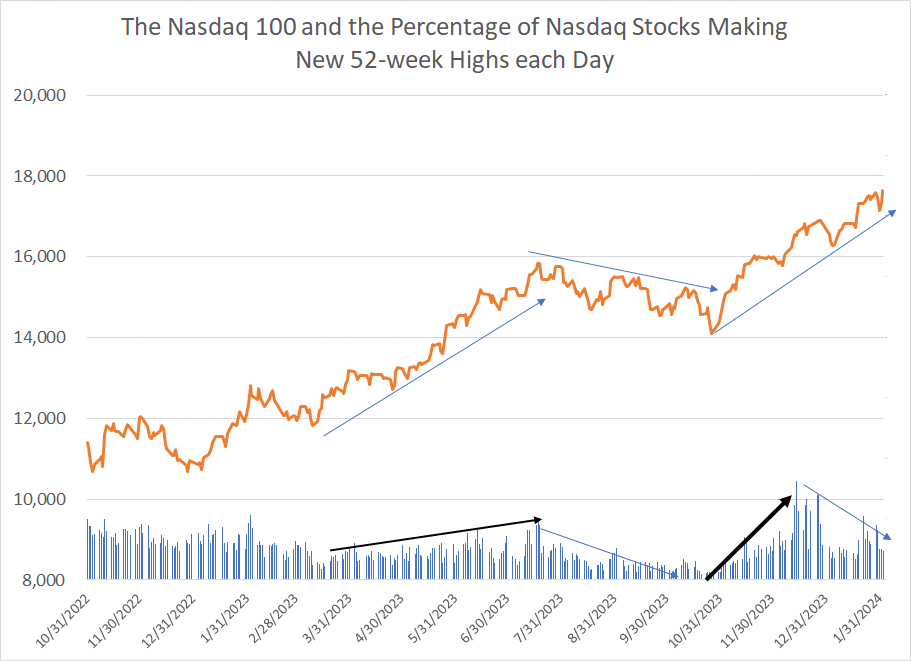
Source: Bloomberg
This chart shows the Nasdaq 100 Index and the percentage of stocks in the Nasdaq Composite (NOT just the Nasdaq 100) logging fresh 52-week highs.
I won’t belabor the point by going through all the turning points since late 2022. Suffice it to say the rally from March through July was supported broadly by an expanding new highs list. The number of stocks in the Nasdaq making new highs continued to shrink through August of last year even as the Nasdaq 100 attempted to rally in late-August and early September.
Once again, the new highs list supported the powerful year-end rally last year.
However, much as for the S&P 500 market breadth on this basis peaked on December 14th when more than 8 percent of stocks traded on Nasdaq reached new 52-week highs. And, while the Nasdaq closed on February 2nd some 6.8% higher than it was in mid-December of last year, there has not been a single trading day in 2024 when more than 4.6% of Nasdaq stocks have logged new one-year highs.
On Friday February 2nd, for example, only 2.4% of stocks on Nasdaq hit new 52-week highs, down from almost 2.6% one day earlier despite the rally late last week.
With these points in mind, I believe the risk of a significant near-term pullback or sell-off in stocks this month is elevated to the point I’m making some moves in the model portfolio this issue.
Longer-term, the picture is more complex. If we do see a pullback in stocks in the next few weeks that’s likely to attract some dip-buyers as major indices and groups retest key support levels. For now, the intermediate-term trend remains undeniably higher.
And that brings me to this:
The Yellen Pivot
By (roughly) May of this year I expect the Fed’s Reverse Repo (RRP) facility to be exhausted. Simply put, most assets in the RRP represent money market funds parking cash at the central bank to earn a risk-free return on their money at a rate of more than 5% annualized. Since last June, Treasury Bills have offered more attractive yields than the RRP, so money market funds have been shifting assets from RRP to buy T-Bills.
That led to what some have dubbed the “Yellen Pivot”:
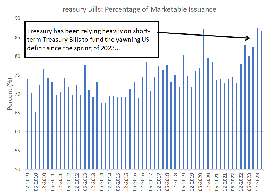
Source: Bloomberg
Since last spring, Treasury has relied heavily on Treasury Bills rather than longer-term notes and bonds to fund the widening US deficit. In Q4 2023, for example, some 87.6% of marketable debt issued by the US government was T-Bills.
Since money market funds can purchase T-Bills, but not notes and bonds, high T-Bill rates have allowed the government to fund the deficit by draining RRP without having a significant impact on bank reserves. However, the Yellen pivot is reaching extremes; Treasury recently reported that as of the end of 2023, 21.5% of the US government’s $26.352 trillion in marketable debt outstanding consisted of Treasury Bills. A year earlier, on December 31, 2022, T-Bill’s share of debt stood at just under 15.5% of the total.
In the intermediate- to long-term, Treasury has a 15% to 20% target for T-Bills as a share of US debt outstanding, so the Yellen Pivot has already pushed Bill issuance above those targets. While that’s not an immediate risk, over the long-haul it’s likely the US will want to reduce Bill issuance and issue more intermediate to long-term debt to fund the government.
However, money market funds can’t buy Treasury Notes and Bonds, so some other entity must buy the debt instead. The most likely source of funds would be domestic bank deposits (individuals and corporations) buying the debt. However, falling deposits would inevitably lead to falling bank reserves and, as I explained in the December 5th issue “Stealth Easing and Bank Reserves,” there’s a clear link between bank reserves, economic activity and the stock market.
Also, recall the Fed’s ongoing quantitative tightening (QT) campaign has the effect of reducing the central bank’s direct holdings of Treasury securities. Treasuries represent an asset on the central bank’s balance sheet so when assets decline, the liabilities side of the balance sheet must also adjust (fall).
Both the RRP and bank reserves are liabilities on the Fed’s balance sheet, so the falling RRP has both helped the government finance its debt and allowed the Fed to continue QT without having much impact on bank reserves.
Once RRP is exhausted, bank reserves would need to adjust enough to both offset QT and fund the Treasury’s borrowing needs.
That’s a problem to put it mildly.
Moreover, even if Treasury were to continue elevated Treasury Bill issuance allowing Bills as a percentage of total debt ratio to climb even further above target, the domestic portion of the RRP used by money market funds now holds just $577.8 billion in assets, down from more than $2 trillion a year ago and more than $50 billion in the past week alone.
Once that’s drained, even new T-Bill issuance is likely to have a more profound impact on bank reserves, economic activity, and stock prices.
Something has got to give.
At risk of sounding like a conspiracy theorist, I suspect the Fed will need to consider tapering its QT program before the summer, reducing the pace of decline in Treasury holdings. Eventually, the Fed will also need to end QT outright, or the central bank risks magnifying any decline in bank reserves, resulting in a dangerous non-linear tightening in credit conditions.
In my view it’s also naive to imagine the Fed can act entirely independent of consideration regarding the fiscal side of the equation. Simply put, in Fiscal Year 2023 (ended September of last year), the US government spent $659 billion in net interest on the national debt alone.
In the first three months of this fiscal year (2024) alone, net interest was $216 billion, almost as much as the $238 billion spent on national defense and $351 billion on social security.
Simply put, rising interest rates put pressure on US debt service costs and rising US federal deficits are putting pressure on the Fed’s balance sheet. That’s only going to get worse in coming months as RRP is exhausted.
Bottom line: As Fed Chair Jerome Powell explained in his 60 Minutes interview last weekend, the Fed is likely to be reluctant to ease rates too soon or too quickly at risk of reigniting inflation.
The central bank will be under increased pressure to act in the next 3 to 4 months – it’s hard to imagine QT continuing at the current pace, or rates remaining as elevated as they are today, because of the stark consequences for bank reserves, the federal budget, and economic conditions.
With these points in mind, here’s what I’m recommending this week:
Actions to Take
Keep reading with a 7-day free trial
Subscribe to The Free Market Speculator to keep reading this post and get 7 days of free access to the full post archives.