

Are Energy Stocks Overvalued?
Are Energy Stocks Overvalued?
Part 1: The S&P 500's Big Problem

Energy stocks have surged over the past year, rising 67.4% since the end of 2021.
What’s even more impressive is that run has come in the context of a bear market in most stocks – the S&P 500 is down almost 17% over a similar holding period, so energy’s outperformance stretches to more than 80 percentage points.
That’s historic:
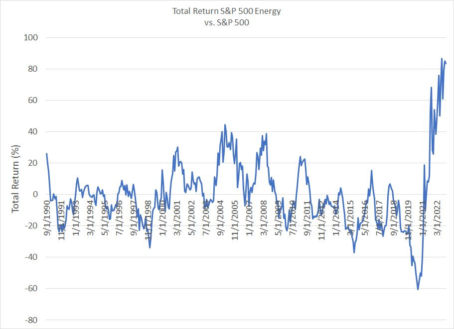
Source: Bloomberg
We examined returns, including both capital gains and dividends, for the S&P 500 Energy Index and S&P 500 since September 1989. This chart shows the percentage outperformance of energy stocks compared to the S&P 500 for every rolling 12-month period through December 2022.
As you can see, energy has never outperformed the broader market to the current degree at any time over the past 30+ years; the closest analog was buying energy stocks in the mid-2000s when outperformance reached around 40 percentage points over 12 months.
With that in mind, it’s only natural, and logical, to wonder whether energy might be due for a pause after a run of that magnitude, or whether energy stocks might be getting expensive in absolute terms and relative to the broader S&P 500.
That’s also one of the most common questions I’ve been receiving from readers in recent weeks.
Well, as I explained in the January 10th issue of The Free Market Speculator, “In the Long-Run, We’re All Dead,” the S&P 500, as a whole, is still expensive right now despite the sell-off over the past year. Our long-term valuation work suggests we’re headed for several years of sub-par returns from the broader equity market.
The good news is that stretched valuations on this basis don’t mean all stocks are a bad deal right now.
And that brings us to this:
The S&P 500’s “Big” Problem
In recent years, the S&P 500 and most other market-cap weighted indices have come to be dominated by a handful of large-cap growth stocks.
Take a look:

Source: Bloomberg
There are 76 stocks in the S&P 500 Information Technology sector and those stocks have the highest weight of any sector in the S&P 500 at 26.5%. For context, the next-highest weighted sector is Health Care, which has a weight of less than 15%.
Within tech, only two stocks – Apple (NSDQ: AAPL) and Microsoft (NSDQ: MSFT) – really matter with combined share of more than 42% of the S&P 500 Technology Index. Broaden out to the 10 largest stocks in tech and the weight jumps to almost two-thirds of the index.
And, Meta (NSDQ: META), the company formerly known as Facebook, Netflix (NSDQ: Netflix), Alphabet (NSDQ: GOOGL) Amazon.com (NSDQ: AMZN) and Tesla (NSDQ: TSLA) aren’t even components of the S&P 500 Information Technology Sector, though all are clearly tech-enabled growth stocks. This wider universe of “Tech+” stocks currently comprises more than one-third of the S&P 500’s value, down from a peak of almost 44% in late 2021.
A decade ago, in early 2013, tech’s total weight in the S&P 500 was less than 20% and my tech+ basket had a weight of less than 22%.
Even at the peak of the Nasdaq bubble in 2000, the market wasn’t as concentrated in just a few issues – the S&P 500 Tech sector accounted for less than 35% of the S&P 500 in early 2000 (my tech+ basket didn’t exist because most components weren’t yet public).
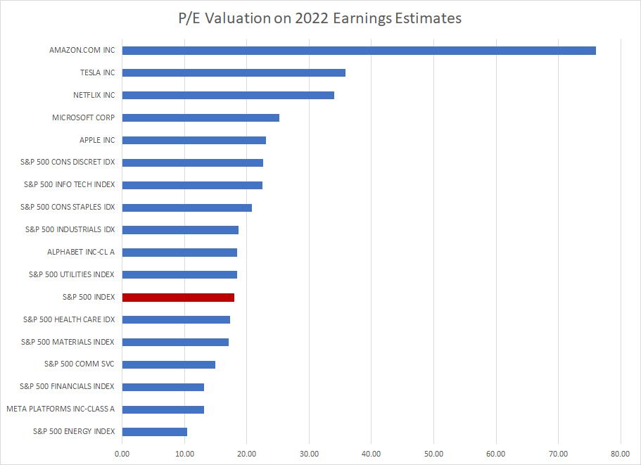
The problem is this Tech+ complex that’s come to dominate the S&P 500 is also an extremely expensive group:
Source: Bloomberg
This chart shows the current P/E for various market sectors and select stocks based on analysts’ consensus estimates for 2022 earnings (most stocks have yet to report full-year 2022 earnings).
Except for Meta, which has fallen 63% from its all-time peak in late 2021, all of the Tech+ basket I just outlined is trading at a significant valuation premium to the S&P 500.
Measuring P/E on this basis, rather than a long-time normalized basis as I calculated for the S&P 500 in this early January piece, is subject to several key biases. One of the most important is that while the market started to fall significantly in 2022, it was a decent year overall for corporate earnings with earnings for the S&P 500 up 5.2% and for tech roughly flat with 2021’s solid showing.
If the economy enters recession this year, as I expect, earnings are likely to turn sharply lower and valuing stocks based on 2022 cyclical peak profitability makes stocks appear artificially cheap. Yet, even on this flattering basis, the stocks that have come to dominate the S&P 500 in the past decade are trading at stretched valuations despite major sell-offs from late 2021-early 2022 peaks.
However, look beyond these behemoths and there are plenty of sectors, including energy, and stocks that are trading at far more reasonable valuations.
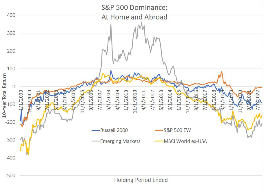
Let’s look at this situation in a different way:
Source: Bloomberg
This chart shows rolling 10-year total returns for 4 different indices compared to the S&P 500 – positive numbers indicate these indices outperformed the S&P 500 and vice versa.
As you can see, the S&P 500 has dominated returns from most indices both here in the US and abroad over the past decade or so.
Simply buying and holding the S&P 500 from December 2011 to December 2021 generated a return of 365%, beating the return from the Russell 2000 Index of US small cap stocks by 127 percentage points, the return from Emerging Markets by 263 percentage points and the return from all global equities except the US by almost 215 percentage points.
As I’ve noted, the S&P 500 is weighted by market capitalization (firm size); Apple is the largest stock in the index with a weight of 6.3% and Davita (NYSE: DVA) is the smallest with a weight of 0.02%. However, there’s also an equal-weighted version of the S&P 500 that assigns every stock in the index an equal weight. Apple and Davita, for example, would be equally important in the S&P 500 Equal Weight Index.
Over the decade ended December 31, 2021, the S&P 500 beat the S&P 500 Equal-Weighted version of itself by about 35 percentage points, a level rivaled only at the peak of the late 90’s-early 2000’s tech boom.
Eye-popping gains from our Nifty Tech+ basket of stocks that have come to dominate the S&P 500 over the past decade are alone responsible for the S&P 500’s dominance over virtually every other major equity benchmark both here in the US and around the world.
The only decision that mattered if you wanted to generate superior returns was buying this small tech+ group of US growth stocks on every dip in price. This entire equity market bonanza rests on just a handful – arguably just 25 big growth stocks or so – that trade at valuations several turns above the S&P 500 average.
It’s the mirror image of the situation that prevailed from the late 1990s to the late 2000s – for 10-year holding periods starting from 1997 through to 2007 or so, emerging markets, small caps and developed markets outside the US all offered much better returns than the S&P 500.
The End of Tech+ Hegemony
I’d argue this is the most important change for the US and global equity markets since late 2021 – the extreme valuation premium afforded this tech+ complex has started to crumble, and other groups are beginning to assume the leadership role.
Relative valuations suggest rotation out of the erstwhile Nifty Tech+ leaders to other sectors and markets is just getting started:

Source: Bloomberg
Bloomberg maintains a database of historic earnings for the S&P 500 Equal-Weight Index dating back only to January 1990. So, in an effort to construct a meaningful sample size, I calculated the P/E ratio for the S&P 500 Equal Weight Index using 5-year average earnings since the mid-1990s.
To create this chart, I plotted the 5-Year normalized P/E for the S&P 500 Equal-Weight divided by the S&P 500 P/E on the horizontal axis – readings above 1.0 suggest the Equal Weight S&P 500 is MORE expensive than the S&P 500.
I plotted this ratio against 5-year subsequent annualized returns for the S&P 500 Equal Weight less the S&P 500. A positive number on this vertical axis signifies the Equal Weight version of the index outperforms the S&P 500.
You can see the tight inverse correlation here and R-squared of near 77%. Simply put, when the S&P 500 Equal Weighted Index is cheap relative to the S&P 500, it tends to generate superior returns over a subsequent 5-year holding period.
Since 1995, the average rolling 5-year return for the S&P 500 Equal weighted index against the S&P 500 is +0.7% annualized and the P/E of the Equal Weight Index has averaged about 10% more expensive than the S&P (a ratio of 1.094 to be exact).
However, today, the Equal Weight Index is historically cheap against the S&P 500 right now, with a ratio of about 0.98. Based on the simple equation overlaid on my chart that suggests about 2.3 percentage points of annualized outperformance for the S&P 500 Equal Weight Index against the S&P 500 over the next 5 years.
Of course, the only way for this to happen is for the expensive mega-cap tech and growth stocks that dominate the S&P 500 to dramatically underperform most other stocks in the index.
Meanwhile the market cap weighted version of the S&P 500 is near record expensive measured against virtually any other major equity market average around the world whether it’s the Russell 1000 Value Index, the Russell 2000 Index of small-caps or global markets like MSCI Europe and MSCI World ex-US.
And, of course, just look at these relative index weights within the S&P 500 itself:
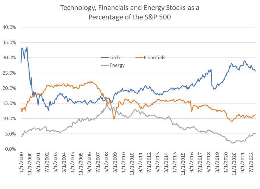
Source: Bloomberg
As recently as 2007-08 energy and financial stocks accounted for close to 16% and 22% of the S&P 500 respectively with technology holding in the 15% to 17% range.
Today, even after dramatic outperformance since 2020, energy still accounts for barely 5% of the S&P 500 – that’s less than a third of its 2008 peak. And financial shares stand at just over 11% of the S&P 500, half their peak before the global financial crisis.
In short, global equity markets have become unbalanced over the years since the 2007-09 Great Recession and Financial Crisis with superior returns – investment alpha – dominated by how much you choose to overweight that handful of mega-cap tech and growth leaders.
That imbalance has started to reverse and, even if energy stocks reclaim their long-term average weight in the S&P 500 of 8% that implies considerable upside to the group relative to current levels.
And check out this chart:
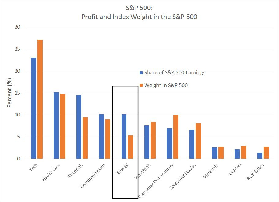
Source: Bloomberg
Energy is the standout on this chart. As you can see, Energy stocks in the S&P 500 contribute 10.1% of total earnings (profits) to the S&P 500 right now yet, the group has a weight in the index of just over 5%.
Contrast that to the tech stocks in the index, which contribute 23% of the S&P 500’s earnings but account for around 27% of the index in terms of weight. Or how about Consumer Discretionary stocks that contribute less to S&P 500 profits than energy – just 6.6% of total earnings for the index – yet carry a weight in the S&P 500 of about 10%, almost double energy’s share.
So, you might be wondering what’s behind the global tech+ hegemony and, even more important, what’s changed over the past year to begin to reverse that imbalance in favor of groups like energy.
In an upcoming issue to be publish next week, I’ll dive into exactly what drove hegemony for Tech+ growth stocks over the past decade and what it means for stocks over the next few years.
DISCLAIMER: This article is not investment advice and represents the opinions of its author, Elliott Gue. The Free Market Speculator is NOT a securities broker/dealer or an investment advisor. You are responsible for your own investment decisions. All information contained in our newsletters and posts should be independently verified with the companies mentioned, and readers should always conduct their own research and due diligence and consider obtaining professional advice before making any investment decision.