

Late Cycle and Quality
Late Cycle and Quality
This crucial market shift is already underway

As I covered in my last post VIX is High, Time to Buy?, most investors associate market volatility with market lows because indicators like the S&P 500 Volatility Index (VIX) tend to spike at or near major market bottoms.
However, what’s less appreciated is that equity markets have a long history of building volatility just before and after important market tops:
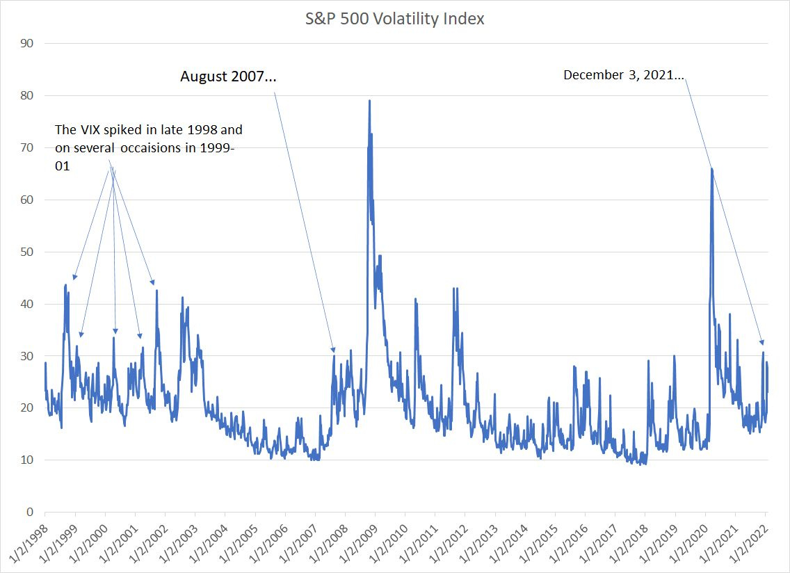
Source: Bloomberg
Starting in late 1998, a year and a half before the start of the Y2k tech wreck, there were several spikes in the VIX towards the 30 level, considered elevated volatility at that time.
We can see the same thing starting in the summer of 2007, just before the October 2007 market peak and the start of a historic bear market from 2007-09.
Finally, while the 2020 bear market was unique in many ways, it’s clear the market cycle was already maturing as of 2018 – several spikes in the VIX indicated a cyclical rise in volatility characteristic of the final stages of a rally and the later stages opf an economic and market cycle.
I’d argue the government and central bank response to the coronavirus crisis and the economic volatility that’s ensued – a deep recession, rapid economic recovery and explosion in inflation – have resulted in what’s likely to be a durable increase in average market volatility.
And true to form, we started seeing spikes in the VIX about a year ago in early 2021, characteristic of a maturing economic and market cycle.
One manifestation of this is that the “quality” factor begins to outperform as the cycle enters its later stages:
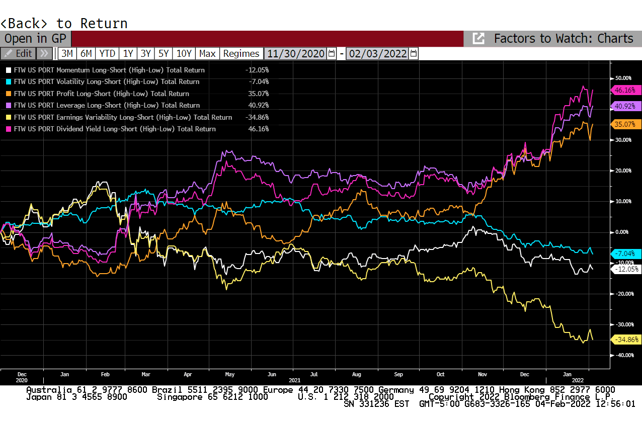
Source: Bloomberg
This is a Bloomberg screenshot showing the performance of 6 important quantitative factors since December 2020.
These “factors” are nothing more than technical or fundamental characteristics exhibited by a group of stocks.
For example, the “Profitability” factor (orange line in my chart) divides all US stocks into 5 quintiles based on profitability metrics like return on equity (ROE). The most profitable 20% of stocks in the database rank in Quintile 1 and the least profitable in Quintile 5.
The lines in my chart above show the performance of Quintile 1 compared to quintile 5 or, put in a different way, the profit obtained by buying Quintile 1 stocks and shorting Quintile 5 stocks.
Historically, profitability starts to work in the later stages of an economic and market cycle as volatility begins to pick up – naturally, investors gravitate to the most consistently profitable stocks when the broader indices start to see wilder swings.
What’s interesting here is that the profitability factor only started to improve last summer and really began to jump starting in early November last year.
Here’s the same data from 2007-08:
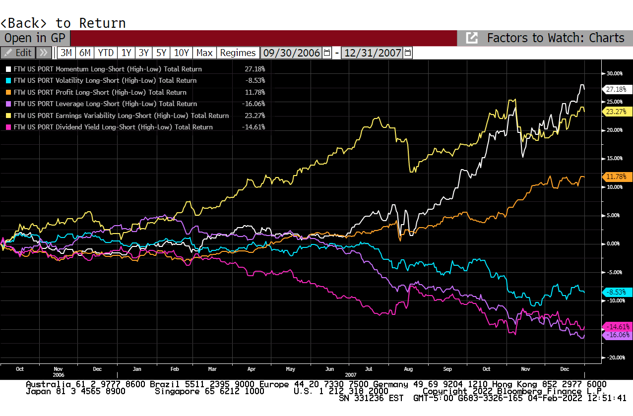
Source: Bloomberg
In this cycle, the profitability factor (again in orange) began to outperform in April 2007 and then surged higher starting in August 2007 amid the spike in market volatility centered on financial stocks like Lehman.
Let me reiterate: It’s too early to call a top for the broader market.
The most important reason: The stock market rarely tops more than a year before the US enters recession and, while economic indicators are showing some early signs of weakening, we’re not even close to levels that signal imminent recession.
Over the years, I’ve learned not to fight these indicators or make bear market forecasts prematurely. However, since late last year I’ve seen a growing list of warning signs, including several I’ve covered in these updates such as the collapse in Nasdaq market breadth, the ongoing increase in volatility and improvement in the profitability factor.
The sensational headlines surrounding a handful of tech stocks last week obfuscate the more important longer-term trends underway.
After all, Meta Platforms (NYSE: FB), the company formerly known as Facebook, missed expectations last Wednesday night, while SNAP Inc. (NSDQ: SNAP) and Amazon (NSDQ: AMZN) beat earnings expectations on Thursday evening and saw dramatic gains on Friday; however, that does little to change the fact that all three stocks are “broken” technically.
For example, amid all the sensational headlines about a 60%+ intraday rally in shares of SNAP last Friday, just look at this chart:
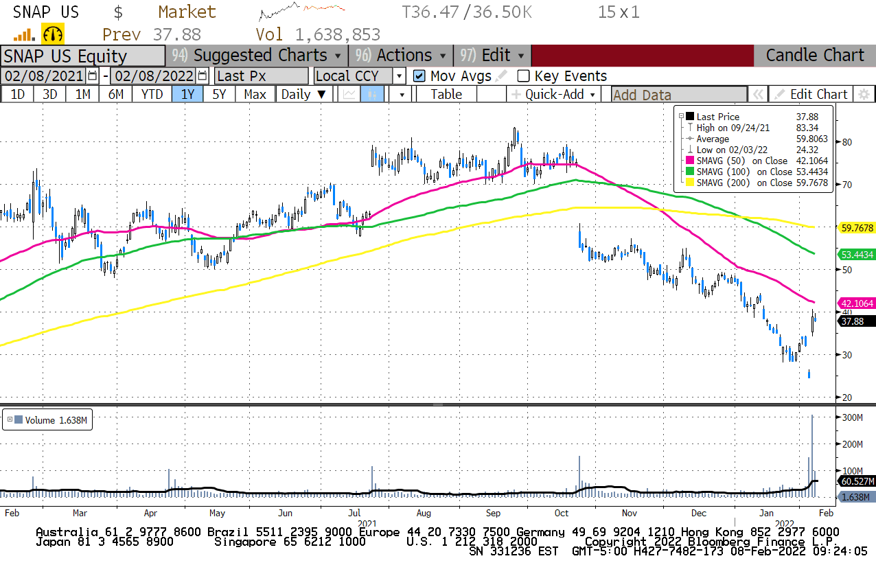
Source: Bloomberg
Even after that rally this stock is still down 50% from its highs in September and is trading below downward-sloping 50-day, 100-day and 200-day moving averages, the very definition of a downtrend.
DISCLAIMER: This article is not investment advice and represents the opinions of its author, Elliott Gue. The Free Market Speculator is NOT a securities broker/dealer or an investment advisor. You are responsible for your own investment decisions. All information contained in our newsletters and posts should be independently verified with the companies mentioned, and readers should always conduct their own research and due diligence and consider obtaining professional advice before making any investment decision.