


What's Working Now?
Moving averages, market leaders and risk-adjusted returns...

On Friday, I published a lengthy update over on FMS’ sister publication, Smart Bonds, titled “Buying Abroad,” covering some of my latest thoughts on the economy including my take on the negative Q1 2025 GDP number and the latest employment report from BLS.
I also wrote about the big drop in high-yield credit spreads lately, an update on a topic I’ve covered before here in FMS.
The relevant sections of my Smart Bonds article are available free to FMS readers by tapping here.
Due to popular demand, I’ve also decided to offer 90-day free trial subscriptions to Smart Bonds, including all of the model portfolios, for all paid-tier FMS readers. The special link you need to claim that trial is available just below the “Actions to Take” section of this issue.
In addition to that, I’ve had a ton of questions from readers regarding how I use and interpret moving averages, including the 200-day and 40-week simple moving averages.
So, this weekend I’ll attempt to answer some of the most common questions, and explain what it means for markets right now starting with this:
Avoiding the Bears
Let’s start with a few historical examples to show how moving averages work.
Take a look:
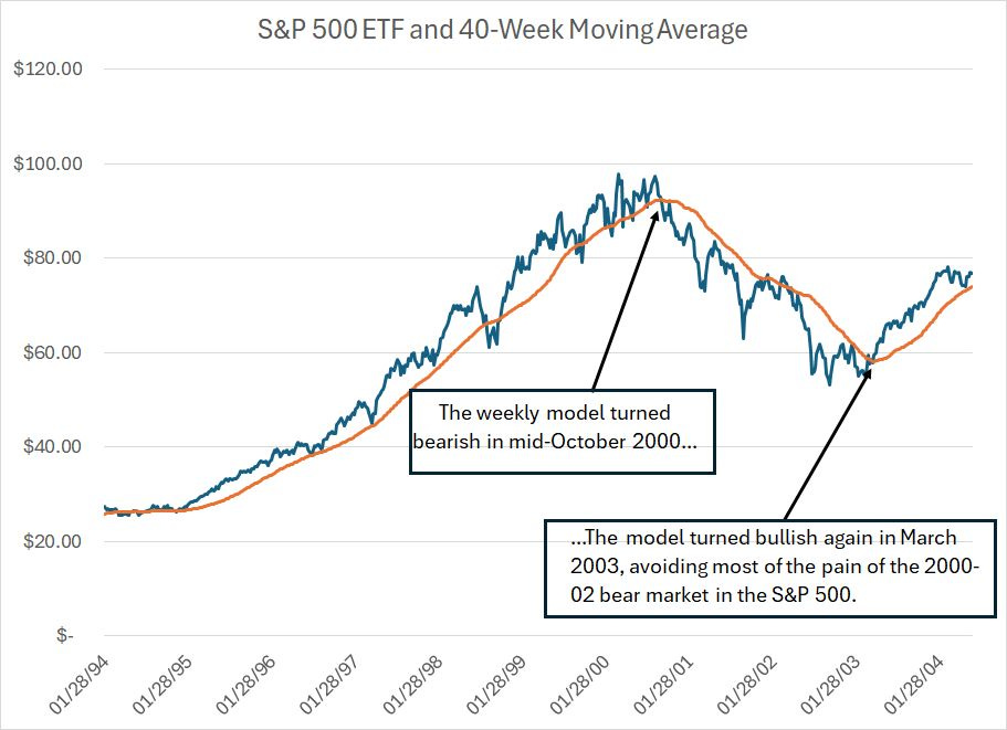
This weekly chart shows the dividend and split-adjusted value of the SPDR S&P 500 ETF (NYSE: SPY), which tracks the S&P 500 Index. This data covers the period from early 1994 through mid-2004.
The orange line is the 40-week moving average of prices.
Simply put, when the SPY is trading above the orange line, this trend-following indicator is bullish and vice versa. I chose this period because it includes the historic bull market for US stocks in the late 1990s, the entire 2000-02 bear market and the beginning of the 2002-2007 bull market.
As you can see, this simple trend-following model remained bullish the S&P 500 through the late 1990s bull market and kept investors out of stocks from October 2000 through March 2003, a period that included a nasty 40% to 50% sell-off.
Then, the model turned bullish again in March 2003, the very beginning of the 2002-07 bull market.
Let’s look at the period from 2006 through 2015:
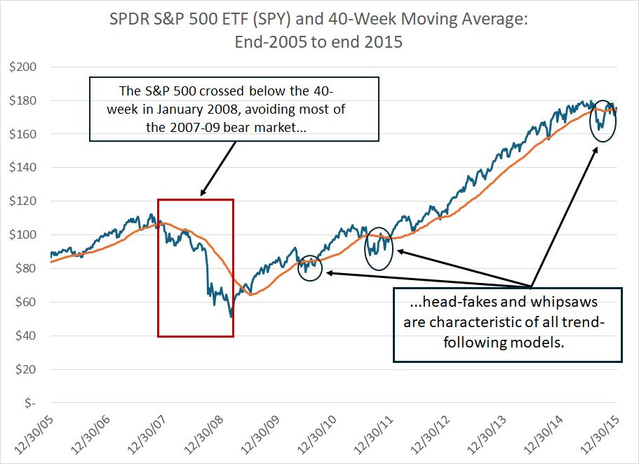
This is the same presentation as my first chart with the SPDR S&P 500 ETF as a dark blue line and the 40-week moving average as an orange line.
The S&P 500 closed significantly below its 40-week moving average in the first week of January 2008 and then crossed back above that moving average in May 2009. So, this basic model kept investors out of stocks for most of the 2007-09 bear market, amid the financial crisis and Great Recession of that era.
And, it also “worked” in 2022 (not pictured) first signaling a “Sell” on SPY in late January 2022 and flipping back to a buy in mid-January 2023.
However, these two historic examples illustrate three very important points to understand about trend-following models of this nature.
First, they’re prone to what are known as whipsaws.
For example, look at my chart for the 1994 to 2004 period above closely and you’ll see that while the SPY remained above the 40-week moving average for the vast majority of weeks from late 1994 through the autumn of 2000, there were some exceptions – a few weeks in 1998, 1999 and early 2000 where the SPY closed below its moving average for one or more weeks, signaling a “sell.”
These sell signals were quickly reversed and the market proceeded to trend higher.
You can also see the opposite scenario in the 2000-02 bear market. This indicator signaled a premature “buy” signal in late 2001 and early 2002, nearly a year before the October 2002 low in the S&P 500.
Now look at that chart of the 2006-2015 period and, in particular the bull market from 2009 through 2015. I’ve labeled three obvious examples of periods when the S&P crossed below its 40-week moving average, sometimes for periods of several weeks, but did not enter a bear market.
While these whipsaws resolved quickly, imagine the investor who sold down their exposure to the S&P 500 and then was forced to buy back a few weeks later at higher prices. While, with the benefit of hindsight that doesn’t look like a huge problem, let me assure you it can be an uncomfortable situation in real time.
That’s why I don’t follow a purely mechanical allocation methodology selling out of stocks when the S&P crossed below its moving average or vice versa.
I supplement these trend-following indicators with discretionary factors. For example, when the S&P 500 dips below a rising 40-week moving average – the average itself is also rising -- as it did in 1998 and 1999 those signals are often prone to failure. Therefore, I give them far less weight.
I also supplement these purely technical models with my current take on the health of the US and global economy and the fundamental and macroeconomic indicators I follow and analyze on an ongoing basis in this service.
Risk-Adjusted Returns
The second point to understand is summarized on this table:
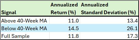
I examined this basic 40-week moving average model from October 29, 1993 through May 2, 2025, a period of more than three decades. Specifically, I looked at annualized weekly returns from the S&P 500 for weeks following a close above the 40-week moving average, weeks following closes below the 40-week moving average and the full sample.
For the full sample period, the average weekly gain in the S&P 500 is 11.8% annualized. However, when the SPY closes above its 40-week moving average the average annualized gain is actually LOWER at 11.0%.
Meanwhile, the average weekly gain following closes below the 40-week moving average is a whopping 14.5% annualized.
There are as few reasons that’s the case. One is the whipsaw issue I just outlined. In 1998 and 1999, for example, the S&P 500 closed below its 40-week moving average for a week or two before seeing a dramatic recovery to new highs.
So, mechanistic use of this model would have “missed” some of these quick reversals.
A second reason is that trend-following indicators by definition never catch the exact turning point. So, they’ll signal a sell after the peak of a bull market and a buy after the bottom of a bear market, missing out on the early, often-dramatic weekly gains off major market lows.
The final column, however, reveals the payoff from following a trend indicator.
The annualized standard deviation – a measure of volatility and risk – is far higher when the SPY is below its 40-week moving average at 26.1% annualized compared to just 17.3% for the full sample.
Even better, gains from stocks when the SPY is above its 40-week are far smoother and more consistent – the annualized standard deviation is about 13.4%, roughly 4 percentage points lower than the full sample and HALF the standard deviation of weeks when the S&P is below its 40-week MA.
So, returns from stocks above the 40-week moving average offer the advantage of a good night’s sleep.
And that brings me to my third, related point.
The S&P 500 has been generally in a long-term uptrend for decades, including the 30+ years I just outlined. So, if you simply bought stocks and held for the long haul your returns would be higher than if you attempted to buy and sell stocks based on the SPY’s relationship to the 40-week moving average.
That’s not how I use this model.
Rather, I use this model as a prompt to ask a simple question:
What’s Working?
Or, to be somewhat more specific:
Are there other asset classes offering better return prospects than large-cap US stocks – that’s the S&P 500 – right now?
And are there other asset classes, industry groups or global markets in an uptrend on this basis while the S&P 500 is below its 40-week moving average?
Let me give you an example. Back in 2007-08, the S&P 500 crossed below its 40-week moving average. That turned out to be a great signal as the 2007-09 bear market was among the worst in terms of both duration and severity in US financial history.
Of course, we didn’t know that in real-time but, at a minimum, the break below this moving average suggested the US stock market could be in for a period of heighted volatility.
However, look at this:
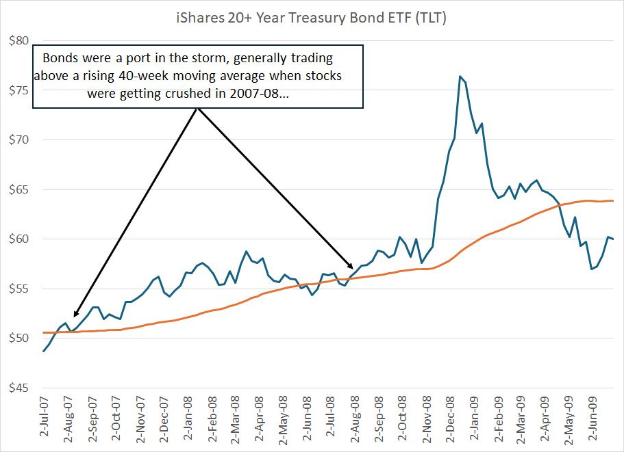
Back in late 2007 and through most of 2008, a period when stocks were weak, long-term Treasury bonds (US Government Bonds) tracked by the iShares 20+ Year Treasury ETF (TLT) jumped.
Granted, there were a pair of short-lived whipsaws in the summer of 2008, but TLT was trading above a rising 40-week moving average and generated a strong positive return in 2008, one of the worst years for the S&P 500 in history.
And, that brings me to the current situation:

As you can see in this weekly chart of the SPDR S&P 500 ETF, the S&P 500 crossed below its 40-week moving average in early March 2025.
And, unlike prior instances – like March and November 2023 – the index has remained below this moving average for 10 consecutive weeks while the moving average itself is now on the verge of trending lower.
However, not all markets and asset classes look like the S&P 500 right now.
Take a look:

Here’s a chart of the SPDR Gold Trust (GLD), which tracks gold prices over the past few years.
Gold has soared this year and remains above a rising 40-week moving average. And, as I explained in a video posted here on FMS in the middle of last month, some gold stocks we’ve recommended in the model portfolio have actually beaten the Nasdaq 100 over holding periods of close to 5 years.
And, late last month in “Agriculture, Tech and the Great Cycle,” I recommended an agriculture stock for the FMS model portfolio, and explained why I believe the group is entering a new multi-year bull market.
That stock reported earnings last week and broke higher:
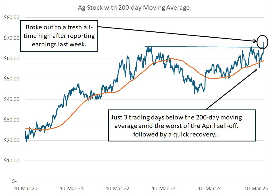
My apologies for not revealing the name and symbol of this stock here — it’s a very recent recommendation in the paid tier of FMS and it wouldb’t be fair to paid readers to reveal recent model portfolio additions in the free part of FMS posts.
However, look at this chart. This stock broke above its 200-day moving average in early 2024 and has been trending above a rising average since last summer.
At the height of the early April tariff crash, this stock dipped under that 200-day moving average for a grand total of just 3 trading days before quickly recovering to near its 52-week highs.
Following last week’s earnings release, the stock broke to a fresh all-time high, jumping more than 7% in the trading day after releasing earnings.
And this is only one of many agriculture stocks flashing signs of strength. Fertilizer producer Mosaic (NYSE: MOS), a stock I referenced in “Agriculture, Tech and the Great Cycle,” also reported earnings last week and broke higher:

Mosaic has been trading under a falling 40-week moving average since early 2023, now finally reversing to the upside. The moving average itself is now starting to turn higher.
I must admit, I find this one a little frustrating:
Fake Diversification, Energy and Oil
In my experience, the vast majority of individual investors who wish to allocate money to the energy sector end up buying an exchange-traded fund (ETF)
The two most popular ETFs out there are the SPDR Energy Select Sector ETF (XLE) and the SPDR S&P Exploration & Production ETF (XOP).
I get it. Buying an ETF like this seems a logical choice.
XLE owns the energy stocks in the S&P 500 and XOP provides equal-weighted exposure to a basket of 53 stocks, mainly exploration and production (E&P) stocks (producers).
That seems like great, diversified exposure to the sector, right?
And if you own XLE, the better performer of the two over the past year, you probably assume energy stocks aren’t performing well:

Indeed, this weekly chart shows that after a strong burst of massive outperformance from early 2020 through mid-2022, energy stocks have essentially marched in place.
This year, after a strong start to the year, XLE tumbled amid the tariff crash in March-April.
However, the truth of the matter is that XLE is dominated by 2 stocks — ExxonMobil (NYSE: XOM) and Chevron (NYSE: CVX) which accounted for a combined total of almost 40% of the ETF.
Since it’s equal-weighted, XOP is less concentrated, but I’d argue it’s still not diversified. That’s because most of the ETF holdings are leveraged, in one way or another, to oil.
I believe oil prices are finding a low right now, a topic I covered at some length in a video last week here on FMS. However, I’ve been pounding the proverbial table on natural gas as an investment theme since the second half of 2024 alongside my colleague Roger Conrad.
I covered some of the fundamentals of the natural gas market in “2025: The Year of Natural Gas,” right here on FMS.
Suffice it to say that unlike the ETFs, both leveraged mainly to crude oil, there are a ton of uptrends to be found on the natural gas side of the energy market:

This is a weekly chart of a name I’ve mentioned before here on FMS, EQT Corp. (EQT), which produces natural gas from the Marcellus Shale region of Appalachia.
Even at the height of the sell-off this year, EQT never broke down below its rising 40-week moving average. And last week’s surge puts us close to a 9-year high in the stock.
(Note: We recommend EQT Corp. across a few of our publications; however, in the FMS model portfolio we’ve opted for a different natural gas producer I believe has more upside right now.)
You see, the real problem with the market this year isn’t that stocks are getting killed, it’s that most individual investors — US investors in particular — are invested in the wrong stocks.
In the late 1960s and early ‘70s most investor were overweight the so-called “Nifty 50,” an informal list of supposedly one-decision growth stocks that were bid to nosebleed valuations. Popular mutual funds of that era were stuffed to the proverbial gills with these stocks.
Unfortunately, in the equity bear markets of the 1970s and early 1980s, these “Nifty” stocks were crushed.
In the late 1990s boom, it was the companies building the plumbing of the Internet that were the toast at cocktail parties, names like Cisco Systems (NSDQ: CSCO):

CSCO is a great company, but here we are a quarter century later, and the darling of the 1990s bubble years still hasn’t regained its year 2000 peak.
That’s how it works in every cycle.
The leaders of one phase of the cycle become the laggards of the next cycle. And, as I’ve been writing about for months now, I believe the Great Cycle has turned and that’s not good news for some of the market’s erstwhile leaders:
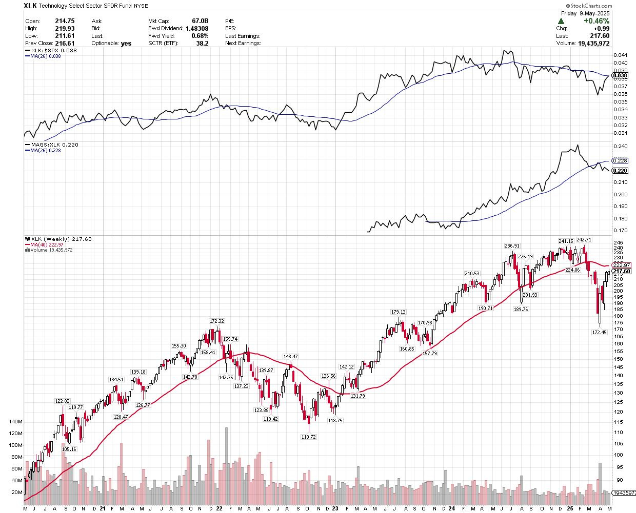
Source: Chart Courtesy of StockCharts.Com
This is a weekly chart of the SPDR Technology ETF (XLK) over the past 5 years.
For the first time since 2022, XLK is trading below its 40-week moving average. Even worse, relative strength for technology to the S&P 500 peaked last July (see the top pane of my chart).
And look at the middle pane of my chart showing the relative strength of the Magnificent 7 Stocks — tracked by the Roundhill Mag 7 ETF (MAGS) — to the SPDR Technology ETF. The most popular stocks in the US — the Magnificent 7 growth and tech darlings — started underperforming the rest of the tech sector in late January.
Keep in mind the Magnificent 7 names comprise approximately 30.5% of the S&P 500 and 41.1% of the Nasdaq 100. More broadly technology and tech-attached growth names in other sectors — like Amazon.com (AMZN) in Consumer Discretionary — comprise more than 40% of the S&P and more than 50% of the Nasdaq.
Bottom line: When the broader market falls below its major moving averages, and key leaders like the Magnificent 7 break down, I use that as a prompt to look for other names, other sectors and other assets that are now outperforming.
After all, rather than trying to pick a bottom in a stock like Alphabet (NSDQ: GOOGL), or try to ascertain the next 5% move in an ETF like the Nasdaq 100 Trust (QQQ), I’d much rather buy an agriculture or natural gas stock that’s cheaper, in an uptrend, and breaking out to all-time highs.
Or how about buying European or British financial stocks, which are up an average of more than 30% this year and offer yields in the 4% to 8% range?
The old saw that there’s always a bull market somewhere is true, it’s just that it may not be in the same stocks or industry groups as last year, or it may be in a different asset class entirely.
We just have to find it.
Here’s a quick model portfolio update, I’m eyeing some potential new recommendations and will likely have a new issue out in the coming workweek.
Keep reading with a 7-day free trial
Subscribe to The Free Market Speculator to keep reading this post and get 7 days of free access to the full post archives.